主要借鉴了Kaggle基础问题——房价预测的两篇教程Comprehensive data exploration with Python和House Prices EDA并进行总结。
本篇,主要进行数据探索,对数据的基本特征有一个全局的大致了解。
import pandas as pd
import numpy as np
import matplotlib.pyplot as plt
from sklearn.preprocessing import StandardScaler, OneHotEncoder
from sklearn.model_selection import train_test_split
import seaborn as sns
from scipy.stats import norm
from scipy import stats
%matplotlib inline
首先,我们拿到了数据集的csv文件,可以直接利用pandas导入得到DataFrame数据:
df_train = pd.read_csv(r'E:\kaggle\house_price_regression\train.csv')与 numpy 的ndarray数据相比,DataFrame数据自带有行列信息,且有很多便捷的方法可以直接进行快速分析。
例如,可以查看数据的基本布局信息。
df_train.head()  # 可以查看(默认)前5行数据信息
# df_train.tail() # 可以查看后10行数据信息| Id | MSSubClass | MSZoning | LotFrontage | LotArea | Street | Alley | LotShape | LandContour | Utilities | … | PoolArea | PoolQC | Fence | MiscFeature | MiscVal | MoSold | YrSold | SaleType | SaleCondition | SalePrice | |
|---|---|---|---|---|---|---|---|---|---|---|---|---|---|---|---|---|---|---|---|---|---|
| 0 | 1 | 60 | RL | 65.0 | 8450 | Pave | NaN | Reg | Lvl | AllPub | … | 0 | NaN | NaN | NaN | 0 | 2 | 2008 | WD | Normal | 208500 |
| 1 | 2 | 20 | RL | 80.0 | 9600 | Pave | NaN | Reg | Lvl | AllPub | … | 0 | NaN | NaN | NaN | 0 | 5 | 2007 | WD | Normal | 181500 |
| 2 | 3 | 60 | RL | 68.0 | 11250 | Pave | NaN | IR1 | Lvl | AllPub | … | 0 | NaN | NaN | NaN | 0 | 9 | 2008 | WD | Normal | 223500 |
| 3 | 4 | 70 | RL | 60.0 | 9550 | Pave | NaN | IR1 | Lvl | AllPub | … | 0 | NaN | NaN | NaN | 0 | 2 | 2006 | WD | Abnorml | 140000 |
| 4 | 5 | 60 | RL | 84.0 | 14260 | Pave | NaN | IR1 | Lvl | AllPub | … | 0 | NaN | NaN | NaN | 0 | 12 | 2008 | WD | Normal | 250000 |
5 rows × 81 columns
由上表可见,数据共有81列,我们可以查看这些特征的具体名称:
df_train.column # 查看各个特征的具体名称Index(['Id', 'MSSubClass', 'MSZoning', 'LotFrontage', 'LotArea', 'Street',
'Alley', 'LotShape', 'LandContour', 'Utilities', 'LotConfig',
'LandSlope', 'Neighborhood', 'Condition1', 'Condition2', 'BldgType',
'HouseStyle', 'OverallQual', 'OverallCond', 'YearBuilt', 'YearRemodAdd',
'RoofStyle', 'RoofMatl', 'Exterior1st', 'Exterior2nd', 'MasVnrType',
'MasVnrArea', 'ExterQual', 'ExterCond', 'Foundation', 'BsmtQual',
'BsmtCond', 'BsmtExposure', 'BsmtFinType1', 'BsmtFinSF1',
'BsmtFinType2', 'BsmtFinSF2', 'BsmtUnfSF', 'TotalBsmtSF', 'Heating',
'HeatingQC', 'CentralAir', 'Electrical', '1stFlrSF', '2ndFlrSF',
'LowQualFinSF', 'GrLivArea', 'BsmtFullBath', 'BsmtHalfBath', 'FullBath',
'HalfBath', 'BedroomAbvGr', 'KitchenAbvGr', 'KitchenQual',
'TotRmsAbvGrd', 'Functional', 'Fireplaces', 'FireplaceQu', 'GarageType',
'GarageYrBlt', 'GarageFinish', 'GarageCars', 'GarageArea', 'GarageQual',
'GarageCond', 'PavedDrive', 'WoodDeckSF', 'OpenPorchSF',
'EnclosedPorch', '3SsnPorch', 'ScreenPorch', 'PoolArea', 'PoolQC',
'Fence', 'MiscFeature', 'MiscVal', 'MoSold', 'YrSold', 'SaleType',
'SaleCondition', 'SalePrice'], dtype='object')
若想对数据的基本情况进行快速了解,可以用如下方式获得:
df_train.describe() # df_train['SalePrice'].describe()能获得某一列的基本统计特征| Id | MSSubClass | LotFrontage | LotArea | OverallQual | OverallCond | YearBuilt | YearRemodAdd | MasVnrArea | BsmtFinSF1 | … | WoodDeckSF | OpenPorchSF | EnclosedPorch | 3SsnPorch | ScreenPorch | PoolArea | MiscVal | MoSold | YrSold | SalePrice | |
|---|---|---|---|---|---|---|---|---|---|---|---|---|---|---|---|---|---|---|---|---|---|
| count | 1460.000000 | 1460.000000 | 1201.000000 | 1460.000000 | 1460.000000 | 1460.000000 | 1460.000000 | 1460.000000 | 1452.000000 | 1460.000000 | … | 1460.000000 | 1460.000000 | 1460.000000 | 1460.000000 | 1460.000000 | 1460.000000 | 1460.000000 | 1460.000000 | 1460.000000 | 1460.000000 |
| mean | 730.500000 | 56.897260 | 70.049958 | 10516.828082 | 6.099315 | 5.575342 | 1971.267808 | 1984.865753 | 103.685262 | 443.639726 | … | 94.244521 | 46.660274 | 21.954110 | 3.409589 | 15.060959 | 2.758904 | 43.489041 | 6.321918 | 2007.815753 | 180921.195890 |
| std | 421.610009 | 42.300571 | 24.284752 | 9981.264932 | 1.382997 | 1.112799 | 30.202904 | 20.645407 | 181.066207 | 456.098091 | … | 125.338794 | 66.256028 | 61.119149 | 29.317331 | 55.757415 | 40.177307 | 496.123024 | 2.703626 | 1.328095 | 79442.502883 |
| min | 1.000000 | 20.000000 | 21.000000 | 1300.000000 | 1.000000 | 1.000000 | 1872.000000 | 1950.000000 | 0.000000 | 0.000000 | … | 0.000000 | 0.000000 | 0.000000 | 0.000000 | 0.000000 | 0.000000 | 0.000000 | 1.000000 | 2006.000000 | 34900.000000 |
| 25% | 365.750000 | 20.000000 | 59.000000 | 7553.500000 | 5.000000 | 5.000000 | 1954.000000 | 1967.000000 | 0.000000 | 0.000000 | … | 0.000000 | 0.000000 | 0.000000 | 0.000000 | 0.000000 | 0.000000 | 0.000000 | 5.000000 | 2007.000000 | 129975.000000 |
| 50% | 730.500000 | 50.000000 | 69.000000 | 9478.500000 | 6.000000 | 5.000000 | 1973.000000 | 1994.000000 | 0.000000 | 383.500000 | … | 0.000000 | 25.000000 | 0.000000 | 0.000000 | 0.000000 | 0.000000 | 0.000000 | 6.000000 | 2008.000000 | 163000.000000 |
| 75% | 1095.250000 | 70.000000 | 80.000000 | 11601.500000 | 7.000000 | 6.000000 | 2000.000000 | 2004.000000 | 166.000000 | 712.250000 | … | 168.000000 | 68.000000 | 0.000000 | 0.000000 | 0.000000 | 0.000000 | 0.000000 | 8.000000 | 2009.000000 | 214000.000000 |
| max | 1460.000000 | 190.000000 | 313.000000 | 215245.000000 | 10.000000 | 9.000000 | 2010.000000 | 2010.000000 | 1600.000000 | 5644.000000 | … | 857.000000 | 547.000000 | 552.000000 | 508.000000 | 480.000000 | 738.000000 | 15500.000000 | 12.000000 | 2010.000000 | 755000.000000 |
8 rows × 38 columns
需要注意:上述操作只能对数值型特征有效,而若采用注释里面的操作能获得某一列的基本统计特征。
我们也可以利用直方图查看某一特征数据的具体分布情况:
sns.distplot(df_train['SalePrice']) # 图中的蓝色曲线是默认参数 kde=True 的拟合曲线特征<matplotlib.axes._subplots.AxesSubplot at 0x229055fa6a0>
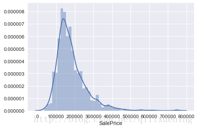
由上图可见,房价的并不服从正态分布,我们可以查看其斜度skewness和峭度kurtosis,这是很重要的两个统计量:
print('skewness: {0}, kurtosis: {1}'.format(df_train['SalePrice'].skew(), df_train['SalePrice'].kurt()))skewness: 1.8828757597682129, kurtosis: 6.536281860064529
利用DataFrame的自身特性,我们可以很容易地做出反映变量关系的散点图:
output,var,var1,var2 = 'SalePrice', 'GrLivArea', 'TotalBsmtSF', 'OverallQual'
fig, axes = plt.subplots(nrows=1,ncols=3,figsize=(16,5))
df_train.plot.scatter(x=var,y=output,ylim=(0,800000),ax=axes[0])
df_train.plot.scatter(x=var1,y=output,ylim=(0,800000),ax=axes[1])
df_train.plot.scatter(x=var2,y=output,ylim=(0,800000),ax=axes[2])
<matplotlib.axes._subplots.AxesSubplot at 0x22905c5fe48>
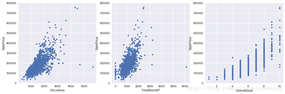
从上图我们注意到,OverQual属性虽然是数值型变量,但具有明显的有序性,此时对于这样的变量,采用箱形图显示效果更佳:
fig, ax = plt.subplots(figsize=(8,6))
sns.boxplot(x=var2,y=output,data=df_train)
ax.set_ylim(0,800000)
plt.show()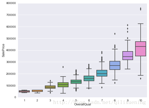
上述箱形图的绘制matplotlib也能做到,但相对麻烦,而对于下面YearBuilt这个特征,用seaborn绘制出来的效果简洁而美观:
var3 = 'YearBuilt'
fig, ax = plt.subplots(figsize=(16,8))
sns.boxplot(x=var3,y=output,data=df_train)
ax.set_ylim(0,800000)
plt.xticks(rotation=90)
plt.show()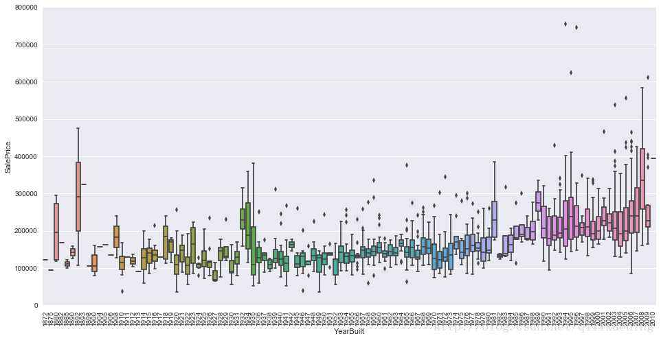
除此之外,seaborn一个比较强大而方便的功能在于,可以对多个特征的散点图、直方图信息进行整合,得到各个特征两两组合形成的图矩阵:
var_set = ['SalePrice', 'OverallQual', 'GrLivArea', 'GarageCars', 'TotalBsmtSF', 'FullBath', 'YearBuilt']
sns.set(font_scale=1.25)  # 设置横纵坐标轴的字体大小
sns.pairplot(df_train[var_set])  # 7*7图矩阵
# 可在kind和diag_kind参数下设置不同的显示类型,此处分别为散点图和直方图,还可以设置每个图内的不同类型的显示
plt.show()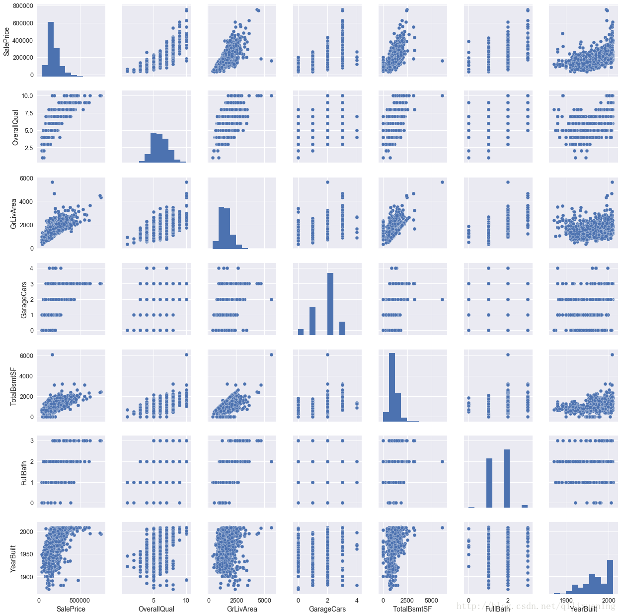
既然有了上述这样一个功能,那就不能不提seaborn下另外一个与其类似的操作,不过它更加自由与灵活。
由于数据特征较多,为了便于展示,我们先另外创建一些数据:
df_tr = pd.read_csv(r'E:\kaggle\house_price_regression\train.csv').drop('Id',axis=1)
df_X = df_tr.drop('SalePrice',axis=1)
df_y = df_tr['SalePrice']
quantity = [attr for attr in df_X.columns if df_X.dtypes[attr] != 'object']  # 数值变量集合
quality = [attr for attr in df_X.columns if df_X.dtypes[attr] == 'object']  # 类型变量集合
我们对数值型数据进行melt操作,使其具有两列,分别为变量名、取值。这其实相当于将所有选定的特征的数据 df1,...dfn进行pd.concat([df1,...dfn],axis=0)操作
melt_X = pd.melt(df_X, value_vars=quantity)
melt_X.head()| variable | value | |
|---|---|---|
| 0 | MSSubClass | 60.0 |
| 1 | MSSubClass | 20.0 |
| 2 | MSSubClass | 60.0 |
| 3 | MSSubClass | 70.0 |
| 4 | MSSubClass | 60.0 |
melt_X.tail()| variable | value | |
|---|---|---|
| 52555 | YrSold | 2007.0 |
| 52556 | YrSold | 2010.0 |
| 52557 | YrSold | 2010.0 |
| 52558 | YrSold | 2010.0 |
| 52559 | YrSold | 2008.0 |
sns.FacetGrid()默认会根据melt_X['variable']内的取值做unique操作,得到最终子图的数量,然后可以利用col_wrap设置每行显示的子图数量(不要求必须填满最后一行),sharex、sharey设置是否共享坐标轴;
g.map()其实就类似于函数式编程里面的map()函数,第一个参数表示绘制图的方法(此处为直方图),后面的参数为此绘图方法下的参数设置。
g = sns.FacetGrid(melt_X, col="variable",  col_wrap=5, sharex=False, sharey=False)
g = g.map(sns.distplot, "value")  # 以melt_X['value']作为数据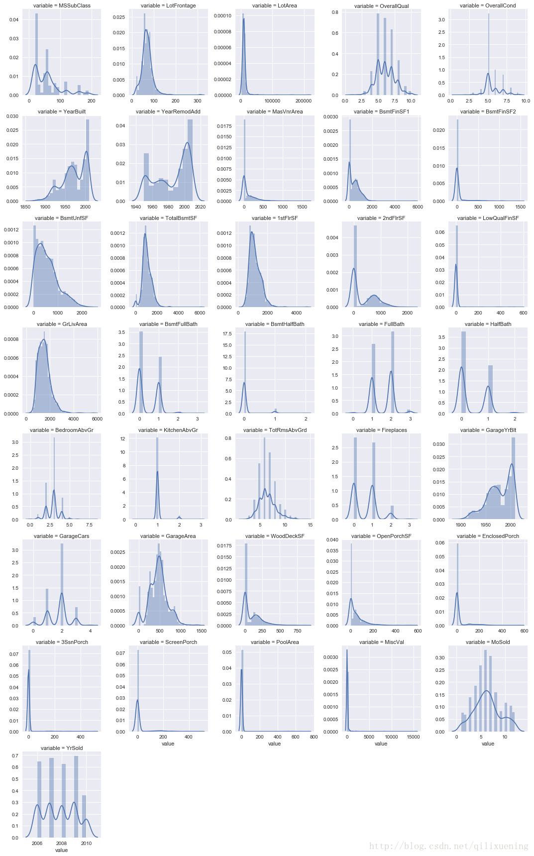
上述操作主要是单个或两个特征的数据分布进行分析,下面我们对各个特征间的关系进行分析:
最简单地,直接获取整个DataFrame数据的协方差矩阵并利用sns.heatmaP()进行可视化
corrmat = df_train.corr()
f, ax = plt.subplots(figsize=(12, 9))
sns.heatmap(corrmat, vmax=.8, square=True, ax=ax)  # square参数保证corrmat为非方阵时,图形整体输出仍为正方形
plt.show()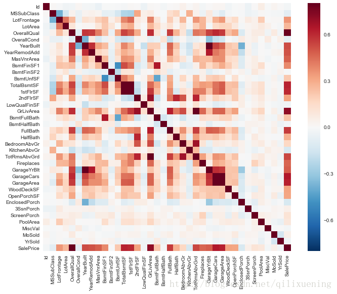
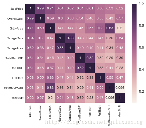
然后,我们可以选取与output变量相关系数最高的10个特征查看其相关情况,找出那些相互关联性较强的特征
k = 10
top10_attr = corrmat.nlargest(k, output).index
top10_mat = corrmat.loc[top10_attr, top10_attr]
fig,ax = plt.subplots(figsize=(8,6))
sns.set(font_scale=1.25)
sns.heatmap(top10_mat, annot=True, annot_kws={'size':12}, square=True)
# 设置annot使其在小格内显示数字,annot_kws调整数字格式
plt.show()