线上demo:https://my.weblf.cn/alone_page/echarts/line1.html
祥见代码:
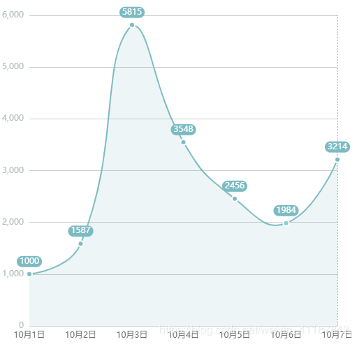
<!DOCTYPE html>
<html lang="en">

<head>
  <meta charset="UTF-8">
  <meta name="viewport" content="width=device-width, initial-scale=1.0">
  <meta http-equiv="X-UA-Compatible" content="ie=edge">
  <title>line1</title>
  <script src="https://cdn.jsdelivr.net/npm/[email protected]/dist/echarts.min.js"></script>
</head>

<body>
  <div id="charts1" style="width: 500px;;height:500px;"></div>
</body>
<script>
  var mycharts1;
  var days=[ //天数
      "10月1日",
      "10月2日",
      "10月3日",
      "10月4日",
      "10月5日",
      "10月6日",
      "10月7日"
    ];
  var step_num1=[1000, 1587, 5815, 3548, 2456, 1984, 3214]
  function ini_map() {
    mycharts1 = echarts.init(document.getElementById("charts1"));
    var option = {
      grid: {
        left: "0%",
        right: "20px",
        bottom: "3%",
        top: "20px",
        containLabel: true
      },
      tooltip: {
        show: true,
        trigger: "axis", // 'item',数据项图形触发,主要在散点图,饼图等无类目轴的图表中使用。'axis',坐标轴触发,主要在柱状图,折线图等会使用类目轴的图表中使用。
        axisPointer: {
          // 坐标轴指示器,坐标轴触发有效
          type: "line", // 默认为直线,可选为:'line' | 'shadow'
          z: 1,
          lineStyle: {
            color: 'rgba(125, 187, 195, 1)',
            type: 'dotted'
          },
        },
        position: [10000, 10000],
        formatter: "{b}: {c}次", // 需要展示的数据,b为名称,c为数值
        confine: false // 是否将悬浮框限定在特定区域
      },
      xAxis: [{
        type: "category",
        boundaryGap: false,
        data: days,
        axisLine: { //是否显示刻度轴
          show: false
        },
        axisTick: { //是否显示刻度线
          show: false
        },
        axisLabel: { //刻度文本样式
          show: true,
          interval: 0, //刻度间距,0为全部展示
          rotate: 0, //刻度标签旋转,可解决文本显示不全的问题
          formatter: '{value}',
          textStyle: { //改变刻度字体样式
            color: '#666666'
          }
        }
      }],
      yAxis: [{
        type: "value",
        axisLine: { //是否显示刻度轴
          show: false
        },
        axisTick: { //是否显示刻度线
          show: false
        },
        axisLabel: { //刻度文本样式
          formatter: '{value}',
          textStyle: { //改变刻度字体样式
            color: '#B4BBBB'
          }
        }
      }],
      series: [{
        name: "邮件营销",
        type: "line",
        stack: "总量",
        smooth: true, // 这个可以显示为平滑过渡的线条
        symbol: 'circle',
        symbolSize: 8, // 拐点大小,数字随意,跟下面的线宽一样或少 1 像素
        areaStyle: {
          normal: {
            color: 'rgba(125, 187, 195, 0.2)' //区域颜色
          }
        },
        itemStyle: {
          normal: {
            borderColor: 'white',
            borderWidth: 2,
            color: 'rgba(125, 187, 195, 1)', //改变折线点的颜色
            lineStyle: {
              color: 'rgba(125, 187, 195, 1)' //改变折线颜色
            },
            label: { //拐点上的lable
              show: true,
              color: 'white',
              backgroundColor: '#7dbbc3',
              padding: [2, 4],
              borderRadius: 8
            }
          }
        },
        data: step_num1
      }]
    };

    mycharts1.setOption(option);
    window.onresize = mycharts1.resize;
    //默认高亮
    setTimeout(() => {
      mycharts1.dispatchAction({
        type: 'highlight',
        dataIndex: 6
      });
    }, 1000)
  }
  ini_map()
</script>

</html>
效果图