今天朋友要我帮他用echarts弄两个模拟图,在结合了官网和其他人写的博客的例子之后,我的折线图和仪表盘终于可以正常的显示了,现在跟大家分享一下。
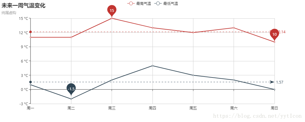
折线图
<!DOCTYPE html>
<html>
    <head>
        <meta charset="UTF-8">
        <title></title>
        <script type="text/javascript" src="js/echarts.js" ></script><!--这个可以去echarts的官网下载--!>
    </head>
    <body>
        <div id="main" style="width: 1000px;height:400px;"></div>

    </body>
</html>
js代码块:
<script>
//初始化
var myChart = echarts.init(document.getElementById('main'));
//参数设置
option = {
title : {
text: '未来一周气温变化',
subtext: '纯属虚构'
},
tooltip : {
trigger: 'axis'
},
legend: {
data:['最高气温','最低气温']
},
toolbox: {
show : true,
feature : {
mark : {show: true},
dataView : {show: true, readOnly: false},
magicType : {show: true, type: ['line', 'bar']},
restore : {show: true},
saveAsImage : {show: true}
}
},
calculable : true,
xAxis : [
{
type : 'category',
boundaryGap : false,
data : ['周一','周二','周三','周四','周五','周六','周日']
}
],
yAxis : [
{
type : 'value',
axisLabel : {
formatter: '{value} °C'
}
}
],
series: [ //系列列表
{
name:'最高气温',
type:'line',
data:[11, 11, 15, 13, 12, 13, 10],
markPoint : {
data : [
{type : 'max', name: '最大值'},
{type : 'min', name: '最小值'}
]
},
markLine : {
data : [
{type : 'average', name: '平均值'}
]
}
},
{
name:'最低气温',
type:'line',
data:[1, -2, 2, 5, 3, 2, 0],
markPoint : {
data : [
{name : '周最低', value : -2, xAxis: 1, yAxis: -1.5}
]
},
markLine : {
data : [
{type : 'average', name : '平均值'}
]
}
}]
};
myChart.setOption(option); //参数设置方法
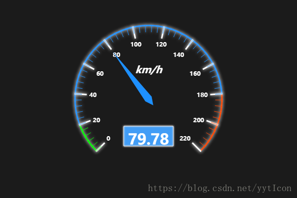
</script>仪表盘
js代码块:
<script type="text/javascript">
            // 基于准备好的dom,初始化echarts实例
            var myChart = echarts.init(document.getElementById('main'));

            // 指定图表的配置项和数据
           var option = {
              backgroundColor: '#1b1b1b',
             tooltip : {
        formatter: "{a} <br/>{b} : {c}%"
    },
    toolbox: {
        show : true,
        feature : {
            mark : {show: true},
            restore : {show: true},
            saveAsImage : {show: true}
        }
    },
    series : [
                {
            name:'速度',
            type:'gauge',
            min:0,
            max:220,
            splitNumber:11,
            axisLine: {            // 坐标轴线
                lineStyle: {       // 属性lineStyle控制线条样式
                    color: [[0.09, 'lime'],[0.82, '#1e90ff'],[1, '#ff4500']],
                    width: 3,
                    shadowColor : '#fff', //默认透明
                    shadowBlur: 10
                }
            },
            axisLabel: {            // 坐标轴小标记
                textStyle: {       // 属性lineStyle控制线条样式
                    fontWeight: 'bolder',
                    color: '#fff',
                    shadowColor : '#fff', //默认透明
                    shadowBlur: 10
                }
            },
            axisTick: {            // 坐标轴小标记
                length :15,        // 属性length控制线长
                lineStyle: {       // 属性lineStyle控制线条样式
                    color: 'auto',
                    shadowColor : '#fff', //默认透明
                    shadowBlur: 10
                }
            },
            splitLine: {           // 分隔线
                length :25,         // 属性length控制线长
                lineStyle: {       // 属性lineStyle(详见lineStyle)控制线条样式
                    width:3,
                    color: '#fff',
                    shadowColor : '#fff', //默认透明
                    shadowBlur: 10
                }
            },
            pointer: {           // 分隔线
                shadowColor : '#fff', //默认透明
                shadowBlur: 5
            },
            title : {
                textStyle: {       // 其余属性默认使用全局文本样式,详见TEXTSTYLE
                    fontWeight: 'bolder',
                    fontSize: 20,
                    fontStyle: 'italic',
                    color: '#fff',
                    shadowColor : '#fff', //默认透明
                    shadowBlur: 10
                }
            },
            detail : {
                backgroundColor: 'rgba(30,144,255,0.8)',
                borderWidth: 1,
                borderColor: '#fff',
                shadowColor : '#fff', //默认透明
                shadowBlur: 5,
                offsetCenter: [0, '50%'],       // x, y,单位px
                textStyle: {       // 其余属性默认使用全局文本样式,详见TEXTSTYLE
                    fontWeight: 'bolder',
                    color: '#fff'
                }
            },
            data:[{value: 40, name: 'km/h'}]
        }
    ]
           }
            myChart.setOption(option);

            setInterval(function(){//把option.series[0].data[0].value的值使用random()方法获取一个随机数
                option.series[0].data[0].value = (Math.random() * 100).toFixed(2) - 0;
                myChart.setOption(option, true);
            }, 3000);
        </script>
附上效果图
仪表盘:
折线图: