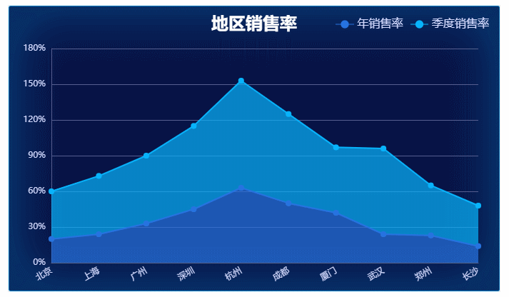
效果图
背景图片

下载ECharts
npm install echarts --save
引入并注册全局ECharts
在 main.js 文件里引入并注册 ( 这里是 Vue3.0 的模板 )
import Vue from 'vue'
import App from './App.vue'
import router from './router'
import store from './store'

import echarts from 'echarts'
Vue.prototype.$echarts = echarts

Vue.config.productionTip = false

new Vue({
  router,
  store,
  render: h => h(App)
}).$mount('#app')
在组件中使用ECharts
<template>
  <div class='wrapper'>
    <div class='chart' id='chart'></div>
  </div>
</template>

<script>
export default {
  data () {
    return {}
  },
  mounted () {
    this.drawChart()
  },
  methods: {
    drawChart () {
      // 基于准备好的dom,初始化echarts实例
      let chart = this.$echarts.init(document.getElementById('chart'))
      // 监听屏幕变化自动缩放图表
      window.addEventListener('resize', function () { chart.resize() })
      chart.setOption({
        // 设置图表的位置
        grid: {
          x: 60, // 左间距
          y: 60, // 上间距
          x2: 30, // 右间距
          y2: 40, // 下间距
          containLabel: true // grid 区域是否包含坐标轴的刻度标签, 常用于『防止标签溢出』的场景
        },
        // dataZoom 组件 用于区域缩放
        dataZoom: [
          {
            type: 'inside',
            xAxisIndex: [0], // 设置 dataZoom-inside 组件控制的 x 轴
            // 数据窗口范围的起始和结束百分比  范围: 0 ~ 100
            start: 0,
            end: 80
          }
        ],
        // 图表主标题
        title: {
          text: '地区销售率', // 主标题文本,支持使用 \n 换行
          top: 10, // 定位 值: 'top', 'middle', 'bottom' 也可以是具体的值或者百分比
          left: 'center', // 值: 'left', 'center', 'right' 同上
          textStyle: { // 文本样式
            fontSize: 24,
            fontWeight: 600,
            color: '#fff'
          }
        },
        // 提示框组件
        tooltip: {
          trigger: 'axis', // 触发类型, axis: 坐标轴触发
          axisPointer: {
            type: 'line' // 指示器类型
          },
          textStyle: {
            color: '#d5dbff' // 文字颜色
          },
          // 提示框浮层内容格式器,支持字符串模板和回调函数两种形式
          // 折线(区域)图、柱状(条形)图、K线图 : {a}(系列名称),{b}(类目值),{c}(数值), {d}(无)
          formatter: '{b}<br />{a0}: {c0}%<br />{a1}: {c1}%'
        },
        // 图例组件
        legend: {
          // 图例的数据数组
          data: [
            {
              name: '年销售率' // 图例项的名称 与 series 里的 name 相对应
            },
            {
              name: '季度销售率'
            }
          ],
          top: 13, // 定位
          right: 10,
          textStyle: { // 文本样式
            fontSize: 16,
            color: '#d5dbff'
          }
        },
        // X轴
        xAxis: [
          {
            show: true, // 不设置默认值为 true
            // 坐标轴类型,  'category' 类目轴,适用于离散的类目数据,为该类型时必须通过 data 设置类目数据
            type: 'category',
            // 坐标轴轴线
            axisLine: {
              show: true, // 是否显示坐标轴轴线 默认显示
              lineStyle: {
                type: 'solid', // 坐标轴线线的类型 'solid', 'dashed', 'dotted'
                width: 1, // 坐标轴线线宽, 不设置默认值为 1
                color: '#565e8f' // 坐标轴线线的颜色
              }
            },
            // 分隔线
            splitLine: {
              show: false
            },
            // 坐标轴刻度
            axisTick: {
              show: false
            },
            // 坐标轴刻度标签
            axisLabel: {
              show: true, // 是否显示刻度标签 默认显示
              color: '#d5dbff', // 刻度标签文字的颜色
              fontSize: 12, // 文字的字体大小
              rotate: 30, // 刻度标签旋转的角度,在类目轴的类目标签显示不下的时候可以通过旋转防止标签之间重叠。
              margin: 10, // 刻度标签与轴线之间的距离 默认值 8
              // 使用字符串模板,模板变量为刻度默认标签 {value}
              formatter: '{value}'
            },
            // 类目名称
            data: ['北京', '上海', '广州', '深圳', '杭州', '成都', '厦门', '武汉', '郑州', '长沙', '哈尔滨', '沈阳']
          }
        ],
        yAxis: [
          // 左侧Y轴
          {
            type: 'value', // 坐标轴类型,   'value' 数值轴,适用于连续数据
            // 坐标轴在图表区域中的分隔线
            splitLine: {
              show: true, // 是否显示分隔线 默认数值轴显示
              lineStyle: { // 分隔线颜色,可以设置成单个颜色。
                color: '#565e8f'
              }
            },
            // 坐标轴刻度
            axisTick: {
              show: false // 是否显示坐标轴刻度 默认显示
            },
            // 坐标轴轴线。
            axisLine: {
              show: true, // 是否显示坐标轴轴线 默认显示
              lineStyle: {
                color: '#565e8f' // 坐标轴线线的颜色
              }
            },
            axisLabel: {
              show: true, // 是否显示刻度标签 默认显示
              color: '#d5dbff', // 刻度标签文字的颜色
              // 使用字符串模板,模板变量为刻度默认标签 {value}
              formatter: '{value}%'
            }
          }
        ],
        series: [
          {
            type: 'line', // 系列类型
            name: '年销售率', // 系列名称, 用于tooltip的显示, legend 的图例筛选
            // 数据堆叠,同个类目轴上系列配置相同的stack值后,后一个系列的值会在前一个系列的值上相加
            stack: '销售率',
            symbol: 'circle', // 标记的图形
            symbolSize: 8, // 标记的大小
            // 图形的样式
            itemStyle: {
              color: '#2774e0'
            },
            // 线的样式, 修改 lineStyle 中的颜色不会影响图例颜色, 一般不设置线的样式
            lineStyle: {
              type: 'solid', // 线的类型 'solid', 'dashed', 'dotted'
              color: '#2774e0'
            },
            // 区域填充样式
            areaStyle: {
              color: { // 填充的颜色
                type: 'linear', // linear 线性渐变  radial 径向渐变
                x: 0,
                y: 0,
                x2: 0,
                y2: 1,
                colorStops: [{
                  offset: 0,
                  color: '#2774e0' // 0% 处的颜色
                }, {
                  offset: 1,
                  color: '#2774e0' // 100% 处的颜色
                }]
              }
            },
            // 系列中的数据内容数组
            data: [20, 24, 33, 45, 63, 50, 42, 24, 23, 14, 40, 52]
          },
          {
            type: 'line', // 系列类型
            name: '季度销售率', // 系列名称, 用于tooltip的显示, legend 的图例筛选
            // 数据堆叠,同个类目轴上系列配置相同的stack值后,后一个系列的值会在前一个系列的值上相加
            stack: '销售率',
            symbol: 'circle', // 标记的图形
            symbolSize: 8, // 标记的大小
            // 图形的样式
            itemStyle: {
              color: '#08b4fc'
            },
            // 线的样式, 修改 lineStyle 中的颜色不会影响图例颜色, 一般不设置线的样式
            lineStyle: {
              type: 'solid', // 线的类型 'solid', 'dashed', 'dotted'
              color: '#08b4fc'
            },
            // 区域填充样式
            areaStyle: {
              color: { // 填充的颜色
                type: 'linear', // linear 线性渐变  radial 径向渐变
                x: 0,
                y: 0,
                x2: 0,
                y2: 1,
                colorStops: [{
                  offset: 0,
                  color: '#08b4fc' // 0% 处的颜色
                }, {
                  offset: 1,
                  color: '#08b4fc' // 100% 处的颜色
                }]
              }
            },
            // 系列中的数据内容数组
            data: [40, 49, 57, 70, 90, 75, 55, 72, 42, 34, 55, 70]
          }
        ]
      })
    }
  }
}
</script>

<style scoped>
.wrapper {
  width: 100%;
}
.wrapper .chart {
  width: 60%;
  height: 400px;
  margin: 100px 50px 0;
  border: 1px solid #eeeeee;
  background: url(../../public/static/bg.png) no-repeat;
  background-size: 100% 100%;
}
</style>
