吴恩达《机器学习》学习笔记七——逻辑回归(二分类)代码
课程链接:https://www.bilibili.com/video/BV164411b7dx?from=search&seid=5329376196520099118
这次的笔记紧接着上两次对逻辑回归模型和正则化笔记,将一个分类问题用逻辑回归和正则化的方法解决。机器学习在我看来,理论和代码需要两手抓,即使理论搞懂,代码也将是又一个门槛,所以多多尝试。
这次笔记用到的数据集:https://pan.baidu.com/s/1h5Ygse5q2wkTeXA9Pwq2RA
提取码:5rd4
一、无正则项的逻辑回归
1.问题描述
建立一个逻辑回归模型来预测一个学生是否被大学录取。根据两次考试的结果来决定每个申请人的录取机会。有以前的申请人的历史数据, 可以用它作为逻辑回归的训练集
python实现逻辑回归 目标:建立分类器(求解出三个参数 θ0 θ1 θ2)即得出分界线 备注:θ1对应’Exam 1’成绩,θ2对应’Exam 2’ 设定阈值,根据阈值判断录取结果 备注:阈值指的是最终得到的概率值.将概率值转化成一个类别.一般是>0.5是被录取了,<0.5未被录取.
2.导入模块
import pandas as pd
import numpy as np
import matplotlib.pyplot as plt
import seaborn as sns
plt.style.use('fivethirtyeight') #样式美化
import matplotlib.pyplot as plt
from sklearn.metrics import classification_report#这个包是评价报告
1.Seaborn是基于matplotlib的图形可视化python包。它提供了一种高度交互式界面,便于用户能够做出各种有吸引力的统计图表。
Seaborn是在matplotlib的基础上进行了更高级的API封装,从而使得作图更加容易,在大多数情况下使用seaborn能做出很具有吸引力的图,而使用matplotlib就能制作具有更多特色的图。应该把Seaborn视为matplotlib的补充,而不是替代物。同时它能高度兼容numpy与pandas数据结构以及scipy与statsmodels等统计模式。
2.plt.style.use()函数;可以对图片的整体风格进行设置。可以通过plt.style.availabel知道一共有多少种主题。具体参考plt.style.use()函数介绍。
3.sklearn中的classification_report函数用于显示主要分类指标的文本报告.在报告中显示每个类的精确度,召回率,F1值等信息。具体参考classification_report函数介绍
3.准备数据
data = pd.read_csv('work/ex2data1.txt', names=['exam1', 'exam2', 'admitted'])
data.head()#看前五行

data.describe()

数据读入后,通过可视化查看一下数据分布:
sns.set(context="notebook", style="darkgrid", palette=sns.color_palette("RdBu", 2)) #设置样式参数,默认主题 darkgrid(灰色背景+白网格),调色板 2色

sns.lmplot('exam1', 'exam2', hue='admitted', data=data,
           size=6,
           fit_reg=False,                         #fit_reg'参数,控制是否显示拟合的直线
           scatter_kws={"s": 50}
          )                                       #hue参数是将name所指定的不同类型的数据叠加在一张图中显示
plt.show()#看下数据的样子

定义了下面三个函数,分别用于从数据中提取特征X,提取标签y,以及对特征进行标准化处理。
def get_X(df):#读取特征
#     """
#     use concat to add intersect feature to avoid side effect
#     not efficient for big dataset though
#     """
    ones = pd.DataFrame({'ones': np.ones(len(df))})#ones是m行1列的dataframe
    data = pd.concat([ones, df], axis=1)  # 合并数据,根据列合并 axis = 1的时候,concat就是行对齐,然后将不同列名称的两张表合并 加列
    return data.iloc[:, :-1].as_matrix()  # 这个操作返回 ndarray,不是矩阵

def get_y(df):#读取标签
#     '''assume the last column is the target'''
    return np.array(df.iloc[:, -1])#df.iloc[:, -1]是指df的最后一列

def normalize_feature(df):
#     """Applies function along input axis(default 0) of DataFrame."""
    return df.apply(lambda column: (column - column.mean()) / column.std())#特征缩放在逻辑回归同样适用
提取特征和标签:
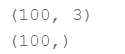
X = get_X(data)
print(X.shape)

y = get_y(data)
print(y.shape)
4.假设函数
逻辑回归模型的假设函数:

def sigmoid(z):
    # your code here  (appro ~ 1 lines)
    return 1 / (1 + np.exp(-z))
绘制一下sigmoid函数的图像:
fig, ax = plt.subplots(figsize=(8, 6))
ax.plot(np.arange(-10, 10, step=0.01),
        sigmoid(np.arange(-10, 10, step=0.01)))
ax.set_ylim((-0.1,1.1))     #lim 轴线显示长度
ax.set_xlabel('z', fontsize=18)
ax.set_ylabel('g(z)', fontsize=18)
ax.set_title('sigmoid function', fontsize=18)
plt.show()

5.代价函数

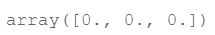
初始化参数:
theta = theta=np.zeros(3) # X(m*n) so theta is n*1
theta
定义代价函数:
def cost(theta, X, y):
    ''' cost fn is -l(theta) for you to minimize'''
    costf = np.mean(-y * np.log(sigmoid(X @ theta)) - (1 - y) * np.log(1 - sigmoid(X @ theta)))
    return costf
# Hint:X @ theta与X.dot(theta)等价
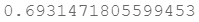
计算一下初始的代价函数值:
cost(theta, X, y)
6.梯度下降

这是批量梯度下降(batch gradient descent)
转化为向量化计算:

依次定义梯度:
def gradient(theta, X, y):
    # your code here  (appro ~ 2 lines)
    return (1 / len(X)) * X.T @ (sigmoid(X @ theta) - y)
计算梯度初始值:
gradient(theta, X, y)

7.拟合参数
这里不再自定义更新参数的函数,而是使用scipy.optimize.minimize 去自动寻找参数。
import scipy.optimize as opt
res = opt.minimize(fun=cost, x0=theta, args=(X, y), method='Newton-CG', jac=gradient)
print(res)

其中fun是指优化后的代价函数值,x是指优化后的三个参数值。以上,算是已经训练完成。
8.用训练集预测和验证
因为这里没有提供验证集,所以使用训练集进行预测和验证。就是用训练好的模型对训练集进行预测,将结果与真实结果进行比较评估。
def predict(x, theta):
    prob = sigmoid(x @ theta)
    return (prob >= 0.5).astype(int)   #实现变量类型转换
final_theta = res.x
y_pred = predict(X, final_theta)

print(classification_report(y, y_pred))

9.寻找决策边界
决策边界就是下面这样一条线:

print(res.x) # this is final theta

coef = -(res.x / res.x[2])  # find the equation
print(coef)

x = np.arange(130, step=0.1)
y = coef[0] + coef[1]*x

在看一下数据描述,确定一下x和y的范围:
data.describe() # find the range of x and y

sns.set(context="notebook", style="ticks", font_scale=1.5)  默认使用notebook上下文 主题 context可以设置输出图片的大小尺寸(scale)

sns.lmplot('exam1', 'exam2', hue='admitted', data=data,
           size=6,
           fit_reg=False,
           scatter_kws={"s": 25}
          )

plt.plot(x, y, 'grey')
plt.xlim(0, 130)
plt.ylim(0, 130)
plt.title('Decision Boundary')
plt.show()

二、正则化逻辑回归
1.准备数据
这边使用一个新的数据集:
df = pd.read_csv('ex2data2.txt', names=['test1', 'test2', 'accepted'])
df.head()

sns.set(context="notebook", style="ticks", font_scale=1.5)

sns.lmplot('test1', 'test2', hue='accepted', data=df,
           size=6,
           fit_reg=False,
           scatter_kws={"s": 50}
          )

plt.title('Regularized Logistic Regression')
plt.show()

从这个数据分布来看,不可能使用一条直线做到很好的划分数据集两个类别。所以我们需要做一个特征映射,就是在已有的两个特征的基础上添加一些高次幂的特征组合,使得决策边界可以变成一条能较好划分的曲线。
2.特征映射
在这里我把它映射成这样的一组特征:

一共有28个项,那么我们可以将这些组合特征看成一个个独立的特征,即看成x1、x2。。。x28,然后通过逻辑回归的方法来求解。
def feature_mapping(x, y, power, as_ndarray=False):
#     """return mapped features as ndarray or dataframe"""

    data = {"f{}{}".format(i - p, p): np.power(x, i - p) * np.power(y, p)
                for i in np.arange(power + 1)
                for p in np.arange(i + 1)
            }

    if as_ndarray:
        return pd.DataFrame(data).as_matrix()
    else:
        return pd.DataFrame(data)
x1 = np.array(df.test1)
x2 = np.array(df.test2)
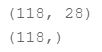
data = feature_mapping(x1, x2, power=6)
print(data.shape)
data.head()
下面是特征映射之后的数据集,特征变成了28维:

data.describe()

3.正则化代价函数

相比之前的表达式,多了正则化的惩罚项。
theta = np.zeros(data.shape[1])
X = feature_mapping(x1, x2, power=6, as_ndarray=True)
print(X.shape)

y = get_y(df)
print(y.shape)
def regularized_cost(theta, X, y, l=1):
    theta_j1_to_n = theta[1:]
    regularized_term = (l / (2 * len(X))) * np.power(theta_j1_to_n, 2).sum()

    return  cost(theta, X, y) + regularized_term
计算一下初始代价函数值:
regularized_cost(theta, X, y, l=1)

因为我们设置theta为0,所以这个正则化代价函数与代价函数的值应该相同
4.正则化梯度

def regularized_gradient(theta, X, y, l=1):
    theta_j1_to_n = theta[1:]      #不加theta0
    regularized_theta = (l / len(X)) * theta_j1_to_n

    regularized_term = np.concatenate([np.array([0]), regularized_theta])
    return gradient(theta, X, y) + regularized_term
计算一下梯度的初始值:
regularized_gradient(theta, X, y)

5.拟合参数
import scipy.optimize as opt
print('init cost = {}'.format(regularized_cost(theta, X, y)))

res = opt.minimize(fun=regularized_cost, x0=theta, args=(X, y), method='Newton-CG', jac=regularized_gradient)
res

6.预测
final_theta = res.x
y_pred = predict(X, final_theta)

print(classification_report(y, y_pred))

7.画出决策边界
我们需要找到所有满足 X×θ=0 的x,这里不求解多项式表达式,而是创造一个足够密集的网格,对网格里的每一个点进行 X×θ的计算,若结果小于一个很小的值,如10 ^ -3,则可以当做是边界上的一点,遍历该网格上的每一点,即可得到近似边界。
def draw_boundary(power, l):
#     """
#     power: polynomial power for mapped feature
#     l: lambda constant
#     """
    density = 1000
    threshhold = 2 * 10**-3

    final_theta = feature_mapped_logistic_regression(power, l)
    x, y = find_decision_boundary(density, power, final_theta, threshhold)

    df = pd.read_csv('ex2data2.txt', names=['test1', 'test2', 'accepted'])
    sns.lmplot('test1', 'test2', hue='accepted', data=df, size=6, fit_reg=False, scatter_kws={"s": 100})

    plt.scatter(x, y, c='R', s=10)
    plt.title('Decision boundary')
    plt.show()
def feature_mapped_logistic_regression(power, l):
#     """for drawing purpose only.. not a well generealize logistic regression
#     power: int
#         raise x1, x2 to polynomial power
#     l: int
#         lambda constant for regularization term
#     """
    df = pd.read_csv('ex2data2.txt', names=['test1', 'test2', 'accepted'])
    x1 = np.array(df.test1)
    x2 = np.array(df.test2)
    y = get_y(df)

    X = feature_mapping(x1, x2, power, as_ndarray=True)
    theta = np.zeros(X.shape[1])

    res = opt.minimize(fun=regularized_cost,
                       x0=theta,
                       args=(X, y, l),
                       method='TNC',
                       jac=regularized_gradient)
    final_theta = res.x

    return final_theta
def find_decision_boundary(density, power, theta, threshhold):
    t1 = np.linspace(-1, 1.5, density)  #1000个样本
    t2 = np.linspace(-1, 1.5, density)

    cordinates = [(x, y) for x in t1 for y in t2]
    x_cord, y_cord = zip(*cordinates)
    mapped_cord = feature_mapping(x_cord, y_cord, power)  # this is a dataframe

    inner_product = mapped_cord.as_matrix() @ theta

    decision = mapped_cord[np.abs(inner_product) < threshhold]

    return decision.f10, decision.f01
#寻找决策边界函数
下面我们看一下正则化系数不同,导致的决策边界有什么不同?
draw_boundary(power=6, l=1) #set lambda = 1

draw_boundary(power=6, l=0) # set lambda < 0.1

draw_boundary(power=6, l=100) # set lambda > 10

上面三个例子分别展示了较好拟合、过拟合和欠拟合的三种情况。