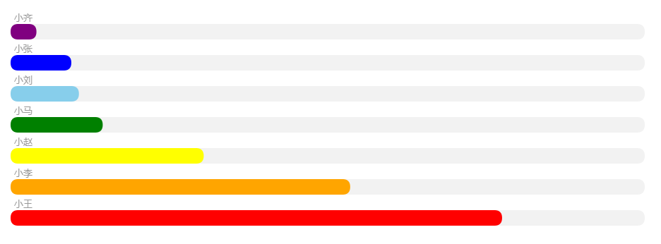
UI给了设计图,看了一眼觉得简单,不就是无序列表布局嘛(ul,li),后来才知道那是echarts图,好吧,样式如下:
代码如下:(渐变色没做)
<!DOCTYPE html>
<html lang="en">
<head>
<meta charset="utf-8">
<meta http-equiv="X-UA-Compatible" content="IE=edge">
<meta name="viewport" content="width=device-width, initial-scale=1.0">
<meta name="description" content="ECharts">
<title>Echarts绘制横向柱状图(圆角+渐变)</title>
<script src="https://cdn.bootcss.com/echarts/3.5.4/echarts.min.js"></script>
</head>
<body>
<div id="main" style="width: 1000px;height:400px;"></div>
<script type="text/javascript">
     var myChart = echarts.init(document.getElementById('main'));

    //初始化数据
    var category = ['小王', '小李', '小赵', '小马', '小刘', '小张', '小齐'];
    var barData = [3100, 2142, 1218, 581, 431, 383, 163];
    var yMax = 4000;
    var dataShadow = [];

    for(var i=0; i<barData.length; i++) {
        dataShadow.push(yMax)
    }

    var option = {
        tooltip: {
            trigger: 'axis',
            axisPointer: {
                type: 'shadow'
            }
        },
        grid: {
            left: '3%',
            right: '4%',
            bottom: '3%',
            containLabel: true
        },
        xAxis: {
            type: 'value',
            axisLine: {
                show: false
            },
            axisTick: {
                show: false
            },
            axisLabel: {
                show: false
            },
            splitLine:{
                show:false
            }
        },
        yAxis: {
            type: 'category',
            data: category,
            splitLine: {show: false},
            axisLine: {
                show: false
            },
            axisTick: {
                show: false
            },
            axisLabel: {
                show: false
            },
            offset: 10,
            nameTextStyle: {
                fontSize: 15
            },
            splitLine:{
                show:false
            },
            data: category
        },
        series: [
            { // For shadow
                name: '数量',
                type: 'bar',
                itemStyle: {
                    normal: {
                        barBorderRadius: 40,
                        color: 'rgba(0,0,0,0.05)'
                    },
                    emphasis: {
                        barBorderRadius: 40
                    },
                },
                barGap:'-100%',
                barCategoryGap:'50%',
                // barCategoryGap:'40%',
                data: dataShadow,
                animation: false
            },
            {
                name: '数量',
                type: 'bar',
                data: barData,
                smooth: true,
                label: {
                    normal: {
                        show: true,
                        position: 'topLeft',
                        offset: [5, -4],
                        textStyle: {
                            color: '#999',
                            fontSize: 13
                        },
                        formatter:function(param) {
                            for(let i=0; i<category.length; i++) {
                                if(param.dataIndex == i) {
                                    return category[i];
                                }
                            }
                        }
                    }
                },
                itemStyle: {
                    emphasis: {
                        barBorderRadius: 40
                    },
                    normal: {
                        barBorderRadius: 40,
                        color: function(params) {
                                let colorList = ['red', 'orange', 'yellow', 'green', 'skyBlue', 'blue', 'purple'];
                                return colorList[params.dataIndex];
                            }
                    }
                }
            }
        ]
    };
    myChart.setOption(option);
</script>
</body>
</html>