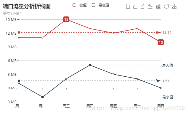
1.演示
2.代码
<!DOCTYPE html>
<html>
    <head>
        <meta charset="UTF-8">
        <script type="text/javascript" src="../js/echarts.js" ></script>
        <title></title>
    </head>
    <body>

        <!-- 为 ECharts 准备一个具备大小(宽高)的 DOM -->
        <div id="main" style="width: 600px;height:400px;"></div>

        <script>

            // 基于准备好的dom,初始化echarts实例
            var myChart = echarts.init(document.getElementById('main'));

            var option = {
                //图表标题
                title: {
                    text: '端口流量分析折线图',
                    subtext: '单位(MB)'
                },
                //图表提示框
                tooltip: {
                    trigger: 'axis'
                },
                //图例
                legend: {
                    data:['峰值','最低值']
                },
                //工具箱(右上角那几个按钮)
                toolbox: {
                    show: true,
                    //各工具配置项,除了各个内置的工具按钮外,还可以自定义工具按钮(自定义的工具名字,只能以 my 开头)
                    feature: {
                        //数据区域缩放
                        dataZoom: {
                            show: true,
                            //不缩放Y轴
                            yAxisIndex: 'none'
                        },
                        //数据视图工具,可以展现当前图表所用的数据
                        dataView: {
                            //是否只读,修改数据可改变图表
                            readOnly: true
                        },
                        //动态类型切换('line', 'bar', 'stack', 'tiled')
                        magicType: {type: ['line', 'bar',]},
                        //配置项还原
                        restore: {},
                        //保存为图片
                        saveAsImage: {}
                    }
                },
                //X轴
                xAxis:  {
                    type: 'category',
                    boundaryGap: false,
                    data: ['周一','周二','周三','周四','周五','周六','周日']
                },
                //Y轴
                yAxis: {
                    type: 'value',
                    axisLabel: {
                        //y轴坐标格式化
                        formatter: '{value} MB'
                    }
                },
                series: [
                    {
                        name:'峰值',
                        type:'line',
                        data:[11, 11, 15, 13, 12, 13, 10],
                        //图表标注
                        markPoint: {
                            //标记的图形('circle', 'rect', 'roundRect', 'triangle', 'diamond', 'pin', 'arrow')
                            symbol: 'roundRect',
                            symbolSize: '20',
                            data: [
                                {type: 'max', name: '最大值'},
                                {type: 'min', name: '最小值'}
                            ]
                        },
                        //图表标线
                        markLine: {
                            data: [
                                {type: 'average', name: '平均值'}
                            ],
                            //标线的标签设置
                            label: {
                                normal:{
                                    show: true,
                                    //标签位置
                                    position: 'end',

                                }
                            }

                        }
                    },
                    {
                        name:'最低值',
                        type:'line',
                        data:[1, -2, 2, 5, 3, 2, 0],

                        markLine: {
                            data: [
                                {type: 'average', name: '平均值'},
                                [
                                    {
                                        symbol: 'none',
                                        x: '90%',
                                        yAxis: 'min'
                                    },
                                    {
                                        symbol: 'circle',
                                        label: {
                                            normal: {
                                                position: 'start',
                                                formatter: '最小值',
                                            }
                                        },
                                        type: 'min',
                                        name: '最低点'
                                    },

                                ],
                                [
                                    {
                                        symbol: 'none',
                                        x: '90%',
                                        yAxis: 'max'
                                    },
                                    {
                                        symbol: 'circle',
                                        label: {
                                            normal: {
                                                position: 'start',
                                                formatter: '最大值'
                                            }
                                        },
                                        type: 'max',
                                        name: '最高点'
                                    },

                                ]
                            ]
                        }
                    }
                ]
            };


            myChart.setOption(option);

        </script>

    </body>
</html>