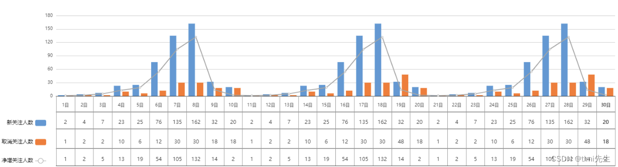
echarts 折柱表混合图(折线,柱状图,表格)

效果图如下:
在这里插入图片描述
代码如下:

<!DOCTYPE html>
<html>
    <head>
        <meta charset="UTF-8">
        <script type="text/javascript" src="js/echarts.js"></script>
    </head>
    <body>
        <div class="chart">
            <div id="lineBar" style="width: 100%;height:400px;"></div>
        </div>
        <script>
            var myCharte = echarts.init(document.getElementById('lineBar'));
            const colors = ['#5b9bd5', '#ed7d31', '#a5a5a5'];
            // 新关注人数
            var newData = [2, 4, 7, 23, 25, 76, 135, 162, 32, 20, 2, 4, 7, 23, 25, 76, 135, 162, 32, 20,2, 4, 7, 23, 25, 76, 135, 162, 32, 20]
            // 取消关注人数
            var cancelData = [1, 2, 2, 10, 6, 12, 30, 30, 18, 18, 1, 2, 2, 10, 6, 12, 30, 30, 48, 18,1, 2, 2, 10, 6, 12, 30, 30, 48, 18]
            // 净增关注人数
            var addData = [1, 2, 5, 13, 19, 54, 105, 132, 14, 2,1, 2, 5, 13, 19, 54, 105, 132, 14, 2,1, 2, 5, 13, 19, 54, 105, 132, 14, 2,]
            // 最大日期数量 0 开始
            var maxDate = 29;  
            // 日期
            var dateDay = [];
            for (var i=1;i<maxDate+2;i++) {
      
      
                dateDay.push(`${ 
        i}`)
            }
            
            option = {
      
      
                grid: {
      
      
                    x: 130,
                    y:45,
                    x2: 40,
                    y2: 170
                },
                tooltip: {
      
      
                    trigger: "axis",
                    axisPointer: {
      
      
                        type: "cross",
                        crossStyle: {
      
      
                            color: "#999"
                        }
                    }
                },
                legend: {
      
      
                    align: "right",
                    itemGap: 30,
                    orient: "vertical",
                    textStyle: {
      
      
                        color: "#000"
                    },
                    bottom: 10,
                    left: 0,
                    data: ["新关注人数", "取消关注人数", "净增关注人数"]
                },
                xAxis: [{
      
      
                        type: "category",
                        max: maxDate,
                        offset: 8, 
                        interval: Math.ceil(12) / 12,
                        axisLabel: {
      
      
                            fontWeight: "bold",
                            show: true,
                            interval: 0, // 强制显示全部刻度名
                            textStyle: {
      
      
                                fontSize: "14px"
                            }
                        },
                        lineStyle: {
      
      
                            color: '#f00',
                            width: 1,
                            type: 'solid',
                        },
                        data: dateDay,
                    },
                    {
      
      //下方表格的竖线
                        position: "bottom", // 将分组x轴位置定至底部,不然默认在顶部
                        offset: 45, // 向下偏移,使分组文字显示位置不与原x轴重叠
                        axisTick: {
      
      
                            length: -160, // 延长刻度线做分组线
                            inside: true, // 使刻度线相对轴线在上面与原x轴相接,默认在轴线下方
                            lineStyle: {
      
      
                                color: "#999"
                            } // 非必须,仅为了演示,明显标示出分组刻度线
                        },
                        max: 29,
                        interval: 2,
                        axisLabel: {
      
      
                            inside: true, // 使刻度名称相对轴线在上面与原x轴相接,默认在轴线下方
                            interval: 0 // 强制显示全部刻度名
                        },
                        data: [""]
                    },
                    {
      
      //下方表格的竖线  第一条线
                        position: "bottom", // 将分组x轴位置定至底部,不然默认在顶部
                        offset: 0, // 向下偏移,使分组文字显示位置不与原x轴重叠
                        axisTick: {
      
      
                            length: -160, // 延长刻度线做分组线
                            inside: true, // 使刻度线相对轴线在上面与原x轴相接,默认在轴线下方
                            lineStyle: {
      
      
                                color: "#999"
                            } // 非必须,仅为了演示,明显标示出分组刻度线
                        },
                        max: 1,
                        data: [""]
                    },
                    {
      
      
                        position: "bottom", // 将分组x轴位置定至底部,不然默认在顶部
                        offset: 36, // 向下偏移,使分组文字显示位置不与原x轴重叠
                        max: 30,
                        axisTick: {
      
      
                          alignWithLabel: true,
                        },
                    },
                    {
      
      
                        position: "bottom", // 将分组x轴位置定至底部,不然默认在顶部
                        offset: 75, // 向下偏移,使分组文字显示位置不与原x轴重叠
                        max: maxDate,
                        interval: 1,
                        axisTick: {
      
      
                            length: 0, // 延长刻度线做分组线
                            inside: true, // 使刻度线相对轴线在上面与原x轴相接,默认在轴线下方
                        },
                        axisLabel: {
      
      
                            inside: true, // 使刻度名称相对轴线在上面与原x轴相接,默认在轴线下方
                            interval: 0 // 强制显示全部刻度名
                        },
                        data: newData
                    },
                    {
      
      
                        position: "bottom", // 将分组x轴位置定至底部,不然默认在顶部
                        offset: 120, // 向下偏移,使分组文字显示位置不与原x轴重叠
                        max: maxDate,
                        interval: Math.ceil(12) / 12,
                        axisTick: {
      
      
                            length: 0, // 延长刻度线做分组线
                            inside: true, // 使刻度线相对轴线在上面与原x轴相接,默认在轴线下方
                        },
                        axisLabel: {
      
      
                            inside: true, // 使刻度名称相对轴线在上面与原x轴相接,默认在轴线下方
                            interval: 0 // 强制显示全部刻度名
                        },
                        data: cancelData
                    },
                    {
      
      
                        position: "bottom", // 将分组x轴位置定至底部,不然默认在顶部
                        offset: 160, // 向下偏移,使分组文字显示位置不与原x轴重叠
                        max: maxDate,
                        interval: 0,
                        axisTick: {
      
      
                            length: 0, // 延长刻度线做分组线
                            inside: true, // 使刻度线相对轴线在上面与原x轴相接,默认在轴线下方
                            lineStyle: {
      
      
                                color: "#f00"
                            } // 非必须,仅为了演示,明显标示出分组刻度线
                        },
                        axisLabel: {
      
      
                            inside: true, // 使刻度名称相对轴线在上面与原x轴相接,默认在轴线下方
                            interval: 0 // 强制显示全部刻度名
                        },
                        data: addData
                    },
                ],
                yAxis: [{
      
      
                        type: "value",
                        axisLabel: {
      
      
                            formatter: "{value}",
                            textStyle: {
      
      
                                fontSize: "14px"
                            }
                        },
                        axisLine: {
      
      
                            show:false,
                        },
                        axisTick:{
      
      
                            show: false
                        },
                    },
                    {
      
      
                        show:false,
                    }
                ],
                series: [{
      
      
                        name: "新关注人数",
                        type: "bar",
                        data: newData,
                        itemStyle: {
      
      
                            color: colors[0]
                        }
                    },
                    {
      
      
                        name: "取消关注人数",
                        type: "bar",
                        data: cancelData,
                        itemStyle: {
      
      
                            color: colors[1]
                        }
                    },
                    {
      
      
                        name: "净增关注人数",
                        type: "line",
                        data: addData,
                        itemStyle: {
      
      
                            color: colors[2]
                        },
                        lineStyle: {
      
      
                            width: 2
                        }
                    },
                ]
            };
            myCharte.setOption(option);
        </script>
    </body>
</html>

猜你喜欢

转载自blog.csdn.net/qq_35241329/article/details/132562253