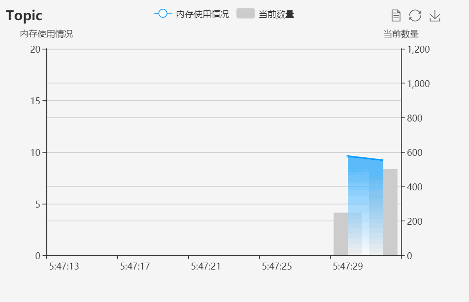
先看下效果,自己用ps做了张gif图,发现很好玩啊。。不喜勿喷
自己下载个echarts.min.js
直接上代码:
<!DOCTYPE html>
<html>
<head>
<meta charset="utf-8">
<title>ECharts</title>
<script src="https://cdn.bootcss.com/echarts/3.7.1/echarts.min.js"></script>
</head>
<body>
<div id="main" style="width: 600px;height:400px;"></div>
<script type="text/javascript">
// 基于准备好的dom,初始化echarts实例
var myChart = echarts.init(document.getElementById('main'));
// 指定图表的配置项和数据
var option = {
title: {
text: 'Topic'
// 副标题 ,subtext: '随机数'
},
tooltip: {
trigger: 'axis'
},
legend: {
data: ['内存使用情况', '当前数量']
},
toolbox: {
show: true,
feature: {
dataView: {
readOnly: false
},
restore: {},
saveAsImage: {}
}
},
dataZoom: {
show: false,
start: 0,
end: 100
},
xAxis: [{
type: 'category',
boundaryGap: true,
data: (function() {
var now = new Date();
var res = [];
var len = 10;
while (len--) {
res.unshift(now.toLocaleTimeString().replace(/^\D*/, ''));
now = new Date(now - 2000);
}
return res;
})()
}],
yAxis: [{
type: 'value',
scale: true,
name: '内存使用情况',
max: 20,
min: 0,
boundaryGap: [0.2, 0.2]
}, {
type: 'value',
scale: true,
name: '当前数量',
max: 1200,
min: 0,
boundaryGap: [0.2, 0.2]
}],
series: [{
name: '当前数量',
type: 'bar',
xAxisIndex: 0,
yAxisIndex: 1,
itemStyle: {normal: {
color:'#CCCCCC',
lineStyle:{color:'#CCCCCC'}
}},
data: (function() {
var res = [];
var len = 10;
while (len--) {
res.push(null);
}
return res;
})()
}, {
name: '内存使用情况',
type: 'line',
smooth:true,
// itemStyle成为面积图的关键。
itemStyle: {normal: {
color:'#0099ff',
areaStyle: {type: 'default'},
lineStyle:{color:'#0099ff'}
}},
areaStyle: {// 实现蓝白渐变色
normal: {
color: new echarts.graphic.LinearGradient(0, 0, 0, 1, [{
offset: 0,
color: 'rgb(0, 153, 255)'
}, {
offset: 1,
color: 'rgb(255,255,255)'
}])
}
},
data: (function() {
var res = [];
var len = 0;
while (len < 10) {
res.push(null);
len++;
}
return res;
})()
}]
};
setInterval(function() {
axisData = (new Date()).toLocaleTimeString().replace(/^\D*/, '');
var data0 = option.series[0].data;
var data1 = option.series[1].data;
data0.shift();
data0.push(Math.round(Math.random() * 1000));
data1.shift();
data1.push((Math.random() * 10 + 5).toFixed(1) - 0);
option.xAxis[0].data.shift();
option.xAxis[0].data.push(axisData);
myChart.setOption(option);
}, 2100);
</script>
</body>
</html>