目录
提示:文章写完后,目录可以自动生成,如何生成可参考右边的帮助文档
前言
提示:最近需求上要实现一个统计报表,其中有一个堆叠柱状图+折线图的图表,官网没有现成实例,自己尝试写一个。
提示:以下是本篇文章正文内容,下面案例可供参考
一、客户要求

二、开发步骤
1.封装echarts组件
在vue项目封装echarts子组件,在Prop暴露option属性:
option: {
      type: Object,
      default: () => ({
        title: {
          text: 'echart图表'
        },
        xAxis: {
          data: ['1月', '1月', '1月', '1月', '1月', '1月']
        },
        yAxis: {},
        series: [
          {
            name: '',
            type: 'bar',
            stack: 'total',
            label: {
              show: true
            },
            emphasis: {
              focus: 'series'
            },
            data: [10, 20, 30, 40, 50, 60]
          }
        ]
      })
    }
2.改造echart官网柱状图实例
官网找到最接近的实例,如下:

这个效果加上折线图,就能达到需求的效果,另外,这里我们只需要一根柱子,去掉多余的柱子:

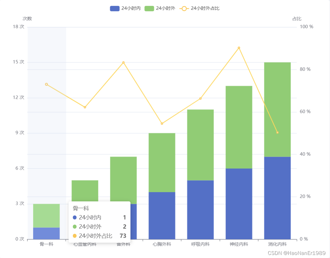
图表完整option代码如下:
export default {
  tooltip: {
    trigger: 'axis',
    axisPointer: {
      type: 'shadow'
    }
  },
  legend: {
    data: ['24小时内', '24小时外', '24小时外占比']
  },
  grid: {
    left: '3%',
    right: '4%',
    bottom: '3%',
    containLabel: true
  },
  xAxis: [
    {
      type: 'category',
      data: ['骨一科', '心血管内科', '普外科', '心胸外科', '呼吸内科', '神经内科', '消化内科']
    }
  ],
  yAxis: [
    {
      type: 'value',
      name: '次数',
      min: 0,
      max: 18,
      interval: 3,
      axisLabel: {
        formatter: '{value} 次'
      }
    },
    {
      type: 'value',
      name: '占比',
      min: 0,
      max: 100,
      interval: 20,
      axisLabel: {
        formatter: '{value} %'
      }
    }
  ],
  series: [
    {
      name: '24小时内',
      type: 'bar',
      stack: 'Ad',
      emphasis: {
        focus: 'series'
      },
      data: [1, 2, 3, 4, 5, 6, 7]
    },
    {
      name: '24小时外',
      type: 'bar',
      stack: 'Ad',
      emphasis: {
        focus: 'series'
      },
      data: [2, 3, 4, 5, 6, 7, 8]
    },
    {
      name: '24小时外占比',
      type: 'line',
      yAxisIndex: 1,
      tooltip: {
        valueFormatter: function(value) {
          return value + ''
        }
      },
      data: [73.0, 62.2, 83.3, 54.5, 66.3, 90.2, 50.3]
    }
  ]
};
3.最终效果
总结
提示:这里对文章进行总结:
例如:以上就是今天要讲的内容,本文仅仅简单介绍了开发一个堆叠柱状图+折线图的过程,官网提供了大量能使我们快速开发的例子。