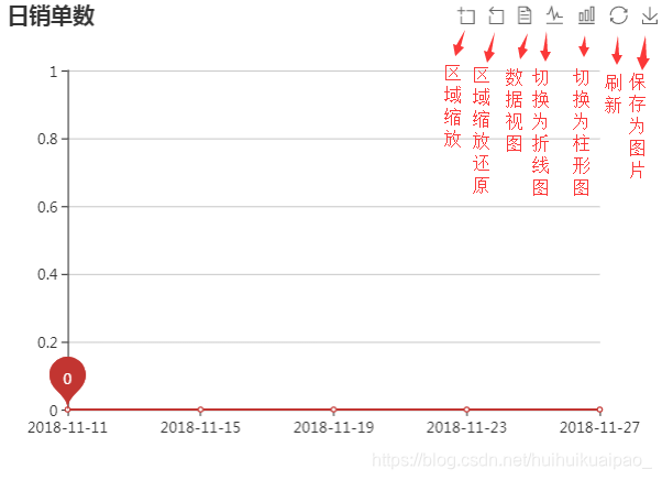
echarts中折线图、柱形图、数据视图的转换需要toolbox里面的内容(也就是加粗的部分)
![]()
// 基于准备好的dom,初始化echarts实例
var day = echarts.init(document.getElementById('day'));
// 指定图表的配置项和数据
var day_options = {
title: {
text: '日报表',
// subtext: '单位:条'
},
tooltip: {
trigger: 'axis'
},
toolbox: {
show: true,
feature: {
dataZoom: {
yAxisIndex: 'none'
}, //区域缩放,区域缩放还原
dataView: {
readOnly: false
}, //数据视图
magicType: {
type: ['line', 'bar']
}, //切换为折线图,切换为柱状图
restore: {}, //还原
saveAsImage: {} //保存为图片
}
},
xAxis: {
type: 'category',
boundaryGap: false,
data: ['2017-11-1','2017-11-1','2017-11-1','2017-11-1','2017-11-1','2017-11-1','2017-11-1','2017-11-1','2017-11-1','2017-11-1']
},
yAxis: {
type: 'value'
},
series: [
{
name:'日报表',
type:'line',
data:[0, 0, 0, 0, 0, 0, 0, 0, 0, 0],
markPoint: {
data: [
{
type: 'max', name: '最大值'
},
{
type: 'min', name: '最小值'
}
]
}
},
]
};
day.setOption(day_options);