目录
python的数据可视工具主要依靠 matplotlib、pandas和 seaborn 。
1. 使用 matplotlib 进行数据可视化
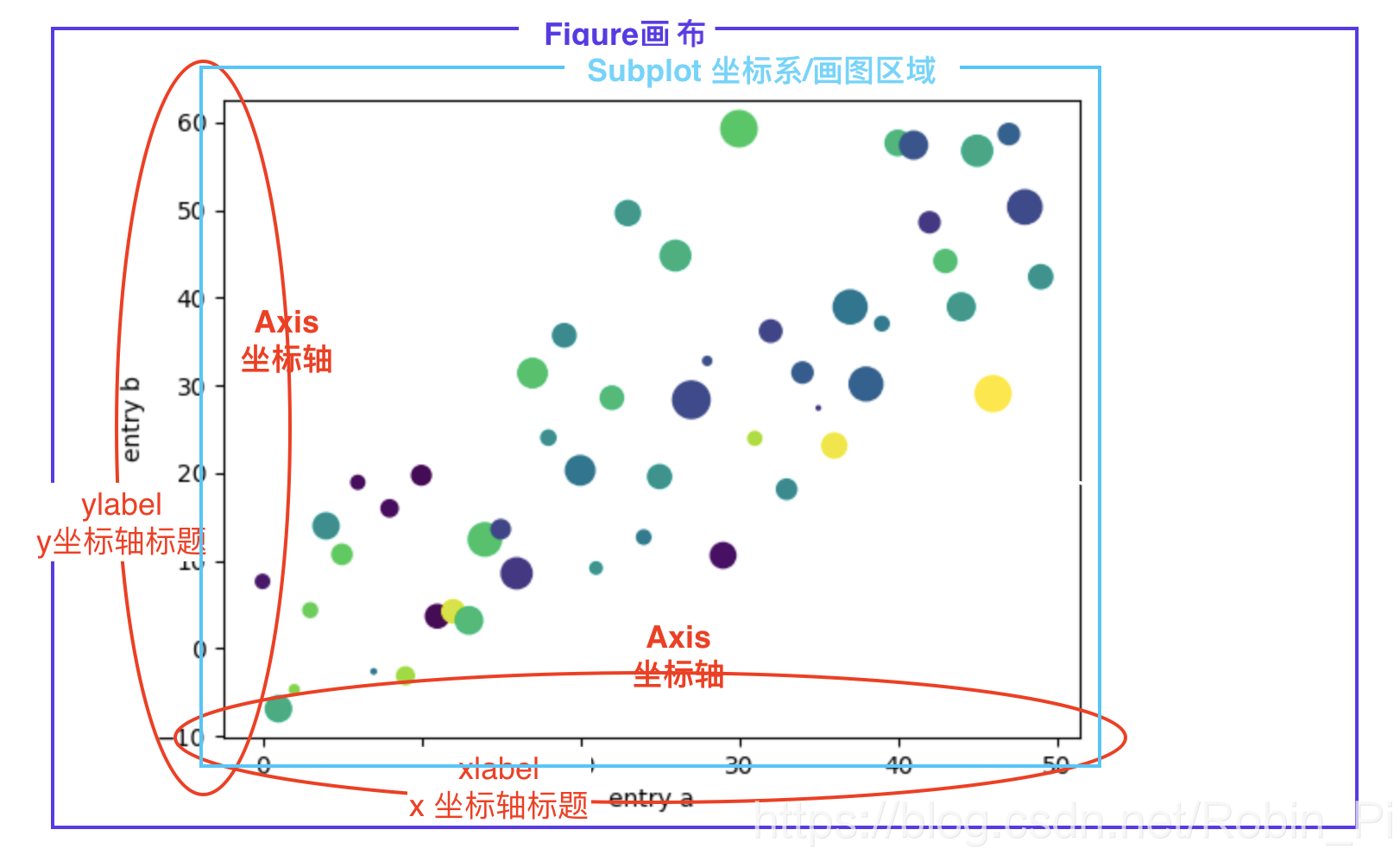
1.1 基础概念
- 画布/画板
- 坐标系/画图区间
1.2 核心步骤:画图三步走
以折线图为例
- 定义坐标点(准备数据)
plot(x, y)绘制图形(默认是线图)plt.show()显示图形
注:不论多少,plot 中的 x 和 y 一一对应,成对出现。
1.3 详细介绍:
记住:
如果没有指明画板figure()和子图subplot,会默认创建一个画板figure(1) 和一个子图subplot(1,1,1)
1.建立画布
建立画布+设置画布大小:plt.figure()
还可以传入画布大小参数 figsize = (8, 6),来调整画布大小!
2. 建立坐标系(确定画图区域)
有几种不同方法:
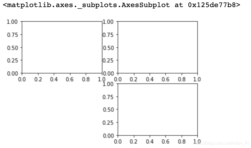
2.1 画布分块+返回所有坐标系
plt.subplots()
该方法后续通过 axes[x,y]指明哪个坐标系进行绘图即可
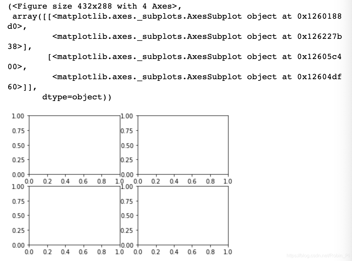
2.2 画布分块+指定坐标系位(进行返回)
ax= fig.add_subplot()
plt.subplot2grid()
plt.subplot()
第一种方法属于对象式编程,后面三个属于函数式编程
后面三个的代码示例:
plt.subplot2grid()
plt.subplot2grid((2,2),(0,0))
plt.subplot2grid((2,2),(0,1))
plt.subplot2grid((2,2),(1,1))
通过坐标控制坐标系位置

subplot()
plt.subplot(2,2,1)
plt.subplot(2,2,2)
plt.subplot(2,2,4)
通过数字控制坐标系位置
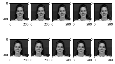
实战:
for i in range(len(crops)):  # crops 为 10 张堆叠的图片 , 大小:(10, 224, 224, 3)
    plt.subplot(2,5,i+1)
    plt.imshow(crops[i, :, :, :])
结果:
subplots()
plt.subplots(2,2)
返回所有的(2x2 个)坐标系
3. 设置坐标轴
设置坐标轴的标题
plt.xlabel("str")
plt.ylabel("str")
plt.title('str')
参数 labelpad 还可以设置标题到坐标轴的距离;
还有其他参数可以对输入的 string 进行设置
设置坐标轴的刻度
自定义在哪些刻度上进行刻度值的显示
plt.xticks(ticks,labels)
plt.yticks(ticks,labels)
小技巧:
通过传入一个空列表可以将 x/y 轴的数值隐藏起来,以保证数据安全。
plt.xticks([])
plt.yticks([])
设置坐标轴的范围
plt.xlim()
plt.ylim()
直接传入起点和终点两个数字作为参数即可。
或者使用更为简便的方法:
axis[xmin, xmax, ymin, ymax],例如,
plt.axis([0, 6, 0, 20])
注意,这里虽然传入的是一个列表的形式,其实在内部都会转换为 numpy 数组形式,以便更利于我们处理数据。
其他设置
-关闭坐标轴显示:plt.axis('off')
-打开网格线:plt.grid(b = 'True')
也可传入axis参数,指定只打开指定的轴
-设置图例
在plt.plot()中传入 label 参数,如 label = ‘str’
然后通过 plt.legend() 显示出来
…
5.绘制图表
-折线图:plt.plot(x,y)
-柱状图:plt.bar(x,y)
-散点图:plt.scatter(x,y)
-热图:plt.imshow(x,cmap)
…
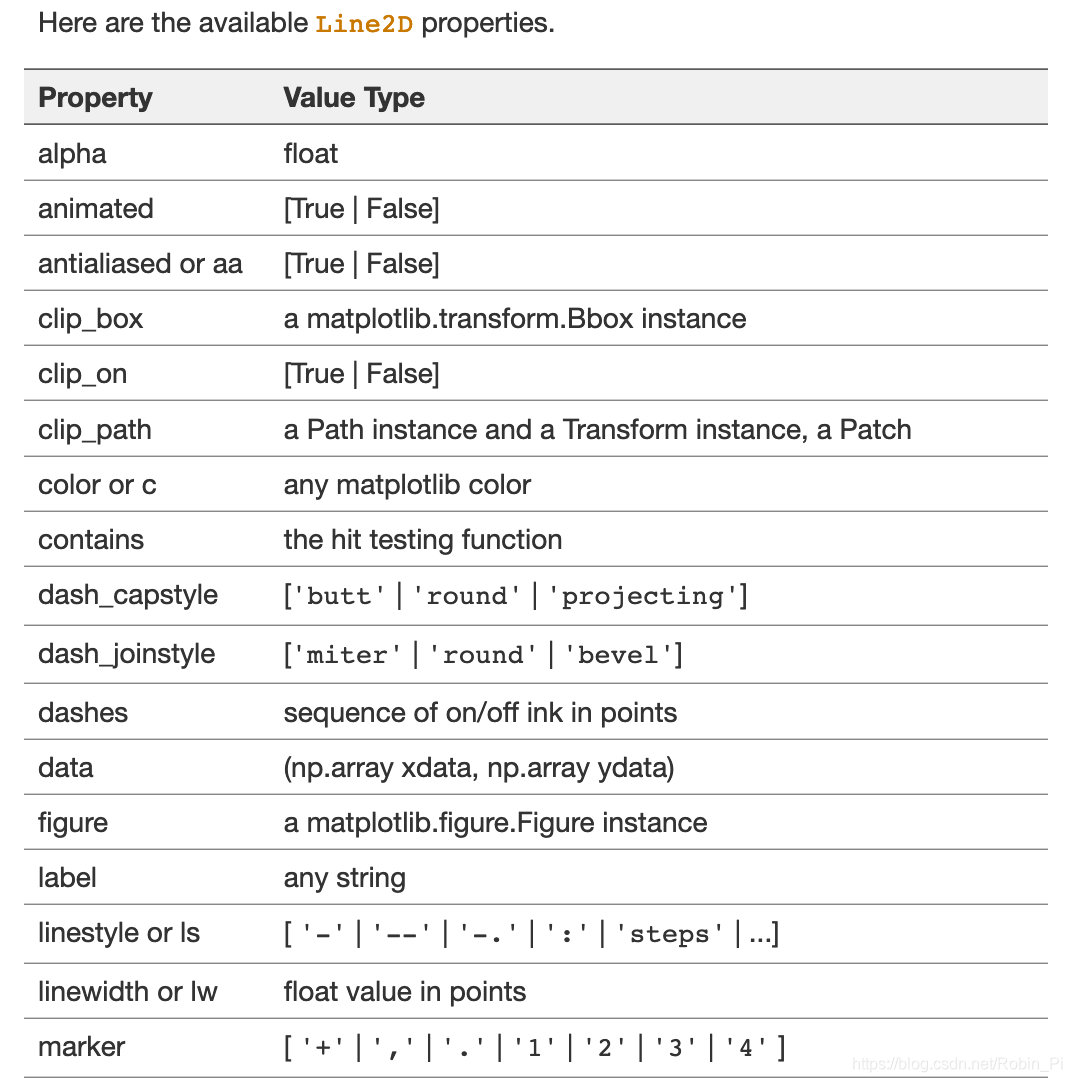
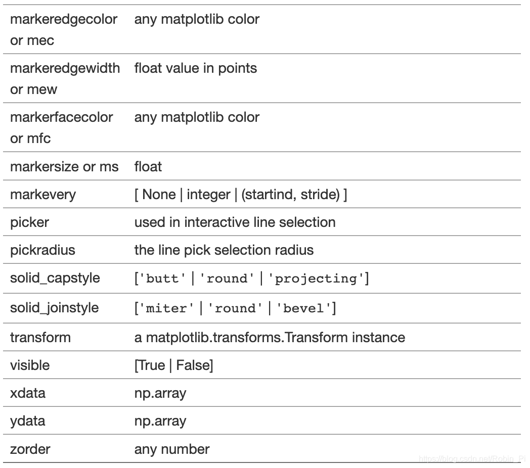
- 绘制 2d 图所用到的可选参数:
6.图标显示
plt.show()
1.4 常见问题
- 是解决不显图像
%matplotlib inline
- 解决中文乱码
plt.rcParams['font.sans-serif']='SimHei'
1.5 极简代码实现
import numpy as np
import matplotlib.pyplot as plt
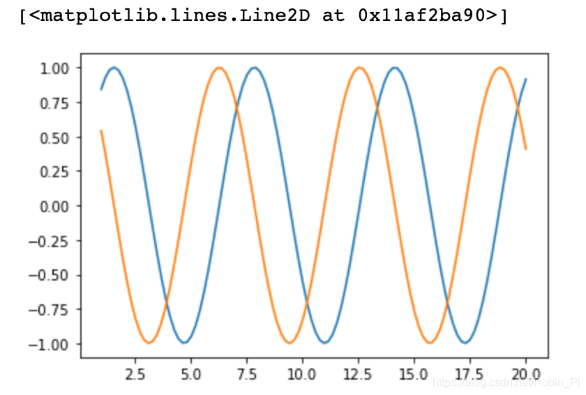
一个坐标系
如前面所说的,有些操作可以省略
x = np.linspace(1, 20, 100)

y1 = np.sin(x)
y2 = np.cos(x)
plt.plot(x, y1)
plt.plot(x, y2)
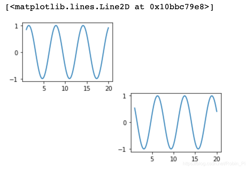
多个坐标系
x = np.linspace(1, 20, 100)

y1 = np.sin(x)
y2 = np.cos(x)
plt.subplot(2,2,1)
plt.plot(x, y1)
plt.subplot(2,2,4)
plt.plot(x, y2)
2. 使用 Pandas 进行数据可视化
Pandas的绘图是在 matplotlib上封装而成,
其基本语法是:
df.plot(x='列名1', y='列名2', kind='图形类型', label=‘图例名称’)
线图
from numpy.random import randn
np.random.seed(1)

df = pd.DataFrame(np.random.randn(20,3),index=np.linspace(0,19,20), columns=list('ABC'))

df.plot()
条形图
from numpy.random import randn
np.random.seed(1)

df = pd.DataFrame(np.random.randn(5,3)+10,index=np.linspace(0,4,5), columns=list('ABC'))

df.plot.bar()
直方图
from numpy.random import randn
np.random.seed(1)

df = pd.DataFrame({

    'A':np.random.randn(100),'B':np.random.randn(100)+1,'C':np.random.randn(100)+2})

df.hist(bins=20)
箱线图
from numpy.random import randn
np.random.seed(1)

df = pd.DataFrame(np.random.rand(10, 5), columns=['A', 'B', 'C', 'D', 'E'])
df.plot.box()
散点图
from numpy.random import randn
np.random.seed(1)

df = pd.DataFrame(np.random.rand(50, 4), columns=['a', 'b', 'c', 'd'])
df.plot.scatter(x='a', y='b')
饼图
from numpy.random import randn
np.random.seed(1)

df = pd.DataFrame(3 * np.random.rand(4), index=['a', 'b', 'c', 'd'], columns=['x'])
df.plot.pie(subplots=True)
3. 使用 seaborn 做数据可视化
总结
- 一维图:
(无直接意义的)一维数据
箱线图 - 二维图
散点图、线图、直方图、条形图 - 三维图:
气泡图
待续~