Python数据分析:数据可视化matplotlib
matplotlib
- 用于创建出版质量图表的绘图工具库,目的是为Python构建一个matlab式的绘图接口
- import matplotlib.pyplot as plt
- pyplot 模块中包含了常用的matplotlib API函数
figure
- matplotlib的图像均位于figure对象中
- 创建figure plt.figure()
subplot
-
fig.add_subplot(a,b,c)
- a, b 表示将fig分割成a*b的区域
- c表示当前选中要操作的区域(从1开始编号)
- 返回的是axessubplot对象
- plot绘图的区域是最后一次指定subplot的位置
-
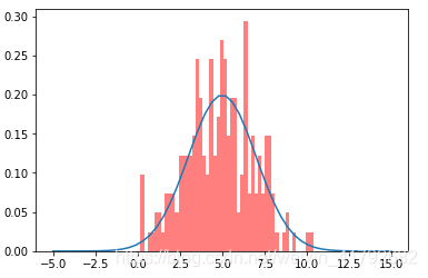
在指定subplot里结合scipy绘制统计图
- 正态分布 sp.stats.norm.pdf
- 正态直方图 sp.stats.norm.rvs
import scipy as sp
from scipy import stats

x = np.linspace(-5, 15, 50)
print(x.shape)

# 绘制高斯分布
plt.plot(x, sp.stats.norm.pdf(x=x, loc=5, scale=2))

# 叠加直方图
plt.hist(sp.stats.norm.rvs(loc=5, scale=2, size=200), bins=50, normed=True, color='red', alpha=0.5)
plt.show()
运行结果:
-
直方图 hist
# 绘制直方图
plt.hist(np.random.randn(100), bins=10, color='b', alpha=0.3)
plt.show()
运行结果:
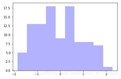
-
散点图 scatter
# 绘制散点图
x = np.arange(50)
y = x + 5 * np.random.rand(50)
plt.scatter(x, y)
运行结果:
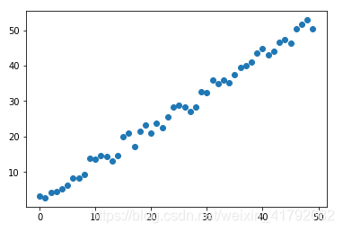
-
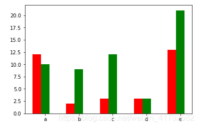
柱状图 bar
# 柱状图
x = np.arange(5)
y1, y2 = np.random.randint(1, 25, size=(2, 5))
width = 0.25
ax = plt.subplot(1,1,1)
ax.bar(x, y1, width, color='r')
ax.bar(x+width, y2, width, color='g')
ax.set_xticks(x+width)
ax.set_xticklabels(['a', 'b', 'c', 'd', 'e'])
plt.show()
运行结果:
-
矩阵绘图 plt.imshow()
# 矩阵绘图
m = np.random.rand(10,10)
print(m)
plt.imshow(m, interpolation='nearest', cmap=plt.cm.ocean)
plt.colorbar()
plt.show()
运行结果:
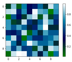
- 混淆矩阵,三个维度的关系
plt.subplots()
-
同时返回新创建的figure和subplot对象数组
-
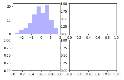
fig, subplot_arr = plt.subplots(2,2)
fig, subplot_arr = plt.subplots(2,2)
subplot_arr[0,0].hist(np.random.randn(100), bins=10, color='b', alpha=0.3)
plt.show()
运行结果:
颜色、标记、线型
-
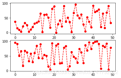
ax.plot(x, y, ‘r–’) 等价于 ax.plot(x,y, linestyle=’–’, color = ‘r’)
fig, axes = plt.subplots(2)
axes[0].plot(np.random.randint(0, 100, 50), 'ro--')
# 等价
axes[1].plot(np.random.randint(0, 100, 50), color='r', linestyle='dashed', marker='o')
运行结果:
刻度、标签、图例
-
设置刻度范围
- plt.xlim(),plt.ylim()
- ax.set_xlim(), ax.set_ylim()
-
设置显示刻度:
- plt.xticks(), plt.yticks()
- ax.set_xticks(), ax.set_yticks()
-
设置刻度标签
- ax.set_xticklabels() ax.set_yticklabels()
-
设置坐标轴标签
- ax.set_xlabel(), ax.set_ylabel()
-
设置标题
- ax.set_title()
-
图例
- ax.plot(label= ’ legend’)
- ax.legend(), plt.legend()
- loc = 'best ’ 自动选择放置图例的最佳位置
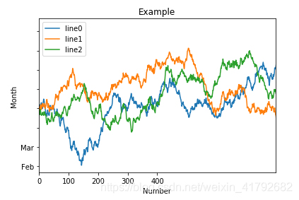
fig, ax = plt.subplots(1)
ax.plot(np.random.randn(1000).cumsum(), label='line0')

# 设置刻度
#plt.xlim([0,500])
ax.set_xlim([0, 800])

# 设置显示的刻度
#plt.xticks([0,500])
ax.set_xticks(range(0,500,100))

# 设置刻度标签
ax.set_yticklabels(['Jan', 'Feb', 'Mar'])

# 设置坐标轴标签
ax.set_xlabel('Number')
ax.set_ylabel('Month')

# 设置标题
ax.set_title('Example')

# 图例
ax.plot(np.random.randn(1000).cumsum(), label='line1')
ax.plot(np.random.randn(1000).cumsum(), label='line2')
ax.legend()
ax.legend(loc='best')
#plt.legend()
运行结果: