官方文档:https://matplotlib.org/users/pyplot_tutorial.html
使用
使用方法:
from matplotlib import pyplot as plt
x=range(2,26,2)
y=[15,13,14.5,17,20,25,26,26,27,22,18,15]
#折线图
plt.plot(x,y)
#散点图
#plt.scatter(x,y)
#柱状图
#plt.bar(x,y)
plt.show()
说明:
轴的属性:
如果在plt.plot()中只传入一个列表,那么默认是y值,系统自动生成x轴
设置轴的标签:
plt.ylabel('tempature')
plt.xlabel('time')
设置轴的坐标点:
#当刻度太密集时候使用列表的步长来解决,matplotlib会自动帮我们对应
plt.xticks(x[::2])
#给x轴设置时间
x=range(120)
_x_ticks=['10点{}分'.format(i) for i in x if i<60]
_x_ticks+=['11点{}分'.format(i-60) for i in x if i>60]
plt.xticks(x[::5],_x_ticks[::5],rotation=45)#rotation设置旋转角度,逆时针旋转
#设置中文字体
plt.rcParams['font.sans-serif'] = ['SimHei']
plt.rcParams['font.family'] = 'sans-serif'
#或者
#fname是字体的路径
from matplotlib import font_manager
myfont=font_manager.FontProperties(fname='./simsun.ttc')
plt.xticks(b[::5],_x_ticks[::5],rotation=45,fontproperties=myfont)
图形属性:
折线图:
对于每一对x、y参数,都有一个可选的第三个参数,它是表示绘图的颜色和行类型的格式字符串。格式字符串的字母和符号来自MATLAB,将颜色字符串与行样式字符串连接起来。默认的格式字符串是’ b- ',这是一个纯蓝色的行。例如,要用红色圆圈绘制上面的图,您将发出以下命令:
plt.plot([1,2,3,4], [1,4,9,16], 'ro')#其他:‘o-’,‘r--’,‘bs’,‘g^’查看 plot()文档得到更多的
多个曲线时,设置标签:
plt.plot(x,y,color='green',label='$me$')#$是让字体是斜体
plt.plot(x, y2, color='red',label='$you$')
#	loc可选属性:best、upper right、upper left、lower left、lower right
#	right、center left、center right、lower center、upper center、center
plt.legend(loc='best')
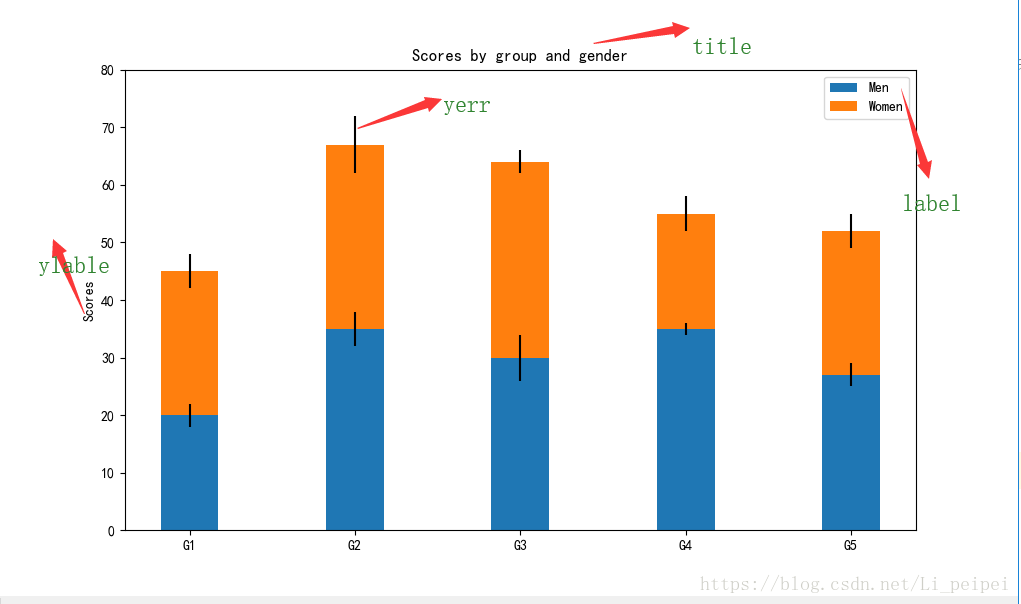
柱状图:
import numpy as np
N = 5
menMeans = (20, 35, 30, 35, 27)
womenMeans = (25, 32, 34, 20, 25)
menStd = (2, 3, 4, 1, 2)
womenStd = (3, 5, 2, 3, 3)
ind = np.arange(N)    # the x locations for the groups
width = 0.35       # the width of the bars: can also be len(x) sequence

p1 = plt.bar(ind, menMeans, width, yerr=menStd)#x轴,y轴,宽度,竖线的长度
p2 = plt.bar(ind, womenMeans, width,
             bottom=menMeans, yerr=womenStd)#bottom设置下方的数据
plt.ylabel('Scores')
plt.title('Scores by group and gender')
plt.xticks(ind, ('G1', 'G2', 'G3', 'G4', 'G5'))
plt.yticks(np.arange(0, 81, 10))
plt.legend((p1[0], p2[0]), ('Men', 'Women'))

plt.show()
#设置横向柱状图
#plt.barh(range(len(a)),b,height=0.3,color='red')
#plt.yticks(range(len(a)),a,rotation=45)
结果:

a = ["战狼2","速度与激情8","功夫瑜伽","蜘蛛侠"]
b_16=[15746,312,4497,319]
b_15=[12357,156,2045,168]
b_14=[2358,399,2358,362]
bar_width=0.2
x_14=list(range(len(a)))
x_15=[i+bar_width for i in x_14]#让每次画的柱状图的起始位置是上次的结束为止,这样看起来就是一个
x_16=[i+bar_width*2 for i in x_14]
plt.figure(figsize=(12,5))
plt.bar(range(len(a)),b_14,width=bar_width,label='9月14日')#画四个蓝色柱状
plt.bar(x_15,b_15,width=bar_width,label='9月15日')#画四个橙色柱状
plt.bar(x_16,b_16,width=bar_width,label='9月16日')#画四个绿色柱状
plt.legend(loc='best')
plt.xticks(x_15,a)
plt.show()
结果

饼状图:
#饼状图
labels = 'Frogs', 'Hogs', 'Dogs', 'Logs'
sizes = [15, 30, 45, 10]
explode = (0, 0.1, 0, 0)  # only "explode" the 2nd slice (i.e. 'Hogs')

fig1, ax1 = plt.subplots()
#explode设置扇区脱离饼状图的大小,autopct设置小数点位数,shadow设置阴影,startangle设置其实角度
ax1.pie(sizes, explode=explode, labels=labels, autopct='%1.1f%%',
        shadow=True, startangle=90)
ax1.axis('equal')  # Equal aspect ratio ensures that pie is drawn as a circle.

plt.show()
散点图:
x=range(1,32)
x2=range(41,72)
y1= [11,17,16,11,12,11,12,6,6,7,8,9,12,15,14,17,18,21,16,17,20,14,15,15,15,19,21,22,22,22,23]
y2 = [26,26,28,19,21,17,16,19,18,20,20,19,22,23,17,20,21,20,22,15,11,15,5,13,17,10,11,13,12,13,6]
x_sum=list(x)+list(x2)
plt.figure(figsize=(12,8))
plt.scatter(x,y1,color='red',label='3月份')
plt.scatter(x2,y2,color='green',label='10月份')
plt.xlabel('时间')
plt.ylabel('温度')
plt.title('三月和十月温度变化图')
x_da=['三月{}日'.format(i) for i in x]
x_da+=['十月{}日'.format(i-50) for i in x2]
plt.xticks(x_sum[::3],x_da[::3],rotation=45)
plt.legend(loc='best')
plt.show()
结果:


直方图:
a=[131,  98, 125, 131, 124, 139, 131, 117, 128, 108, 135, 138, 131, 102, 107, 114, 119, 128, 121, 142, 127, 130, 124, 101, 110, 116, 117, 110, 128, 128, 115,  99, 136, 126, 134,  95, 138, 117, 111,78, 132, 124, 113, 150, 110, 117,  86,  95, 144, 105, 126, 130,126, 130, 126, 116, 123, 106, 112, 138, 123,  86, 101,  99, 136,123, 117, 119, 105, 137, 123, 128, 125, 104, 109, 134, 125, 127,105, 120, 107, 129, 116, 108, 132, 103, 136, 118, 102, 120, 114,105, 115, 132, 145, 119, 121, 112, 139, 125, 138, 109, 132, 134,156, 106, 117, 127, 144, 139, 139, 119, 140,  83, 110, 102,123,107, 143, 115, 136, 118, 139, 123, 112, 118, 125, 109, 119, 133,112, 114, 122, 109, 106, 123, 116, 131, 127, 115, 118, 112, 135,115, 146, 137, 116, 103, 144,  83, 123, 111, 110, 111, 100, 154,136, 100, 118, 119, 133, 134, 106, 129, 126, 110, 111, 109, 141,120, 117, 106, 149, 122, 122, 110, 118, 127, 121, 114, 125, 126,114, 140, 103, 130, 141, 117, 106, 114, 121, 114, 133, 137,  92,121, 112, 146,  97, 137, 105,  98, 117, 112,  81,  97, 139, 113,134, 106, 144, 110, 137, 137, 111, 104, 117, 100, 111, 101, 110,105, 129, 137, 112, 120, 113, 133, 112,  83,  94, 146, 133, 101,131, 116, 111,  84, 137, 115, 122, 106, 144, 109, 123, 116, 111,111, 133, 150]
plt.figure(figsize=(14,6))
d=3
num_bin=int((max(a)-min(a))/d)
plt.hist(a,range(min(a),max(a),d),normed=True)#第一个参数是数据源,第二个参数可以是组距num_bin,但是如果不能整除,就会出现偏移,第三个参数:True是归一化,False是频数

plt.xticks(range(min(a),max(a),d))
plt.grid(alpha=0.7)
plt.show()
结果:

图片属性
图片的标题:
plt.title('tempature of 10 and 11 month')
改变图片的大小:
figf=plt.figure(figsize=(20,8),dpi=80)
背景网格:
#alpha设置透明度,1是实线0是没有
plt.grid(alpha=0.9)
显示中文的方法:
#设置中文字体
plt.rcParams['font.sans-serif'] = ['SimHei']
plt.rcParams['font.family'] = 'sans-serif'
#或者
#fname是字体的路径
from matplotlib import font_manager
myfont=font_manager.FontProperties(fname='./simsun.ttc')
plt.xticks(b[::5],_x_ticks[::5],rotation=45,fontproperties=myfont)