Python数据可视化常用的是matplotlib库,matplotlib是底层库,今天学了pandas的数据可视化,相对于matplotlib库来说,简单许多。
折线图
%matplotlib inline
import numpy as np
import pandas as pd
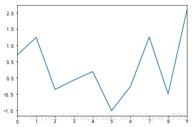
x1 = pd.Series(np.random.normal(size=10))
x1.plot()
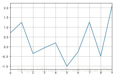
我们也可以加入grid参数添加格网:更多干货分享加python编程语言学习QQ群 515267276
x1.plot(grid=True)
条形图
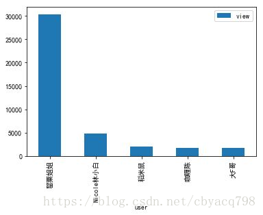
依旧以前文的简书数据为例:
jianshu.groupby(jianshu.index)[[‘view’]].sum().sort([‘view’],ascending=False)[0:5].plot(kind=‘bar’)
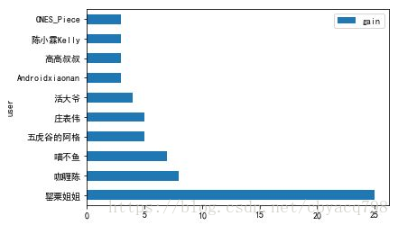
jianshu.groupby(jianshu.index)[[‘gain’]].sum().sort([‘gain’],ascending=False)[0:10].plot(kind=‘barh’)
pandas绘图乱码解决
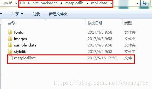
pandas绘图其实是对matplotlib库继承,而matplotlib库默认为ASCII编码,所以绘图中文会乱码。我们需要去matplotlib库里面的matplotlibrc文件进行设置。
更多干货分享加python编程语言学习QQ群 515267276
打开matplotlibrc文件,取消如下行的注释,并在font.sans-serif冒号后加入SimHei,这个为中文字体。重启python即可font.family : sans-serif
font.sans-serif : SimHei
axes.unicode_minus