详见个人博客
1、css四角背景无边边框
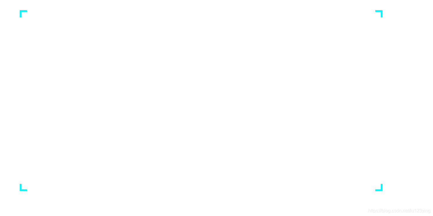
代码如下:
<div class="BoxWrap">
  <div class="horn"></div>
</div>
.horn{
    width: 1000px;
    height: 500px;
    margin: 100px;
    background: linear-gradient(#00faff, #00faff) left top,
		linear-gradient(#00faff, #00faff) left top,
		linear-gradient(#00faff, #00faff) right top,
		linear-gradient(#00faff, #00faff) right top,
		linear-gradient(#00faff, #00faff) left bottom,
		linear-gradient(#00faff, #00faff) left bottom,
		linear-gradient(#00faff, #00faff) right bottom,
		linear-gradient(#00faff, #00faff) right bottom;
	background-repeat: no-repeat;
  background-size: 5px 20px, 20px 5px;
}
2、css四角蓝色边框,科技蓝
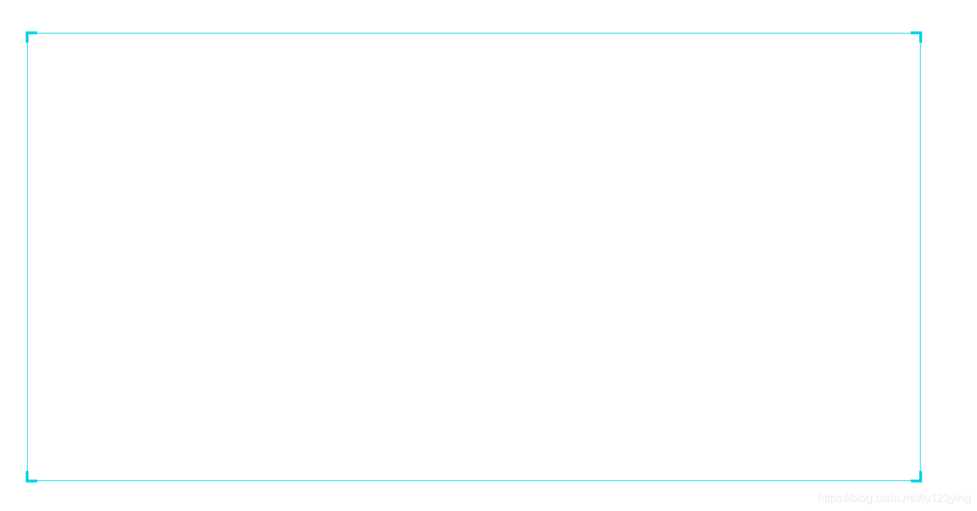
代码如下:
<div class="BoxWrap">
    <div class="horn">
    //四个div分别为四个角上的div
       <div class="lt"></div>
       <div class="rt"></div>
       <div class="rb"></div>
       <div class="lb"></div>
    </div>
.BoxWrap{
        width: 1000px;
        height: 500px;
        position: relative;
      }
      .horn{
        position: absolute;
        width: 100%;
        height: 100%;
        border:1px solid #00d3e7;
        margin: 100px;
      }
      .horn>div{
        width: 10px;
        height: 10px;
        position:absolute;
      }
      .horn .lt{
        border-top: 3px solid #00d3e7;
        border-left: 3px solid #00d3e7;
        left: -3px;
        top: -3px;
      }
      .horn .rt{
        border-top: 3px solid #00d3e7;
        border-right: 3px solid #00d3e7;
        right: -3px;
        top: -3px;
      }
      .horn .rb{
        border-bottom:3px solid #00d3e7;
        border-right: 3px solid #00d3e7;
        right: -3px;
        bottom: -3px;
      }
      .horn .lb{
        border-bottom:3px solid #00d3e7;
        border-left: 3px solid #00d3e7;
        left: -3px;
        bottom: -3px;
      }
3、css实现四角边框,四角为正方形,颜色渐变
代码如下:
<div class="BoxWrap">
    <div class="horn">
      <div class="lt"></div>
      <div class="rt"></div>
      <div class="rb"></div>
      <div class="lb"></div>
    </div>
 .BoxWrap {
      width: 1000px;
      height: 500px;
      position: relative;
    }
    .horn {
      position: absolute;
      width: 100%;
      height: 100%;
      border: 1.5px solid #00d3e7;
      margin: 100px;
      border-image: -webkit-linear-gradient(rgb(85, 87, 231), rgb(149, 228, 241)) 20 20;
      border-image: -moz-linear-gradient(rgb(85, 87, 231), rgb(149, 228, 241)) 20 20;
      border-image: -o-linear-gradient(rgb(85, 87, 231), rgb(149, 228, 241)) 20 20;
      border-image: linear-gradient(rgb(85, 87, 231), rgb(149, 228, 241)) 20 20;
    }
    .horn>div {
      width: 10px;
      height: 10px;
      position: absolute;
      /* background-color: #00d3e7 */
    }
    .horn .lt {
      left: -10px;
      top: -10px;
      background-color: rgb(85, 87, 231);
    }
    .horn .rt {
      right: -10px;
      top: -10px;
      background-color: rgb(85, 87, 231);
    }
    .horn .rb {
      right: -10px;
      bottom: -10px;
      background-color: rgb(149, 228, 241);
    }
    .horn .lb {
      left: -10px;
      bottom: -10px;
      background-color: rgb(149, 228, 241);
    }
<!DOCTYPE html>
<html lang="en">
<head>
  <meta charset="UTF-8">
  <meta name="viewport" content="width=device-width, initial-scale=1.0">
  <meta http-equiv="X-UA-Compatible" content="ie=edge">
  <title>Document</title>
  <!-- <link rel="stylesheet" href="css/style.css"> -->
  <style>

  </style>
</head>
<body>
  <div class="BoxWrap">
  //边框div
    <div class="horn">
    //四个角上正方形div
      <div class="lt"></div>
      <div class="rt"></div>
      <div class="rb"></div>
      <div class="lb"></div>
    </div>
  </div>
</body>
</html>
4、css无角渐变边框
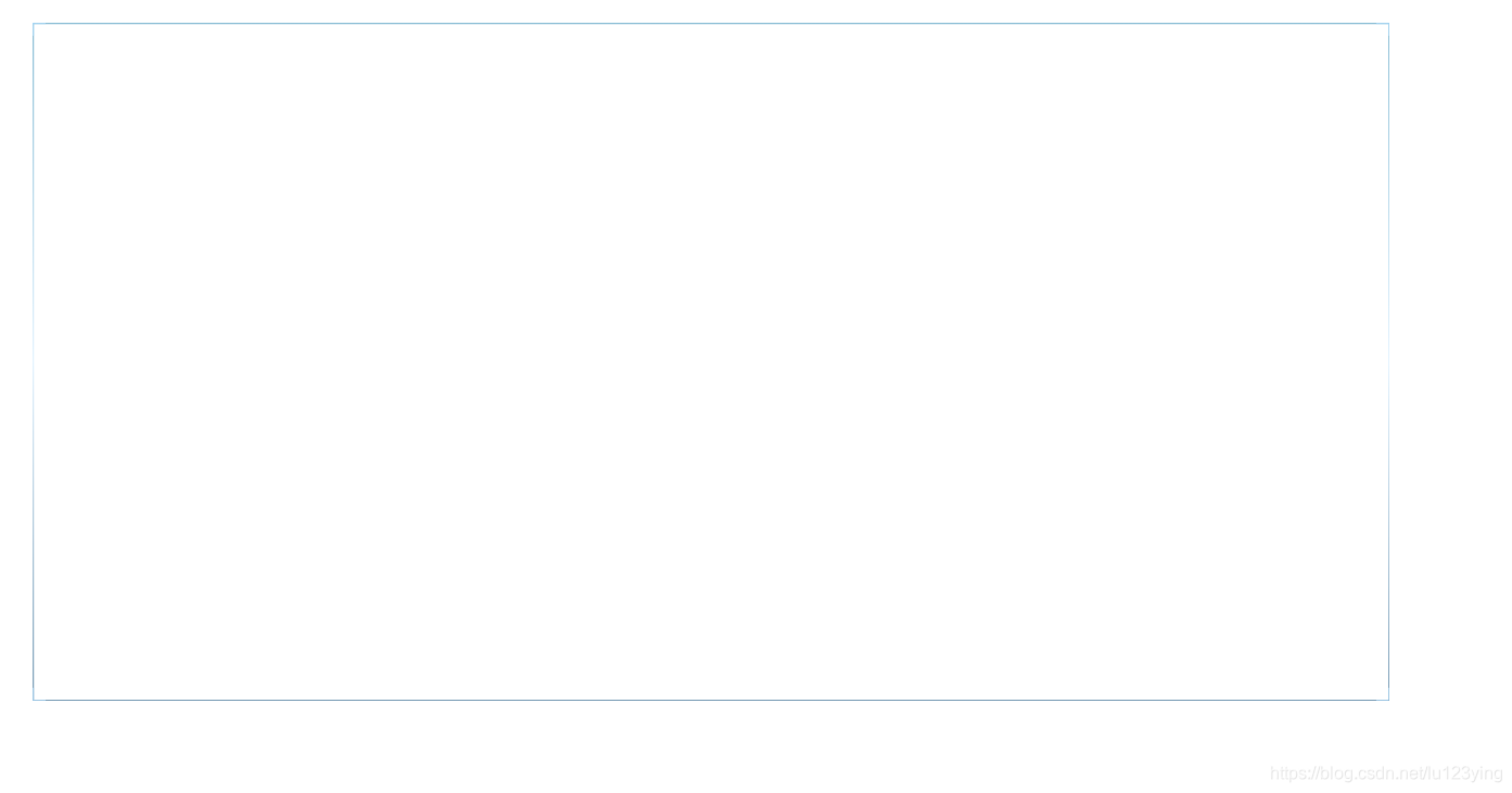
代码如下:
<div class="boxWrap"></div>
.boxWrap {
      width: 1000px;
      height: 500px;
      margin: 100px;
      background: radial-gradient(circle at center center, rgba(25, 25, 112, 0), rgba(25, 25, 112, 0)),
        linear-gradient(rgba(179, 224, 255, 0.62), rgba(179, 224, 255, 0.62)) left top,
        linear-gradient(rgba(179, 224, 255, 0.62), rgba(179, 224, 255, 0.62)) left top,
        linear-gradient(rgba(179, 224, 255, 0.62), rgba(179, 224, 255, 0.62)) right top,
        linear-gradient(rgba(179, 224, 255, 0.62), rgba(179, 224, 255, 0.62)) right top,
        linear-gradient(rgba(179, 224, 255, 0.62), rgba(179, 224, 255, 0.62)) left bottom,
        linear-gradient(rgba(179, 224, 255, 0.62), rgba(179, 224, 255, 0.62)) left bottom,
        linear-gradient(rgba(179, 224, 255, 0.62), rgba(179, 224, 255, 0.62)) right bottom,
        linear-gradient(rgba(179, 224, 255, 0.62), rgba(179, 224, 255, 0.62)) right bottom,
        linear-gradient(rgba(56, 144, 184, 0.60), rgba(56, 144, 184, 0.60)) top,
        linear-gradient(rgba(26, 87, 130, 0.60), rgba(26, 87, 130, 0.60)) bottom,
        linear-gradient(rgba(56, 144, 184, 0.60), rgba(219, 240, 255, 0.80), rgba(26, 87, 130, 0.60)) left,
        linear-gradient(rgba(56, 144, 184, 0.60), rgba(219, 240, 255, 0.80), rgba(26, 87, 130, 0.60)) right;
      background-repeat: no-repeat;
      background-position: 1px 1px, 0px 0px, 0px 0px, 0px 100%, 0px 100%, 100% 0px, 100% 0px, 100% 100%, 100% 100%, 0px 0px, 0px 100%, 0px 100%, 100% 100%;
      background-size: calc(100% - 2px) calc(100% - 2px), 1px 10px, 10px 1px, 1px 10px, 10px 1px, 1px 10px, 10px 1px, 1px 10px, 10px 1px, 100% 1px, 100% 1px, 1px 100%, 1px 100%;

    }
