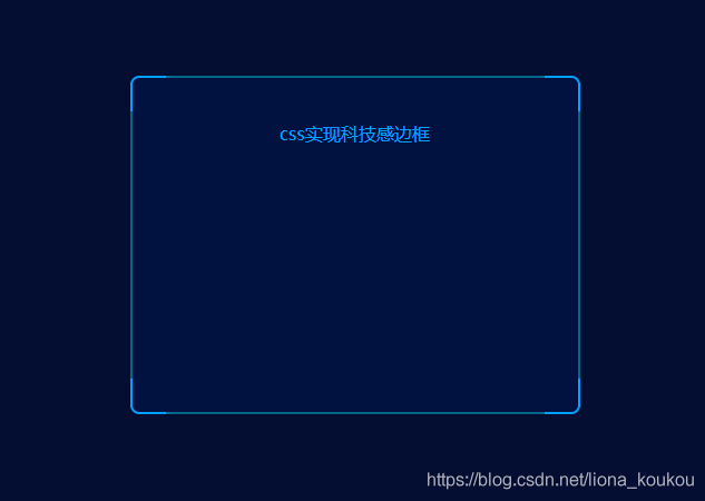
实现效果:使用before和after就可以实现,代码量不多,长度颜色都可以自己调整
实现代码:
<!DOCTYPE html>
<html lang="en">
<head>
    <meta charset="UTF-8">
    <title>Title</title>
    <style>
        *{
            margin:0;
            padding:0;
        }
        html,body{
            width:100%;
            height:100%;
            background:#040d32;
        }
        .border-box{
            position: relative;
            margin:300px auto;
            width:400px;
            height:300px;
            background: rgba(1, 19, 67, 0.8);
            border: 2px solid #00a1ff;
            border-radius: 8px;
        }
        .border-box::before {
            position: absolute;
            top: -2px;
            bottom: -2px;
            left: 30px;
            width: calc(100% - 60px);
            content: "";
            border-top: 2px solid #016886;
            border-bottom: 2px solid #016886;
            z-index: 0;
        }
        .border-box::after {
            position: absolute;
            top: 30px;
            right: -2px;
            left: -2px;
            height: calc(100% - 60px);
            content: "";
            border-right: 2px solid #016886;
            border-left: 2px solid #016886;
            z-index: 0;
        }
        .border-box p{
            line-height:100px;
            text-align: center;
            color:#00a1ff;
        }
    </style>
</head>
<body>
<div class="border-box">
    <p>css实现科技感边框</p>
</div>
</body>
</html>