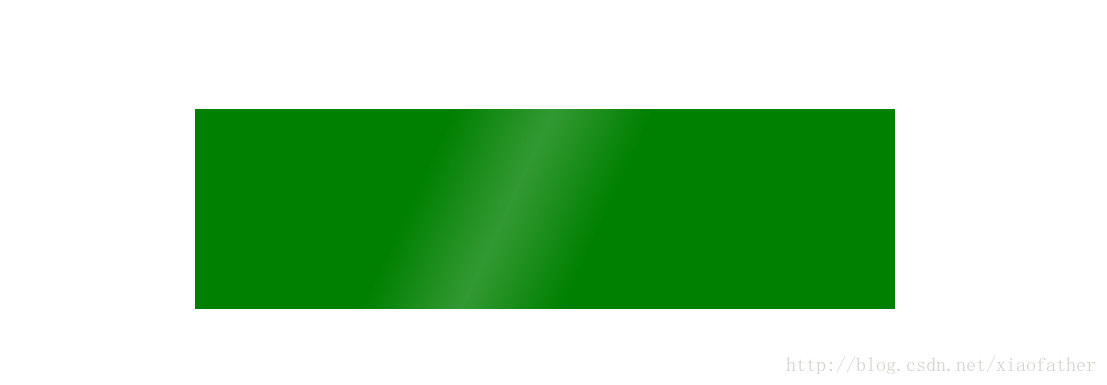
鼠标悬停时候,一层半透明白色从左往右,效果图如下:
代码如下:
<html>
<head>
<meta content = "text/html,charset=utf-8" >
<style>
html,body{
margin:0px;
padding:0px;
}
.parent{
margin: 0px auto;
height: 200px;
width: 700px;
margin-top: 360px;
position:relative;
background-color:green;
}
.parent:hover:before {
left: 150%;
transition: left 2s ease 0s;
}
.parent:before {
content: "";
position: absolute;
width: 200px;
height: 100%;
top: 0;
left: -250px;
overflow: hidden;
background: -moz-linear-gradient(left, rgba(255,255,255,0)0, rgba(255,255,255,.2)50%, rgba(255,255,255,0)100%);
background: -webkit-gradient(linear, left top, right top, color-stop(0%, rgba(255,255,255,0)), color-stop(50%, rgba(255,255,255,.2)), color-stop(100%, rgba(255,255,255,0)));
background: -webkit-linear-gradient(left, rgba(255,255,255,0)0, rgba(255,255,255,.2)50%, rgba(255,255,255,0)100%);
background: -o-linear-gradient(left, rgba(255,255,255,0)0, rgba(255,255,255,.2)50%, rgba(255,255,255,0)100%);
-webkit-transform: skewX(-25deg);
-moz-transform: skewX(-25deg);
}
</style>
</head>
<body>
<div class = "parent">
</div>
<body>
</html>