前言:css3的出现使得我们可以通过前端技术,让网页内容变得更丰富,更华丽。今天来玩玩好玩的颜色渐变。
一、背景颜色渐变。
<body>
<style>
.content { width:300px; height:100px; line-height:100px; text-align:center; font-size:32px; font-weight:bold;
background-image:-webkit-linear-gradient(left, red 0%, blue 30%, yellow 60%, green 90%);
}
</style>
<div class="content">浅色夏沫,夏末微凉</div>
</body>
运行效果
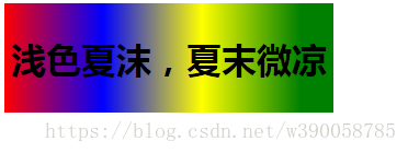
二、文字颜色渐变。
<body>
<style>
.content { width:300px; height:100px; line-height:100px; text-align:center; font-size:32px; font-weight:bold;
background-image:-webkit-linear-gradient(left, red 0%, blue 30%, yellow 60%, green 90%);
-webkit-background-clip:text; -webkit-text-fill-color:transparent; }
</style>
<div class="content">浅色夏沫,夏末微凉</div>
</body>
运行效果

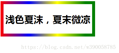
三、边框颜色渐变。
<body>
<style>
.content { width:300px; height:100px; line-height:100px; text-align:center; font-size:32px; font-weight:bold;
border:10px solid;
border-image:-webkit-linear-gradient(left, red 0%, blue 30%, yellow 60%, green 90%) 10; }
</style>
<div class="content">浅色夏沫,夏末微凉</div>
</body>
运行效果