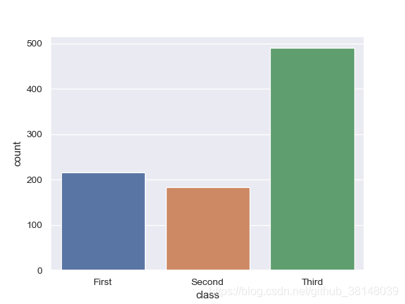
代码如下:
import seaborn as sns
sns.set(style="darkgrid")
titanic = sns.load_dataset("titanic")
ax = sns.countplot(x="class", data=titanic)
效果:
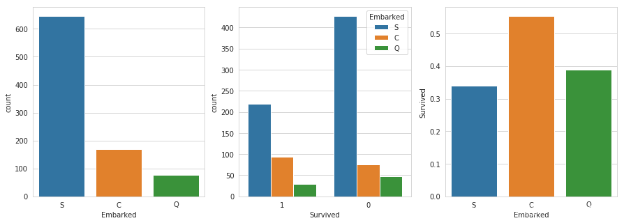
按组分类画柱状图
fig, (axis1,axis2,axis3) = plt.subplots(1,3,figsize=(15,5))

# sns.factorplot('Embarked',data=titanic_df,kind='count',order=['S','C','Q'],ax=axis1)
# sns.factorplot('Survived',hue="Embarked",data=titanic_df,kind='count',order=[1,0],ax=axis2)
sns.countplot(x='Embarked', data=train_data, ax=axis1)
sns.countplot(x='Survived', hue="Embarked", data=train_data, order=[1,0], ax=axis2)

# group by embarked, and get the mean for survived passengers for each value in Embarked
embark_perc = train_data[["Embarked", "Survived"]].groupby(['Embarked'],as_index=False).mean()
sns.barplot(x='Embarked', y='Survived', data=embark_perc,order=['S','C','Q'],ax=axis3)

#坐大船的人是大部分的人
#救回的,没有救回的,分布是相似的。求回的是小部分
#c仓救回的比例最高