import numpy as np
import pandas as pd
import matplotlib.pyplot as plt
from pandas import Series, DataFrame
%matplotlib inline
import seaborn as sns
数据在这里复制,sns.load_dataset(‘flights’)
https://github.com/mwaskom/seaborn-data/blob/master/flights.csv
df = pd.read_clipboard()
df.head()
    year    month   passengers
0   1949    January 112
1   1949    February    118
2   1949    March   132
3   1949    April   129
4   1949    May 121
df.shape
(144, 3)
# 用透视表转换
df = df.pivot(index='month', columns='year',values='passengers')
df

year    1949    1950    1951    1952    1953    1954    1955    1956    1957    1958    1959    1960
month
April   129 135 163 181 235 227 269 313 348 348 396 461
August  148 170 199 242 272 293 347 405 467 505 559 606
December    118 140 166 194 201 229 278 306 336 337 405 432
February    118 126 150 180 196 188 233 277 301 318 342 391
January 112 115 145 171 196 204 242 284 315 340 360 417
July    148 170 199 230 264 302 364 413 465 491 548 622
June    135 149 178 218 243 264 315 374 422 435 472 535
March   132 141 178 193 236 235 267 317 356 362 406 419
May 121 125 172 183 229 234 270 318 355 363 420 472
November    104 114 146 172 180 203 237 271 305 310 362 390
October 119 133 162 191 211 229 274 306 347 359 407 461
September   136 158 184 209 237 259 312 355 404 404 463 508

# 热力图
sns.heatmap(df)
<matplotlib.axes._subplots.AxesSubplot at 0x2214cab7e10>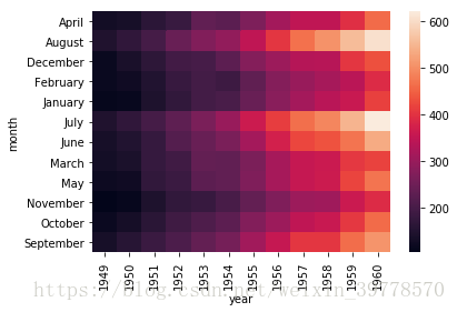
# 按列的折现图
df.plot()
# annot描述
sns.heatmap(df, annot=True)
# fmt设置显示格式
sns.heatmap(df, annot=True, fmt='d')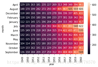
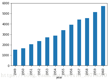
s = df.sum()
s
year
1949    1520
1950    1676
1951    2042
1952    2364
1953    2700
1954    2867
1955    3408
1956    3939
1957    4421
1958    4572
1959    5140
1960    5714
dtype: int64
# 柱状图
sns.barplot(x=s.index, y=s.values)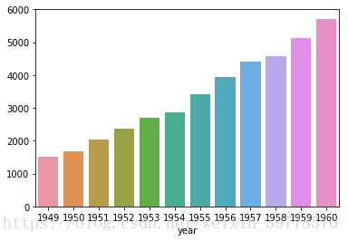
s.plot(kind='bar')