在线加载数据
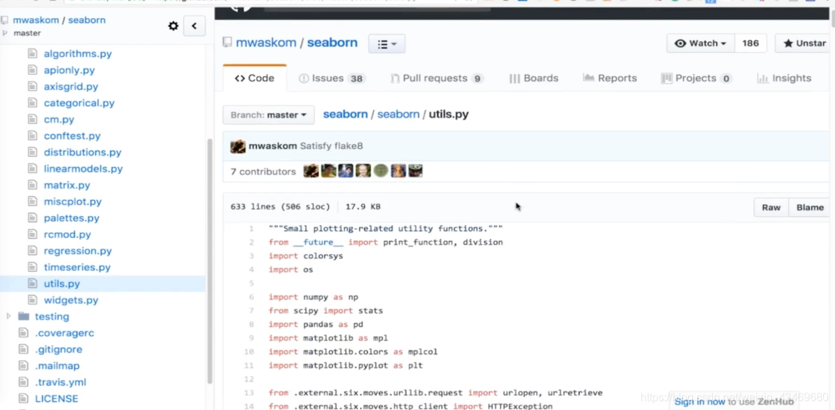
https://github.com/mwaskom/seaborn
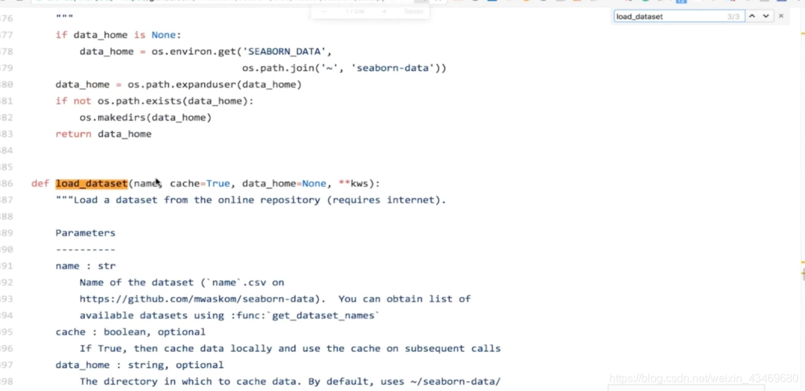


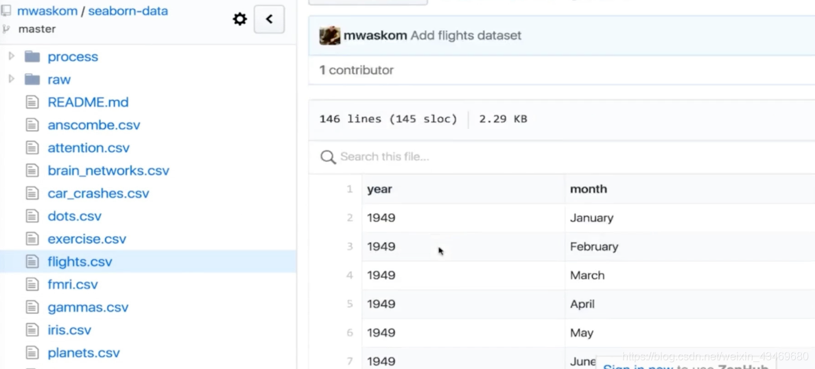
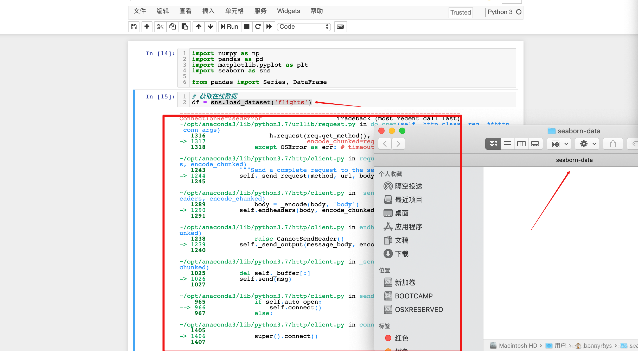
解决数据不存在
【解决sns加载数据报错】sns.load_dataset(“xxx”)报错
热力图
import numpy as np
import pandas as pd
import matplotlib.pyplot as plt
import seaborn as sns

from pandas import Series, DataFrame
# 获取在线数据
df = sns.load_dataset('flights')
df.head()
| year | month | passengers | |
|---|---|---|---|
| 0 | 1949 | January | 112 |
| 1 | 1949 | February | 118 |
| 2 | 1949 | March | 132 |
| 3 | 1949 | April | 129 |
| 4 | 1949 | May | 121 |
df.shape
(144, 3)
# 透视表(方便看一年的数据)
df = df.pivot(index='month', columns='year', values='passengers')
df
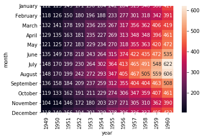
| year | 1949 | 1950 | 1951 | 1952 | 1953 | 1954 | 1955 | 1956 | 1957 | 1958 | 1959 | 1960 |
|---|---|---|---|---|---|---|---|---|---|---|---|---|
| month | ||||||||||||
| January | 112 | 115 | 145 | 171 | 196 | 204 | 242 | 284 | 315 | 340 | 360 | 417 |
| February | 118 | 126 | 150 | 180 | 196 | 188 | 233 | 277 | 301 | 318 | 342 | 391 |
| March | 132 | 141 | 178 | 193 | 236 | 235 | 267 | 317 | 356 | 362 | 406 | 419 |
| April | 129 | 135 | 163 | 181 | 235 | 227 | 269 | 313 | 348 | 348 | 396 | 461 |
| May | 121 | 125 | 172 | 183 | 229 | 234 | 270 | 318 | 355 | 363 | 420 | 472 |
| June | 135 | 149 | 178 | 218 | 243 | 264 | 315 | 374 | 422 | 435 | 472 | 535 |
| July | 148 | 170 | 199 | 230 | 264 | 302 | 364 | 413 | 465 | 491 | 548 | 622 |
| August | 148 | 170 | 199 | 242 | 272 | 293 | 347 | 405 | 467 | 505 | 559 | 606 |
| September | 136 | 158 | 184 | 209 | 237 | 259 | 312 | 355 | 404 | 404 | 463 | 508 |
| October | 119 | 133 | 162 | 191 | 211 | 229 | 274 | 306 | 347 | 359 | 407 | 461 |
| November | 104 | 114 | 146 | 172 | 180 | 203 | 237 | 271 | 305 | 310 | 362 | 390 |
| December | 118 | 140 | 166 | 194 | 201 | 229 | 278 | 306 | 336 | 337 | 405 | 432 |
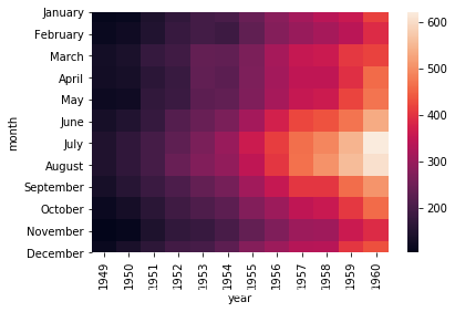
# 热力图(浅部分飞行次数多)
sns.heatmap(df)
<matplotlib.axes._subplots.AxesSubplot at 0x1a1bed4a50>
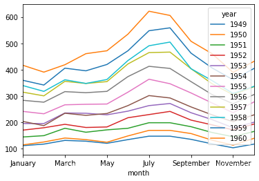
# df普通线性
df.plot()
<matplotlib.axes._subplots.AxesSubplot at 0x1a1de84e90>
sns.heatmap(df, annot=True, fmt='d')
<matplotlib.axes._subplots.AxesSubplot at 0x1a1e86f710>
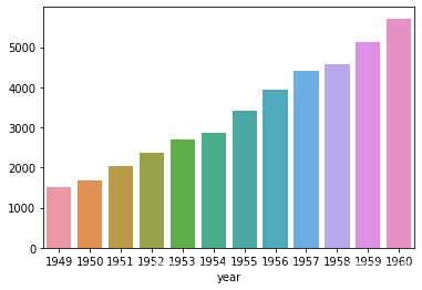
# 柱状图 每年飞行总和
s = df.sum()
s
year
1949    1520
1950    1676
1951    2042
1952    2364
1953    2700
1954    2867
1955    3408
1956    3939
1957    4421
1958    4572
1959    5140
1960    5714
dtype: int64
# 横坐标 年份
s.index
Int64Index([1949, 1950, 1951, 1952, 1953, 1954, 1955, 1956, 1957, 1958, 1959,
            1960],
           dtype='int64', name='year')
# 纵坐标 每年总和
s.values
array([1520, 1676, 2042, 2364, 2700, 2867, 3408, 3939, 4421, 4572, 5140,
       5714])
# sns柱状图
sns.barplot(x = s.index, y=s.values)
<matplotlib.axes._subplots.AxesSubplot at 0x1a1f704650>
# 柱状图-普通画
s.plot(kind="bar")
<matplotlib.axes._subplots.AxesSubplot at 0x1a1f892d10>

