直接上代码和图
`
import pandas as pd
unrate=pd.read_csv('unrate.csv')
#转化为日期格式
unrate['DATE']=pd.to_datetime(unrate['DATE'])`
import pandas
f=open("d:/机器学习训练营/train.csv")
train=pandas.read_csv(f)
Area=train['LotArea']
first=train[0:12]
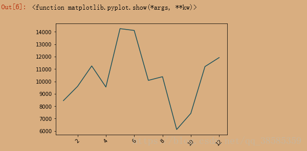
plt.plot(first['Id'],first['LotArea'])
plt.show
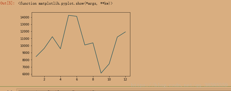
plt.plot(first['Id'],first['LotArea'])
plt.xticks(rotation=45)#将x坐标标识旋转45度
plt.show
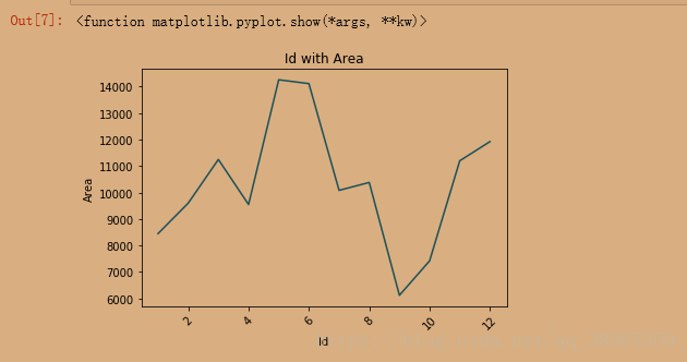
plt.plot(first['Id'],first['LotArea'])
plt.xticks(rotation=45)#将x坐标标识旋转45度
plt.xlabel('Id')
plt.ylabel('Area')
plt.title('Id with Area')
plt.show
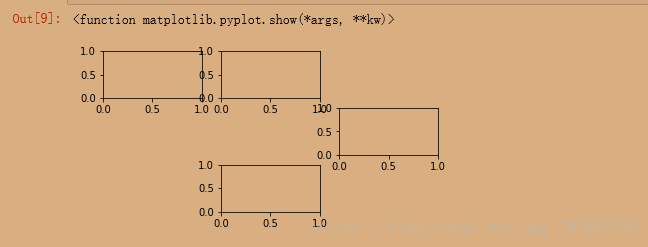
flg=plt.figure()
ax1=flg.add_subplot(4,3,1)
ax2=flg.add_subplot(4,3,2)
ax3=flg.add_subplot(4,3,6)
ax4=flg.add_subplot(4,3,8)
plt.show
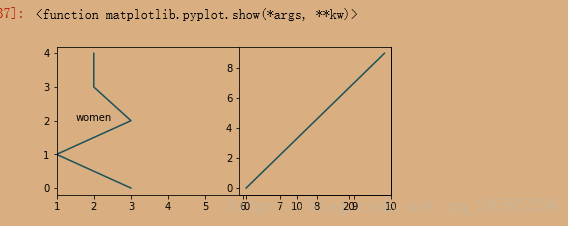
import numpy as np
fig=plt.figure(figsize=(6,6))#figsize调整图像大小
ax1=fig.add_subplot(2,1,1)
ax2=fig.add_subplot(2,2,2)
ax1.plot(np.random.randint(1,5,5),np.arange(5))
ax1.set_xlim(1,10)
ax1.text(1.5,2,"women")
ax2.plot(np.arange(10)*3,np.arange(10))
plt.show
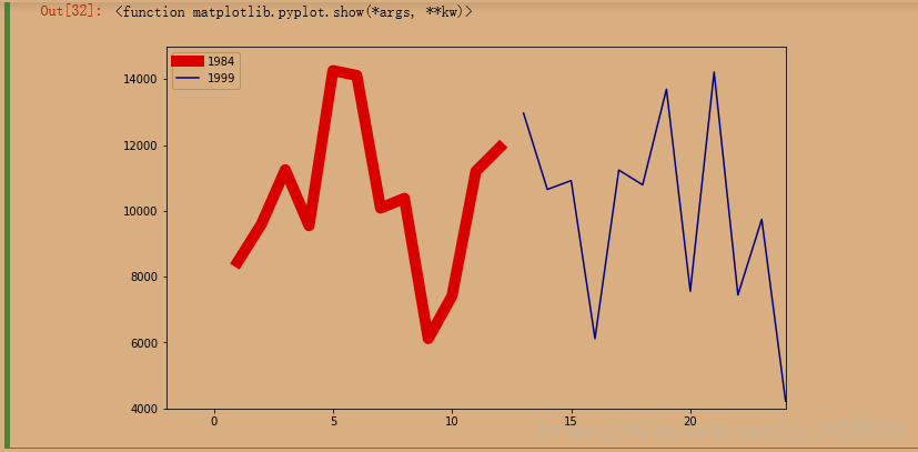
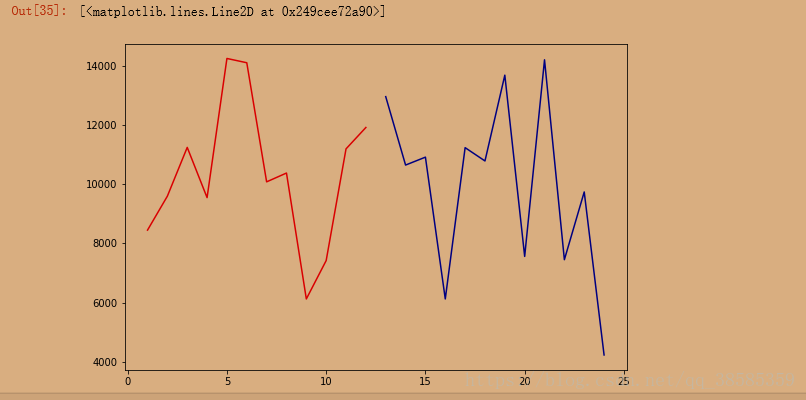
second=train[12:24]
fig=plt.figure(figsize=(9,6))#figsize调整图像大小
plt.plot(first['Id'],first['LotArea'],c='red')
plt.plot(second['Id'],second['LotArea'],c='blue')
fig=plt.figure(figsize=(10,6))#figsize调整图像大小
colors=['red','blue']
label1=str(1984)
label2=str(1999)
plt.xlim(-2,24)#设置横坐标范围
plt.ylim(4000,15000)
plt.plot(first['Id'],first['LotArea'],c='red',label='1984',linewidth=10)
plt.plot(second['Id'],second['LotArea'],c='blue',label='1999')
plt.legend(loc='best')#指定标识框摆放位置
plt.show