前言
在没有设置过transform-origin属性时,CSS变形进行的旋转、移位、缩放等操作都是以元素自己中心(变形原点/中心点)位置进行变形的。而CSS3 中的transform-origin属性用于设置旋转元素的基点位置,熟悉使用transform-origin并结合CSS3动画可以使元素沿着某一基点进行旋转,位移等,本文讲介绍transform-origin的定义和用法并尽可能的分析其原理,文中还将介绍应用到此属性的几个动画效果
定义和语法
语法
transform-origin: x-axis y-axis z-axis;
默认值
transform-origin:50% 50% 0;
单位
transform-origin属性值可以是百分比、em、px等具体的值,也可以是top、right、bottom、left和center这样的关键词。
属性值详解
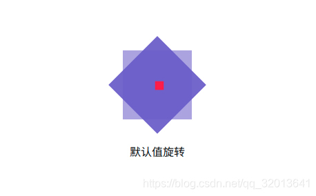
1.默认值,以自身原点旋转45deg
    .outer {
      width: 100px;
      height: 100px;
      background-color: #6a5acd8c;
    }
    .inner {
      transform: rotate(45deg);
      width: 100%;
      height: 100%;
      background-color: #6a5acdeb;
    }
2.以顶部旋转180deg
    .outer {
      width: 100px;
      height: 100px;
      background-color: #6a5acd8c;
    }
    .inner {
      transform: rotate(180deg);
      transform-origin:50% 0;
      width: 100%;
      height: 100%;
      background-color: #6a5acdeb;
    }

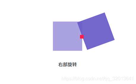
3.以右部旋转160deg
    .outer {
      width: 100px;
      height: 100px;
      background-color: #6a5acd8c;
    }
    .inner {
      transform: rotate(160deg);
      transform-origin:100% 50%;
      width: 100%;
      height: 100%;
      background-color: #6a5acdeb;
    }
4.左上角旋转10deg
    .outer {
      width: 100px;
      height: 100px;
      background-color: #6a5acd8c;
    }
    .inner {
      transform: rotate(10deg);
      transform-origin:0 0;
      width: 100%;
      height: 100%;
      background-color: #6a5acdeb;
    }

从以上的三个例子当中可以清楚地知道了transform-origin: x-axis y-axis;属性值的所代表的偏移位置,了解各属性值所代表的偏移位置后可以很灵活得使元素按照某一基准点进行旋转。
2D圆周环绕动画
为了更直观的观察其环绕的轨迹,特意作了两条横向和纵向的辅助线进行参考。
  <!DOCTYPE html>
<html>
<head>
  <meta charset="utf-8">
  <meta name="viewport" content="width=device-width,initial-scale=1.0">
  <title>transform-origin</title>
  <style>
    html,
    body {
      display: flex;
      flex-direction: column;
      justify-content: center;
      align-items: center;
      margin: 0 auto;
      height: 100%;
      width: 100%;
    }

    .outer {
      /**定义子元素水平居中**/
      display:flex;
      justify-content:center;
      width: 100px;
      height: 100px;
      background-color: #6a5acd8c;
      position:relative;
    }
    /**竖向辅助线**/
    .vertical-line{
      position:absolute;
      left:50%;
      transform:translateX(-50%);
      height:100%;
      width:1px;
      background:#000;
    }
    /**横向辅助线**/
    .horizontal-line{
      position:absolute;
      top:50%;
      transform:translateY(-50%);
      width:100%;
      height:1px;
      background:#000;
    }
    .inner {
      width:20px;
      height:20px;
      border-radius:50%;
      background-color: #6a5acdeb;
      transform-origin:50% 50px;/**50px为环绕半径*/
      animation:an-circle 3s ease-in-out infinite;
    }
    @keyframes an-circle  {
       to {
          transform: rotate(1turn);
       }
    }
  </style>
</head>
<body>
  <div class="outer">
    <div class="horizontal-line"></div>
    <div class="vertical-line"></div>
    <div class="inner"></div>
  </div>
  <br/>
  <p>圆周环绕动画</p>
</body>
</html>
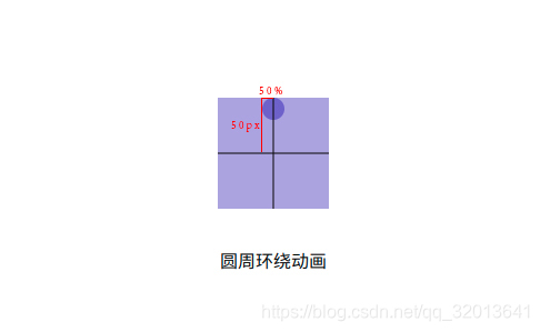
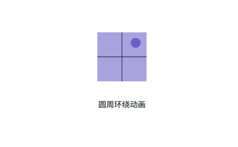
从上两个图可以很清楚的看到设置了transform-origin:50% 50px;元素的基点位置,以及最终的圆周环绕效果。
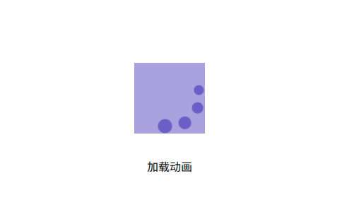
2D加载动画
<!DOCTYPE html>
<html>

<head>
  <meta charset="utf-8">
  <meta name="viewport" content="width=device-width,initial-scale=1.0">
  <title>transform-origin</title>
  <style>
    html,
    body {
      display: flex;
      flex-direction: column;
      justify-content: center;
      align-items: center;
      margin: 0 auto;
      height: 100%;
      width: 100%;
    }

    .outer {
      /**定义子元素水平居中**/
      display:flex;
      justify-content:center;
      width: 100px;
      height: 100px;
      background-color: #6a5acd8c;
      position:relative;
    }
    .inner {
      position:absolute;
      width:20px;
      height:20px;
      border-radius:50%;
      background-color: #6a5acdeb;
      transform-origin: 50% 50px;
      animation:an-circle 3s ease-in-out infinite;
    }
    .inner:nth-child(2){
      height:18px;
      width:18px;
      animation-delay:.2s;
    }
    .inner:nth-child(3){
      height:16px;
      width:16px;
      animation-delay:.4s;
    }
    .inner:nth-child(4){
      height:14px;
      width:14px;
      animation-delay:.6s;
    }
    @keyframes an-circle{
      to{
        transform:rotate(1turn);
      }
    }
  </style>
</head>
<body>
  <div class="outer">
    <div class="inner"></div>
    <div class="inner"></div>
    <div class="inner"></div>
    <div class="inner"></div>
  </div>
  <br/>
  <p>加载动画</p>
</body>
</html>