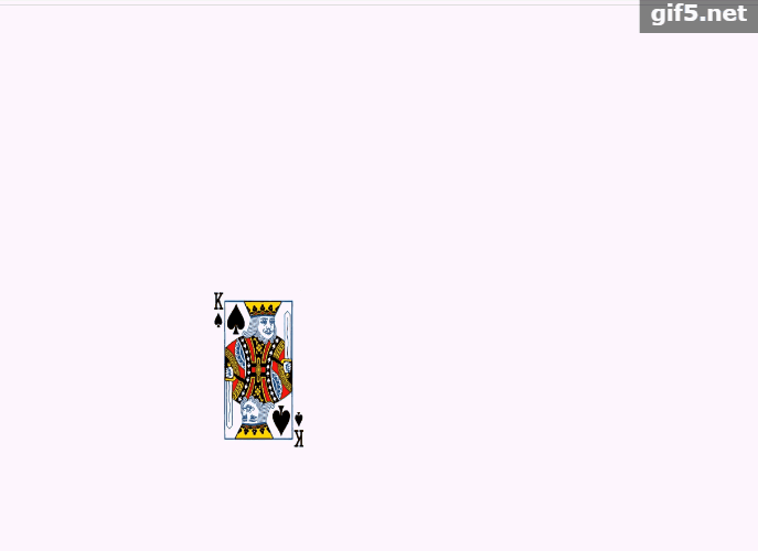
案例:鼠标经过时,扑克牌转动到各自角度。
目的:掌握transform-origin属性的使用。
效果展示:
代码:
<!DOCTYPE html>
<html lang="en">
<head>
	<meta charset="UTF-8">
	<title>旋转中心</title>
	<style>
		#container {
				width: 200px;
				height: 180px;
				margin: 300px auto;
				position: relative;
		}
		img {
			width: 100px;
			height: 180px;
			position: absolute;
			transition:transform 1s;
			transform-origin:top right;
		}
		#container:hover > img:nth-of-type(1){
			transform:rotate(60deg);
		}
		#container:hover > img:nth-of-type(2){
			transform:rotate(120deg);
		}
		#container:hover > img:nth-of-type(3){
			transform:rotate(180deg);
		}
		#container:hover > img:nth-of-type(4){
			transform:rotate(240deg);
		}
		#container:hover > img:nth-of-type(5){
			transform:rotate(300deg);
		}
		#container:hover > img:nth-of-type(6){
			transform:rotate(360deg);
		}
	</style>
</head>
<body>
	<div id="container">
		<img src="images/pk2.png" alt="">
		<img src="images/pk2.png" alt="">
		<img src="images/pk2.png" alt="">
		<img src="images/pk2.png" alt="">
		<img src="images/pk2.png" alt="">
		<img src="images/pk2.png" alt="">
	</div>
</body>
</html>