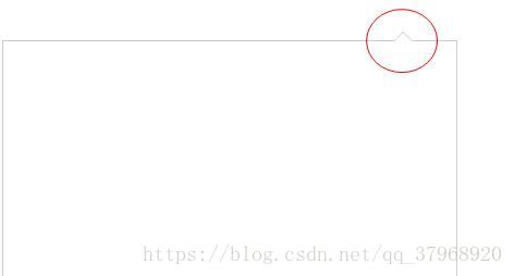
实例一:
<!DOCTYPE html>
<html lang="en">
<head>
    <meta charset="UTF-8">
    <title>Title</title>
</head>
<style>
    .find-div-body{
        position: relative;
        top:30px;
        right:0px;
        width:400px;
        height:200px;
        padding:8px;
        background-color: #FFFFFF;
        border: #cccccc solid 1px;
        border-radius: 3px;
    }
    .find-div-body:before{
        box-sizing: content-box;
        width: 0px;
        height: 0px;
        position: absolute;
        top: -16px;;
        right:41px;
        padding:0;
        border-bottom:8px solid #FFFFFF;
        border-top:8px solid transparent;
        border-left:8px solid transparent;
        border-right:8px solid transparent;
        display: block;
        content:'';
        z-index: 12;
    }
    .find-div-body:after{
        box-sizing: content-box;
        width: 0px;
        height: 0px;
        position: absolute;
        top: -18px;;
        right:40px;
        padding:0;
        border-bottom:9px solid #cccccc;
        border-top:9px solid transparent;
        border-left:9px solid transparent;
        border-right:9px solid transparent;
        display: block;
        content:'';
        z-index:10
    }
</style>
<body>
    <div class="find-div-body">
</div>

</body>
</html>
实现的效果如下图:
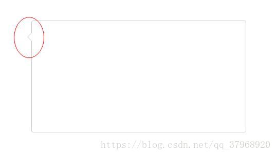
实例二:
<!DOCTYPE html>
<html lang="en">
<head>
    <meta charset="UTF-8">
    <title>Title</title>
</head>
<style>
    .find-div-body{
        position: relative;
        top:30px;
        left: 100px;
        width:400px;
        height:200px;
        padding:8px;
        background-color: #FFFFFF;
        border: #cccccc solid 1px;
        border-radius: 3px;
    }
    .find-div-body:before{
        box-sizing: content-box;
        width: 0px;
        height: 0px;
        position: absolute;
        top: 23px;;
        left: -16px;
        padding:0;
        border-right: 8px solid #FFFFFF;
        border-top:8px solid transparent;
        border-bottom: 8px solid transparent;
        border-left:8px solid transparent;
        display: block;
        content:'';
        z-index: 12;
    }
    .find-div-body:after{
        box-sizing: content-box;
        width: 0px;
        height: 0px;
        position: absolute;
        top: 22px;;
        left: -18px;
        padding:0;
        border-right: 9px solid #cccccc;
        border-top:9px solid transparent;
        border-bottom:9px solid transparent;
        border-left:9px solid transparent;
        display: block;
        content:'';
        z-index:10
    }
</style>
<body>
    <div class="find-div-body">
</div>

</body>
</html>
实现的效果如下图: