1.先画一个正方形,启发一下如何画上三角、下三角、左三角以及右三角。
<div class="square"></div>
.square{
 width: 0;
 height: 0;
 border-width: 100px;
 border-style: solid;
 border-color:#FFCCCC #0099CC #996699 #339933;
}
效果图如下: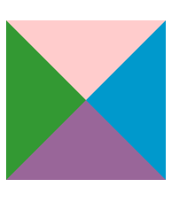
2.上三角画法:
<div class="triangle"></div>
.triangle{
 width: 0;
 height: 0;
 border-width: 100px;
 border-style: solid;
 border-color: transparent transparent #FFCCCC transparent;
}
3.下三角:
<div class="triangle"></div>
.triangle{
 width: 0;
 height: 0;
 border-width: 100px;
 border-style: solid;
 border-color: #ff0000 transparent transparent transparent;
}
4.左三角:
<div class="triangle"></div>
.triangle{
 width: 0;
 height: 0;
 border-width: 100px;
 border-style: solid;
 border-color:  transparent #ff0000 transparent transparent;
}
5.右三角:
<div class="triangle"></div>
.triangle{
 width: 0;
 height: 0;
 border-width: 100px;
 border-style: solid;
 border-color:  transparent transparent transparent  #ff0000;
}
6.伪类画三角形:
<div></div>
div{
    position: relative;
    width:220px;
    height:60px;
    margin:50px auto;
    padding:5px;
    border:1px solid #d9d9d9;
    border-radius:4px;
    box-sizing:border-box;
}
div:before{
    position:absolute;
    left:20px;
    top:0;
    margin-top:-20px;
    content:"";
    border:10px solid transparent;
    border-bottom-color:#d9d9d9;


}
div:after{
    position: absolute;
    top:0;
    left:20px;
    margin-top:-19px;
    content:"";
    border:10px solid transparent;
    border-bottom-color:#fff;
}
效果图如下: