python数据分析与可视化
–前言
–导入模块
–导入数据
–柱状图的绘制
–直方图的绘制
–箱型图的绘制
–折线图的绘制
–饼状图的绘制
前言
python可视化主要利用matplotlib模块和seaborn模块
这两个模块的绘图功能非常强大,大家可以参考这两个模块的官网进行深度学习,作者主要介绍经常用的功能,希望对大家有所帮助
matplot模块官网
https://matplotlib.org/
seaborn模块官网
http://seaborn.pydata.org/
导入模块
#绘图模块
import seaborn as sns
import matplotlib.pyplot as plt
导入数据
#读写excel全部数据
df = pd.read_csv("./data/HR.csv")
#只要含有空值就按行删除的方式删除异常值
df = df.dropna(axis=0,how="any")
#选择性的删除不和要求的异常值
df=df[df["last_evaluation"]<=1][df["salary"]!="name"][df["department"]!="sale"]
柱状图的绘制
绘制柱状图有两种方法
第一种利用我们熟悉的matplot模块的bar()函数绘制,编写的和我们熟悉的matlab环境几乎一下,非常容易上手。
#画柱状图    width = 0.5宽度设为0.5
plt.bar(np.arange(len(df["salary"].value_counts()))+0.5,df["salary"].value_counts(),width=0.5)
plt.title("SALARY")   #标题
plt.xlabel("salary")  #x,横坐标轴
plt.ylabel("Number")  #y,纵坐标轴
#x,横轴做标注  下面的都加+0.5是为了居中x轴的中心位置
plt.xticks(np.arange(len(df["salary"].value_counts()))+0.5,df["salary"].value_counts().index)
#x,y坐标轴的范围   x轴 [0 4] y轴[0 10000]
plt.axis([0,4,0,10000])
#标注每一个柱的数据   zip()打包,ha="center"数据标注在中心位置,va="bottom"垂直于底部
for x,y in zip(np.arange(len(df["salary"].value_counts()))+0.5,df["salary"].value_counts()):
    plt.text(x,y,y,ha ="center",va = "bottom")
#展现
plt.show()
第二种方法是利用seaborn模块的countplot()函数绘制,方法简单,可是要想绘制非常漂亮的图,设置的参数比较多,需要多加练习
#seaborn模块画柱状图
#背景改为黑背景白线的形式 style="darkgrid"
#背景改为白背景黑线的形式 style="whitegrid"
#作者设置的是白背景黑线的形式
sns.set_style(style="whitegrid")
#set_context()可以设置字体,字号
#context = "paper,poster,notebook,talk" ,字体
#font_scale = 0.8 字号
sns.set_context(context="poster",font_scale=0.8)
'''进入matplotlib的官网的colormaps选择自己喜欢的颜色,如"bwr"天蓝
https://matplotlib.org/tutorials/colors/colormaps.html#sphx-glr-tutorials-colors-colormaps-py
sns.set_palette("bwr")
'''
'''进入seaborn的color颜色块,调用的时候是数组,所以一定在调用的时候加上数组[]符号。
http://seaborn.pydata.org/generated/seaborn.color_palette.html#seaborn.color_palette
'''
#选择颜色sns.color_palette("RdBu", n_colors=7)表示数组
sns.set_palette(sns.color_palette("RdBu", n_colors=7))
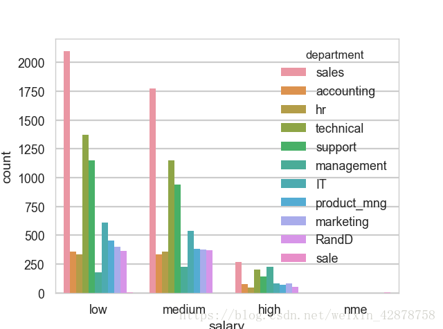
#柱状图的绘制,hue参数,表示在x的基础上,绘制更多的柱图
sns.countplot(x="salary",hue="department",data=df)
plt.show()绘制如下:
直方图的绘制
直方图和柱状图是有区别的。
直方图的柱图面积表示的是数量,所以有宽,有窄的图形。
而柱状图的高度表示数量,两个图形还是不一样的
利用seaborn的distplot()函数
#创建绘图窗口
f = plt.figure()
#建立1×3的绘图小窗口
f.add_subplot(1,3,1)
#直方图的绘制
#bins 表示分组  bins=10表示分10组
#kde=False  表示平滑的曲线不产生了
#hist=False 表示直方图就没有了
sns.distplot(df["satisfaction_level"],bins=10,#kde,hist参数填写)
f.add_subplot(1,3,2)
sns.distplot(df["last_evaluation"],bins =10)
f.add_subplot(1,3,3)
sns.distplot(df["average_monthly_hours"],bins = 10)
plt.show()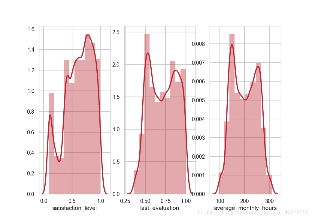
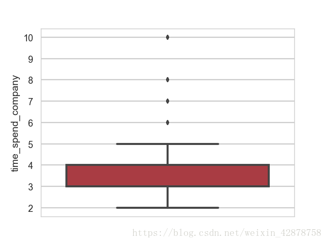
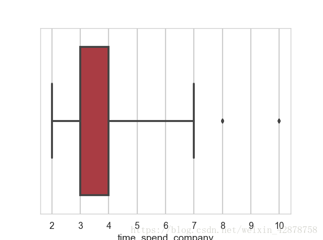
箱型图的绘制
利用seaborn模块的boxplot()函数
#绘制箱线图
#参数:saturation 圈定了方框的边界
#参数:whis 上分位数,再向上几倍 k =whis=1.5~3
#图一
#sns.boxplot(y =df["time_spend_company"])
#图二
sns.boxplot(x =df["time_spend_company"],saturation=0.75,whis=3)
plt.show()
图一
图二
折线图的绘制
利用seaborn模块的pointplot()函数
#绘制折线图
#第一种绘制方法
sub_df=df.groupby("time_spend_company").mean()
sns.pointplot(sub_df.index,sub_df["left"])
#第二种绘制方法
sns.pointplot(x="time_spend_company",y="left",data=df)
plt.show()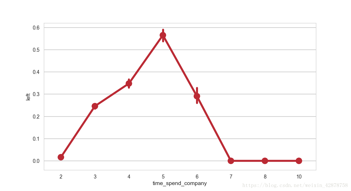
饼状图的绘制
seaborn模块不能绘制饼状图,只能利用matplotlib模块的pie()函数绘制
#修饰饼图,加注释
lbs = df["department"].value_counts().index
#突出强调“sales”的饼分布,与其他间隔0.1
#离开0.1的间隔,如果他等于“sales",否则就是0,然后遍历lbs
explodes=[0.1 if i=="sales"else 0 for i in lbs]
#plt.pie()饼图
#修饰labels,每一个扇形的名字
#修饰autopct 指定格式  %1.1%%  加上数字
#修饰,颜色,colors=ans.color_palette()
#修饰 explode 强调,,着重强调“sales”
plt.pie(df["department"].value_counts(normalize=True),explode=explodes,labels=lbs,autopct="%1.1f%%",colors=sns.color_palette("Reds"))
plt.show()
希望大家能喜欢,有什么不足的,恳请大家指正哦,有什么不懂的,留言哦,一起学习。