本文简单介绍如何使用vue-echarts画出多种颜色的柱状图:
- 搭建vue-cli 脚手架
- 安装vue-echarts依赖
- 引入vue-echarts
- 绘制图表
搭建vue-cli 脚手架
1.安装 vue(推荐使用淘宝镜像cnpm替换npm进行安装)
cnpm install vue2.全局安装 vue-cli 脚手架构建工具
cnpm install --global vue-cli3.创建项目
vue init <template-name> <project-name>template-name为模板名称,模板有webpack,webpack-simple ,browserify ,browserify-simple ,simple;project-name为项目名称。例如创建一个基于webpack模板,项目名称为my-project:
vue init webpack my-project4.按照提示进入项目、安装依赖和运行
cd my-project
cnpm install
npm run dev
安装vue-echarts依赖
cnpm install vue-echarts --save引入vue-echarts
全局引入会将所有的echarts图表打包,导致体积过大,这里推荐按需引入。
import ECharts from 'vue-echarts/components/ECharts';
require('echarts/lib/chart/bar');
绘制图表
<template>
<div>
<e-charts :options="chartOption"></e-charts>
</div>
</template>
<script>
import ECharts from 'vue-echarts/components/ECharts';
require('echarts/lib/chart/bar');
export default {
components: {ECharts},
data() {
return {
chartOption: {
grid: {left: 30, top: 30, right: 30, bottom: 30},
xAxis: {
type: 'category',
axisLine: {show: false},
axisTick: {show: false},
axisLabel: {color: '#999'},
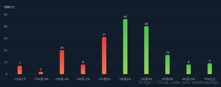
data: ['-10%以下', '-10%至-6%', '6%至-4%', '-4%至-2%', '-2%至0%', '0%至2%', '2%至4%', '4%至6%', '6%至10%', '10%以上']
},
yAxis: [
{
splitNumber: 5,
scale: true,
splitLine: {show: true, lineStyle: {color: ['#b6b6b6'], opacity: 0.1}},
axisLine: {show: false},
axisTick: {show: false},
type: 'value',
name: '',
nameTextStyle: {
fontFamily: 'MicrosoftYaHei',
fontSize: 12,
color: 'rgba(255,255,255,0.6)',
align: 'left'
},
nameGap: 25,
axisLabel: {formatter: '{value}', color: '#999'}
}
],
series: [
{
name: '收入',
type: 'bar',
stack: '总量',
label: {normal: {show: true, position: 'top', color: 'rgba(255,255,255,0.6)'}},
itemStyle: {
normal: {
barBorderRadius: 4,
color: {
type: 'linear',
x: 0,
y: 0,
x2: 0,
y2: 1,
colorStops: [{
offset: 0, color: '#E93D3D'
}, {
offset: 1, color: '#EE7B53'
}]
}}},
barWidth: 18,
data: [7, 2, 20, 8, 31, '-', '-', '-', '-', '-', '-']
},
{
name: '支出',
type: 'bar',
stack: '总量',
label: {normal: {show: true, position: 'top', color: 'rgba(255,255,255,0.6)'}},
itemStyle: {
normal: {
barBorderRadius: 4,
color: {
type: 'linear',
x: 0,
y: 0,
x2: 0,
y2: 1,
colorStops: [{
offset: 0, color: '#4CC453'
}, {
offset: 1, color: '#96D056'
}]
}}},
barWidth: 18,
data: ['-', '-', '-', '-', '-', '-', 46, 40, 16, 8, 9]
}
]
}
};
}
};
</script>
制作混色柱状图主要在于对series系列列表数据的处理,其它样式调整可详见echarts官网的配置项手册。 —— [ echarts配置项手册 ]