近期,在做项目的时候有涉及到柱状图的模块,所以在这里简单总结一下,有需要的朋友们可自行参考。说到柱状图这种图形模块,我们很自然的就想到了echarts 插件了,里面有格式各样的图形效果,可供我们使用。
echarts文档地址:https://echarts.apache.org/examples/zh/index.html#chart-type-bar
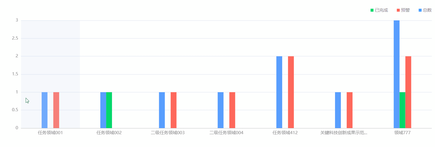
一、实现效果:
二、注意点
这里值得注意一点:当我们直接复制 echarts 里面的代码的时候,实现出来的效果是这样的,当横坐标的项很多的时候,会自动识别为双数的时候不显示横坐标文本,如下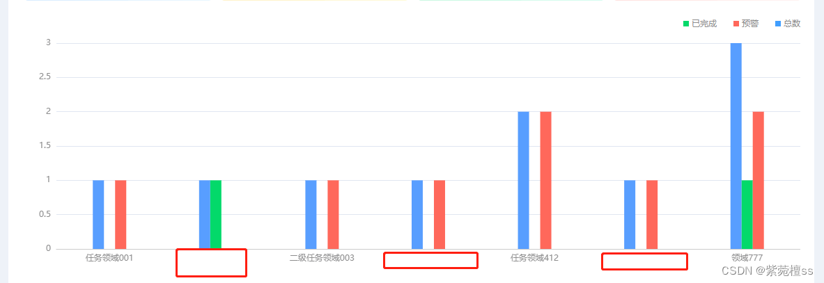
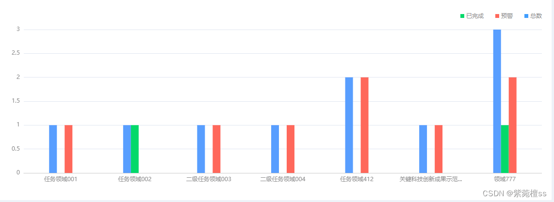
但是我们大多时候需要的是让它们都显示出来,这时候我们就需要在 xAxis 下面的 axisLabel 里面加上 interval: 0 ,即:
xAxis: [
    {


      type: "category",
      axisLabel: {


        interval: 0 // 让横坐标每一项都显示
      },
    },
  ]
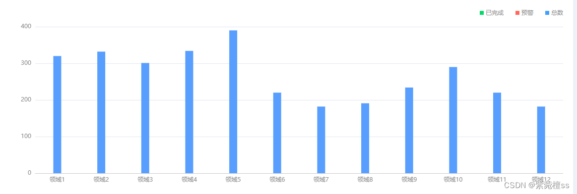
如果柱状图的横坐标只需要显示一条的话,只需要设置series 为一项就可以了,如下
 series: [
    {


      name: "总数",
      type: "bar",
      barGap: 0,
      barWidth: 16,
      color: ["#589EFF"],
      tooltip: {


        valueFormatter: function(value) {


          return value;
        },
      },
      data: [320, 332, 301, 334, 390, 220, 182, 191, 234, 290, 220, 182],
    }
 ]
// 或者
 series: {


    name: "总数",
    type: "bar",
    barGap: 0,
    barWidth: 16,
    color: ["#589EFF"],
    tooltip: {


      valueFormatter: function(value) {


        return value;
      },
    },
    data: [320, 332, 301, 334, 390, 220, 182, 191, 234, 290, 220, 182],
  }
三、完整代码
我这里用的是vue实现的,和使用js原生代码实现没多大区别。
<template>
  <div class="bar_label_rotation">
    <div id="barLabelRotation" style="width: 100%;height:100%;"></div>
  </div>
</template>
<script>
// 引入 echarts
import * as echarts from "echarts/core";
// 按需引入图表,需同步注册 echarts.use 使用
import {

     PieChart, BarChart, LineChart } from "echarts/charts";
// 引入提示框,标题,直角坐标系,数据集,内置数据转换器组件
import {


  TitleComponent,
  TooltipComponent,
  GridComponent,
  DatasetComponent,
  TransformComponent,
  ToolboxComponent,
  LegendComponent,
} from "echarts/components";
// 标签自动布局,全局过渡动画等特性
import {

     LabelLayout, UniversalTransition } from "echarts/features";
// 引入 Canvas 渲染器
import {

     CanvasRenderer } from "echarts/renderers";

// 注册必须的组件
echarts.use([
  TitleComponent,
  TooltipComponent,
  DatasetComponent,
  TransformComponent,
  GridComponent,
  ToolboxComponent,
  BarChart,
  LabelLayout,
  UniversalTransition,
  CanvasRenderer,
  LegendComponent,
  PieChart,
  LineChart,
]);

let option = {


  title: {


    text: " ",
    left: "center",
    top: 20,
  },
  // 是否显示悬浮窗
  tooltip: {


    trigger: "axis",
    axisPointer: {


      type: "shadow",
    },
    textStyle: {


      fontSize: 12,
      // fontWeight:'normal',
    },
  },
  // 设置echarts 的上下左右边距
  grid: {


    left: 20,
    right: 0,
    bottom: 24,
    top: 20,
    containLabel: true,
  },
  xAxis: [
    {


      type: "category", // 类别
      axisTick: {

     show: false },
      axisLabel: {


        color: "#8D8D8E",
        fontSize: "12px",
        interval: 0 // 让横坐标底部每项都显示文本
      },
      axisLine: {


        lineStyle: {


          color: "#CBCBCC"  // 横坐标线条颜色
        },
      },
      data: [  "领域1", "领域2",  "领域3",  "领域4",  "领域5",  "领域6", "领域7",  "领域8", "领域9",  "领域10",  "领域11",  "领域12" ],
    },
  ],
  yAxis: [
    {


      type: "value",
      axisLabel: {


        interval: 0,
        formatter: "{value}",
        color: "#8D8D8E", // 纵坐标文本颜色
        fontSize: "12px" // 纵坐标文本字体大小
      },
    },
  ],
  series: [
    {


      name: "总数", // 悬浮提示文本
      type: "bar",
      barGap: 0,
      barWidth: 16, // 柱状图宽度
      color: ["#589EFF"], // 设置柱状图背景色
      tooltip: {


        valueFormatter: function(value) {


          return value;
        },
      },
      data: [320, 332, 301, 334, 390, 220, 182, 191, 234, 290, 220, 182],
    },
    {


      name: "已完成",
      type: "bar",
      barWidth: 16,
      color: ["#03D96A"],
      tooltip: {


        valueFormatter: function(value) {


          return value;
        },
        textStyle: {


          fontWeight: "normal",
        },
      },
      title: {


        color: "red",
        fontWeight: "bold",
      },
      data: [220, 182, 191, 234, 290, 320, 332, 301, 334, 390, 220, 182],
    },
    {


      name: "预警",
      type: "bar",
      barWidth: 16,
      color: ["#FF685B"],
      tooltip: {


        valueFormatter: function(value) {


          return value;
        },
      },
      title: {


        fontWeight: "bold",
      },
      data: [150, 232, 201, 154, 190, 320, 332, 301, 334, 390, 220, 182],
    },
  ],
};
export default {


  name: "barLabelRotation",
  data() {


    return {


      property: "value",
    };
  },
  mounted() {


    let el = document.getElementById("barLabelRotation");
    // 初始化柱状图
    var myChart = echarts.init(el);
    option && myChart.setOption(option);
  },
};
</script>