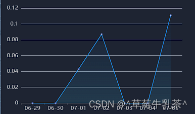
Echarts渲染折线图,修改折线图为渐变色

1、效果图

2、代码展示

 const option = ref({
        title: {
            text: '平均消警时长',
            textStyle: {
                fontSize: 18,
                fontWeight: 'normal',
                color: 'rgb(255,255,255,0.9)',
            },
        },
        tooltip: {
            trigger: 'axis',
            axisPointer: {
                type: 'cross',
                label: {
                    backgroundColor: '#fff',
                    fontSize: 16,
                },
            },
        },
        xAxis: {
            type: 'category',
            data: [],
            axisLabel: {
                fontSize: 16, // 设置 x 轴标签字体大小为 12
                color: '#ccc',
            },
        },
        yAxis: {
            type: 'value',
            axisLabel: {
                fontSize: 16, // 设置 x 轴标签字体大小为 12
                color: '#ccc',
            },
        },
        series: [
            {
                data: [],
                type: 'line',
                areaStyle: {
                    color: {
                        type: 'linear',
                        x: 2,
                        y: 2,
                        x2: 2,
                        y2: 0,
                        colorStops: [
                            {
                                offset: 0,
                                color: 'rgba(127, 255, 212, 0.4)', // 渐变起始颜色
                            },
                            {
                                offset: 1,
                                color: 'rgba(0, 128, 255, 0)', // 渐变结束颜色(透明)
                            },
                        ],
                    },
                },
                lineStyle: {
                    color: '#1e90ff', // 设置线条颜色
                    width: 2, // 设置线条宽度
                },
            },
        ],
    })

猜你喜欢

转载自blog.csdn.net/2301_76882889/article/details/131549773
今日推荐