文章目录
实验 09 线性回归与波士顿房价预测
一、实验目的
- 掌握机器学习的基本概念
- 掌握线性回归的实现过程
- 应用LinearRegression实现回归预测
- 知道回归算法的评估标准及其公式
- 知道过拟合与欠拟合的原因以及解决方法
二、实验设备
- Jupter Notebook
三、实验内容
人们在生活中经常遇到分类与预测的问题,目标变量可能受多个因素影响,根据相关系数可以判断影响因子的重要性。正如一个病人得某种病是多种因素影响造成的。
房子作为居住的场所,对每个人而言是不可或缺的。而房价的高低也是受多种因素的影响。房子所处的城市是一线还是二线,房子周边的交通便利程度,房子附近是否存在医院或者学校等,众多因素都会影响房价。
“回归”是由英国著名生物学家兼统计学家高尔顿(Francis Galton,1822~1911.生物学家达尔文的表弟)在研究人类遗传问题时提出来的。19世纪高斯系统地提出最小二乘估计,从而使回归分析得到蓬勃发展。
波士顿房价数据源于美国某经济学杂志上,分析研究波士顿房价( Boston HousePrice)的数据集。数据集中的每一行数据都是对波士顿周边或城镇房价的情况描述,本实验以波士顿房价数据集为线性回归案例数据,进行模型训练,预测波士顿房价。
3.1 了解数据
首先导入需要的包
import numpy as np
import matplotlib.pyplot as plt
import pandas as pd
import seaborn as sns
from sklearn.datasets import load_boston
from sklearn.model_selection import train_test_split
from sklearn.linear_model import LinearRegression
from sklearn import metrics
from sklearn import preprocessing
加载波士顿房价的数据集
data = load_boston()
data_pd = pd.DataFrame(data.data,columns=data.feature_names)
data_pd['price'] = data.target
在拿到数据之后,先要查看数据的类型,是否有空值,数据的描述信息等等。
可以看到数据都是定量数据。
# 查看数据类型
data_pd.describe()
| CRIM | ZN | INDUS | CHAS | NOX | RM | AGE | DIS | RAD | TAX | PTRATIO | B | LSTAT | price | |
|---|---|---|---|---|---|---|---|---|---|---|---|---|---|---|
| count | 506.000000 | 506.000000 | 506.000000 | 506.000000 | 506.000000 | 506.000000 | 506.000000 | 506.000000 | 506.000000 | 506.000000 | 506.000000 | 506.000000 | 506.000000 | 506.000000 |
| mean | 3.613524 | 11.363636 | 11.136779 | 0.069170 | 0.554695 | 6.284634 | 68.574901 | 3.795043 | 9.549407 | 408.237154 | 18.455534 | 356.674032 | 12.653063 | 22.532806 |
| std | 8.601545 | 23.322453 | 6.860353 | 0.253994 | 0.115878 | 0.702617 | 28.148861 | 2.105710 | 8.707259 | 168.537116 | 2.164946 | 91.294864 | 7.141062 | 9.197104 |
| min | 0.006320 | 0.000000 | 0.460000 | 0.000000 | 0.385000 | 3.561000 | 2.900000 | 1.129600 | 1.000000 | 187.000000 | 12.600000 | 0.320000 | 1.730000 | 5.000000 |
| 25% | 0.082045 | 0.000000 | 5.190000 | 0.000000 | 0.449000 | 5.885500 | 45.025000 | 2.100175 | 4.000000 | 279.000000 | 17.400000 | 375.377500 | 6.950000 | 17.025000 |
| 50% | 0.256510 | 0.000000 | 9.690000 | 0.000000 | 0.538000 | 6.208500 | 77.500000 | 3.207450 | 5.000000 | 330.000000 | 19.050000 | 391.440000 | 11.360000 | 21.200000 |
| 75% | 3.677083 | 12.500000 | 18.100000 | 0.000000 | 0.624000 | 6.623500 | 94.075000 | 5.188425 | 24.000000 | 666.000000 | 20.200000 | 396.225000 | 16.955000 | 25.000000 |
| max | 88.976200 | 100.000000 | 27.740000 | 1.000000 | 0.871000 | 8.780000 | 100.000000 | 12.126500 | 24.000000 | 711.000000 | 22.000000 | 396.900000 | 37.970000 | 50.000000 |
接下来要查看数据是否存在空值,从结果来看数据不存在空值。
# 查看空缺值
data_pd.isnull().sum()
CRIM       0
ZN         0
INDUS      0
CHAS       0
NOX        0
RM         0
AGE        0
DIS        0
RAD        0
TAX        0
PTRATIO    0
B          0
LSTAT      0
price      0
dtype: int64
可以看出来数据集中没有空缺值。
# 查看数据大小
data_pd.shape
(506, 14)
数据集有14列,506行
查看数据前5行,同时给出数据特征的含义
data_pd.head()
| CRIM | ZN | INDUS | CHAS | NOX | RM | AGE | DIS | RAD | TAX | PTRATIO | B | LSTAT | price | |
|---|---|---|---|---|---|---|---|---|---|---|---|---|---|---|
| 0 | 0.00632 | 18.0 | 2.31 | 0.0 | 0.538 | 6.575 | 65.2 | 4.0900 | 1.0 | 296.0 | 15.3 | 396.90 | 4.98 | 24.0 |
| 1 | 0.02731 | 0.0 | 7.07 | 0.0 | 0.469 | 6.421 | 78.9 | 4.9671 | 2.0 | 242.0 | 17.8 | 396.90 | 9.14 | 21.6 |
| 2 | 0.02729 | 0.0 | 7.07 | 0.0 | 0.469 | 7.185 | 61.1 | 4.9671 | 2.0 | 242.0 | 17.8 | 392.83 | 4.03 | 34.7 |
| 3 | 0.03237 | 0.0 | 2.18 | 0.0 | 0.458 | 6.998 | 45.8 | 6.0622 | 3.0 | 222.0 | 18.7 | 394.63 | 2.94 | 33.4 |
| 4 | 0.06905 | 0.0 | 2.18 | 0.0 | 0.458 | 7.147 | 54.2 | 6.0622 | 3.0 | 222.0 | 18.7 | 396.90 | 5.33 | 36.2 |
数据集变量说明下,方便大家理解数据集变量代表的意义。
- CRIM: 城镇人均犯罪率
- ZN: 住宅用地所占比例
- INDUS: 城镇中非住宅用地所占比例
- CHAS: 虚拟变量,用于回归分析
- NOX: 环保指数
- RM: 每栋住宅的房间数
- AGE: 1940 年以前建成的自住单位的比例
- DIS: 距离 5 个波士顿的就业中心的加权距离
- RAD: 距离高速公路的便利指数
- TAX: 每一万美元的不动产税率
- PTRATIO: 城镇中的教师学生比例
- B: 城镇中的黑人比例
- LSTAT: 地区中有多少房东属于低收入人群
- price: 自住房屋房价中位数(也就是均价)
3.2 分析数据
计算每一个特征和price的相关系数
data_pd.corr()['price']
CRIM      -0.388305
ZN         0.360445
INDUS     -0.483725
CHAS       0.175260
NOX       -0.427321
RM         0.695360
AGE       -0.376955
DIS        0.249929
RAD       -0.381626
TAX       -0.468536
PTRATIO   -0.507787
B          0.333461
LSTAT     -0.737663
price      1.000000
Name: price, dtype: float64
将相关系数绝对值大于0.5的特征画图显示出来:
corr = data_pd.corr()
corr = corr['price']
corr[abs(corr)>0.5].sort_values().plot.bar()
<matplotlib.axes._subplots.AxesSubplot at 0x13d1990e5e0>
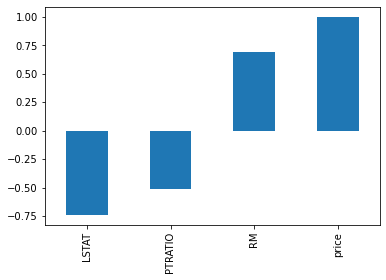
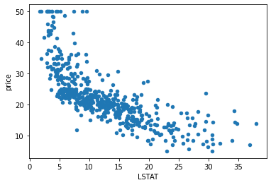
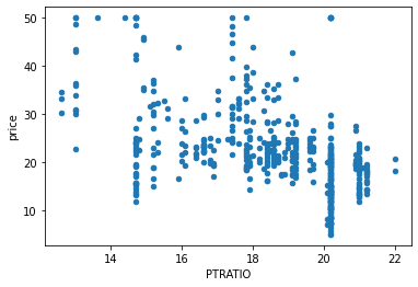
可以看出LSTAT、PTRATIO、RM三个特征的相关系数大于0.5,下面画出三个特征关于price的散点图。
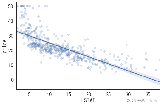
(1)LSTAT和price的散点图
data_pd.plot(kind="scatter",x="LSTAT",y="price")
<matplotlib.axes._subplots.AxesSubplot at 0x13d198bc3d0>
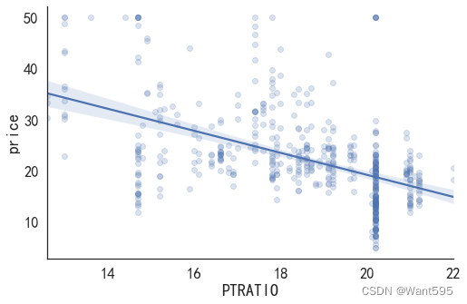
data_pd.plot(kind="scatter",x="PTRATIO",y="price")
<matplotlib.axes._subplots.AxesSubplot at 0x13d199dca60>
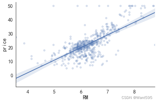
data_pd.plot(kind="scatter",x="RM",y="price")
<matplotlib.axes._subplots.AxesSubplot at 0x13d19a2f430>
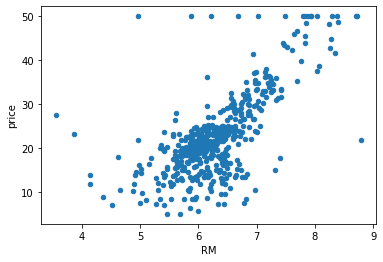
可以看出三个特征和价格都有明显的线性关系。
3.3 建立模型
(一)使用一个变量进行预测
(1)使用LASTAT做一元线性回归
首先制作训练集和测试集
# 制作训练集和测试集的数据
feature_cols = ['LSTAT']
X = data_pd[feature_cols]
y = data_pd['price']

# 分割训练集和测试集
train_X,test_X,train_Y,test_Y = train_test_split(X,y)
y.describe()
count    506.000000
mean      22.532806
std        9.197104
min        5.000000
25%       17.025000
50%       21.200000
75%       25.000000
max       50.000000
Name: price, dtype: float64
# 加载模型
linreg = LinearRegression()
# 拟合数据
linreg.fit(train_X,train_Y)

print(linreg.intercept_)

# pair the feature names with the coefficients
b=list(zip(feature_cols, linreg.coef_))
b
63.81849572918555

[('PTRATIO', -2.2442477329043706)]
# 进行预测
y_predict = linreg.predict(test_X)
# 计算均方根误差
print("均方根误差=",metrics.mean_squared_error(y_predict,test_Y))
均方根误差= 74.6287048997467
画图
import seaborn as sns #seaborn就是在matplot的基础上进行了进一步封装
sns.lmplot(x='LSTAT', y='price', data=data_pd, aspect=1.5, scatter_kws={

    'alpha':0.2})
<seaborn.axisgrid.FacetGrid at 0x13d1b0f5a00>
(2)使用PTRATIO做一元线性回归
# 制作训练集和测试集的数据
feature_cols = ['PTRATIO']
X = data_pd[feature_cols]
y = data_pd['price']

# 分割训练集和测试集
train_X,test_X,train_Y,test_Y = train_test_split(X,y)
# 加载模型
linreg = LinearRegression()
# 拟合数据
linreg.fit(train_X,train_Y)

print(linreg.intercept_)

# pair the feature names with the coefficients
b=list(zip(feature_cols, linreg.coef_))
b
61.54376809966996

[('PTRATIO', -2.1175617470715635)]
# 进行预测
y_predict = linreg.predict(test_X)
# 计算均方根误差
print("均方根误差=",metrics.mean_squared_error(y_predict,test_Y))
均方根误差= 54.541969092283985
画图
import seaborn as sns #seaborn就是在matplot的基础上进行了进一步封装
sns.lmplot(x='PTRATIO', y='price', data=data_pd, aspect=1.5, scatter_kws={

    'alpha':0.2})
<seaborn.axisgrid.FacetGrid at 0x13d1b140490>
(3)使用RM做一元线性回归
# 制作训练集和测试集的数据
feature_cols = ['RM']
X = data_pd[feature_cols]
y = data_pd['price']

# 分割训练集和测试集
train_X,test_X,train_Y,test_Y = train_test_split(X,y)
# 加载模型
linreg = LinearRegression()
# 拟合数据
linreg.fit(train_X,train_Y)

print(linreg.intercept_)

# pair the feature names with the coefficients
b=list(zip(feature_cols, linreg.coef_))
b
-32.662292886508155

[('RM', 8.738014969584246)]
# 进行预测
y_predict = linreg.predict(test_X)
# 计算均方根误差
print("均方根误差=",metrics.mean_squared_error(y_predict,test_Y))
均方根误差= 51.81438126437724
画图
import seaborn as sns #seaborn就是在matplot的基础上进行了进一步封装
sns.lmplot(x='RM', y='price', data=data_pd, aspect=1.5, scatter_kws={

    'alpha':0.2})
<seaborn.axisgrid.FacetGrid at 0x13d1b1addc0>
根据均方根误差进行模型比较
答案:RM一元回归分析的均方根误差最小,所以该模型最好
(二)使用多元线性回归分析进行预测
使用LSTAT,PTRATIO,RM做多元线性回归分析
首先制作训练集和测试集
# 制作训练集和测试集的数据
feature_cols = ['LSTAT','PTRATIO','RM']
X = data_pd[feature_cols]
y = data_pd['price']

# 分割训练集和测试集
train_X,test_X,train_Y,test_Y = train_test_split(X,y)
# 加载模型
linreg = LinearRegression()
# 拟合数据
linreg.fit(train_X,train_Y)

print(linreg.intercept_)

# pair the feature names with the coefficients
b=list(zip(feature_cols, linreg.coef_))
b
24.145147504479777

[('LSTAT', -0.6077646658186993),
 ('PTRATIO', -0.9890097312795556),
 ('RM', 3.894020674969254)]
# 进行预测
y_predict = linreg.predict(test_X)
# 计算均方根误差
print("均方根误差=",metrics.mean_squared_error(y_predict,test_Y))
均方根误差= 22.06146178562167
画图比较
将训练好的测试集和原始测试集绘图比较
import matplotlib.pyplot as plt
from matplotlib import rcParams
rcParams['font.sans-serif'] = 'SimHei'
fig = plt.figure(figsize=(10,6)) ##设定空白画布,并制定大小
##用不同的颜色表示不同数据
plt.plot(range(test_Y.shape[0]),test_Y,color="blue", linewidth=1.5, linestyle="-")
plt.plot(range(test_Y.shape[0]),y_predict,color="red", linewidth=1.5, linestyle="-.")
plt.legend(['真实值','预测值'])
plt.show() ##显示图片
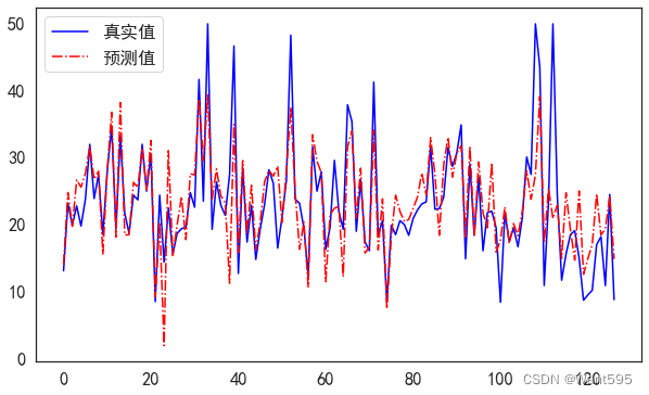
根据均方根误差进行模型比较
答案:多元线性回归分析的均方根误差最小,所以该模型最好