学Python数据科学,玩游戏、学日语、搞编程一条龙。
整套学习自学教程中应用的数据都是《三國志》、《真·三國無雙》系列游戏中的内容。
相关系数量化数据集的变量或特征之间的关联。这些统计数据对科学和技术非常重要,Python 有很好的工具可以用来计算它们。SciPy、NumPy 和Pandas相关方法以及数据可视化功能。

文章目录
相关性实现
统计和数据科学通常关注数据集的两个或多个变量(或特征)之间的关系。数据集中的每个数据点都是一个观察值,特征是这些观察值的属性或属性。
关于相关性的比较方式的理论部分可以参考。
这里主要介绍下面3种相关性的计算方式:
- Pearson’s r
- Spearman’s rho
- Kendall’s tau
NumPy 相关性计算
np.corrcoef() 返回 Pearson 相关系数矩阵。

import numpy as np
x = np.arange(10, 20)
x
array([10, 11, 12, 13, 14, 15, 16, 17, 18, 19])

y = np.array([2, 1, 4, 5, 8, 12, 18, 25, 96, 48])
y
array([ 2,  1,  4,  5,  8, 12, 18, 25, 96, 48])

r = np.corrcoef(x, y)
r
array([[1.        , 0.75864029],
       [0.75864029, 1.        ]])
SciPy 相关性计算
import numpy as np
import scipy.stats
x = np.arange(10, 20)
y = np.array([2, 1, 4, 5, 8, 12, 18, 25, 96, 48])
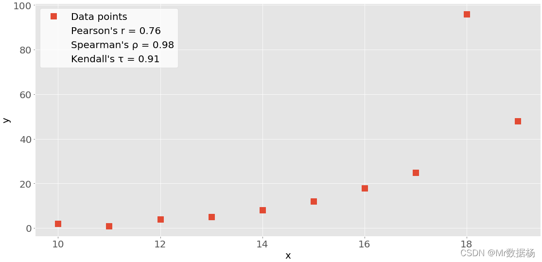
scipy.stats.pearsonr(x, y) # Pearson's r
(0.7586402890911869, 0.010964341301680832)
scipy.stats.spearmanr(x, y) # Spearman's rho
SpearmanrResult(correlation=0.9757575757575757, pvalue=1.4675461874042197e-06)
scipy.stats.kendalltau(x, y) # Kendall's tau
KendalltauResult(correlation=0.911111111111111, pvalue=2.9761904761904762e-05)
在检验假设时,您可以在统计方法中使用p 值。p 值是一项重要的衡量标准,需要深入了解概率和统计数据才能进行解释。
scipy.stats.pearsonr(x, y)[0]    # Pearson's r
0.7586402890911869
scipy.stats.spearmanr(x, y)[0]   # Spearman's rho
0.9757575757575757
scipy.stats.kendalltau(x, y)[0]  # Kendall's tau
0.911111111111111
Pandas 相关性计算
相对于来说计算比较简单。
import pandas as pd
x = pd.Series(range(10, 20))
y = pd.Series([2, 1, 4, 5, 8, 12, 18, 25, 96, 48])

x.corr(y)                     # Pearson's r
0.7586402890911867
y.corr(x)
0.7586402890911869
x.corr(y, method='spearman')  # Spearman's rho
0.9757575757575757
x.corr(y, method='kendall')   # Kendall's tau
0.911111111111111
线性相关实现
线性相关性测量变量或数据集特征之间的数学关系与线性函数的接近程度。如果两个特征之间的关系更接近某个线性函数,那么它们的线性相关性更强,相关系数的绝对值也更高。
线性回归:SciPy 实现
线性回归是寻找尽可能接近特征之间实际关系的线性函数的过程。换句话说,您确定最能描述特征之间关联的线性函数,这种线性函数也称为回归线。
import pandas as pd
x = pd.Series(range(10, 20))
y = pd.Series([2, 1, 4, 5, 8, 12, 18, 25, 96, 48])
使用scipy.stats.linregress()对两个长度相同的数组执行线性回归。
result = scipy.stats.linregress(x, y)
scipy.stats.linregress(xy)
LinregressResult(slope=7.4363636363636365, intercept=-85.92727272727274, rvalue=0.7586402890911869, pvalue=0.010964341301680825, stderr=2.257878767543913)

result.slope # 回归线的斜率
7.4363636363636365

result.intercept # 回归线的截距
-85.92727272727274

result.rvalue # 相关系数
0.7586402890911869

result.pvalue #  p值
0.010964341301680825

result.stderr # 估计梯度的标准误差
2.257878767543913
未来更多内容参考机器学习专栏中的线性回归内容。
等级相关
比较与两个变量或数据集特征相关的数据的排名或排序。如果排序相似则相关性强、正且高。但是如果顺序接近反转,则相关性为强、负和低。换句话说等级相关性仅与值的顺序有关,而不与数据集中的特定值有关。
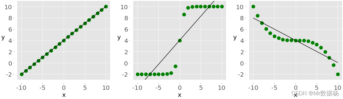
图1和图2显示了较大的 x 值始终对应于较大的 y 值的观察结果,这是完美的正等级相关。图3说明了相反的情况即完美的负等级相关。
排名:SciPy 实现
使用 scipy.stats.rankdata() 来确定数组中每个值的排名。
import numpy as np
import scipy.stats
x = np.arange(10, 20)
y = np.array([2, 1, 4, 5, 8, 12, 18, 25, 96, 48])
z = np.array([5, 3, 2, 1, 0, -2, -8, -11, -15, -16])

# 获取排名序
scipy.stats.rankdata(x)  # 单调递增
array([ 1.,  2.,  3.,  4.,  5.,  6.,  7.,  8.,  9., 10.])
scipy.stats.rankdata(y)
array([ 2.,  1.,  3.,  4.,  5.,  6.,  7.,  8., 10.,  9.])
scipy.stats.rankdata(z) # 单调递减
array([10.,  9.,  8.,  7.,  6.,  5.,  4.,  3.,  2.,  1.])
rankdata() 将nan值视为极大。
scipy.stats.rankdata([8, np.nan, 0, 2])
array([3., 4., 1., 2.])
等级相关性:NumPy 和 SciPy 实现
使用 scipy.stats.spearmanr() 计算 Spearman 相关系数。
result = scipy.stats.spearmanr(x, y)
result
SpearmanrResult(correlation=0.9757575757575757, pvalue=1.4675461874042197e-06)

result.correlation
0.9757575757575757

result.pvalue
1.4675461874042197e-06

rho, p = scipy.stats.spearmanr(x, y)
rho
0.9757575757575757

p
1.4675461874042197e-06
等级相关性:Pandas 实现
使用 Pandas 计算 Spearman 和 Kendall 相关系数。
import numpy as np
import scipy.stats
x = np.arange(10, 20)
y = np.array([2, 1, 4, 5, 8, 12, 18, 25, 96, 48])
z = np.array([5, 3, 2, 1, 0, -2, -8, -11, -15, -16])

x, y, z = pd.Series(x), pd.Series(y), pd.Series(z)
xy = pd.DataFrame({

    'x-values': x, 'y-values': y})
xyz = pd.DataFrame({

    'x-values': x, 'y-values': y, 'z-values': z})
计算 Spearman 的 rho,method=spearman。
x.corr(y, method='spearman')
0.9757575757575757

xy.corr(method='spearman')
          x-values  y-values
x-values  1.000000  0.975758
y-values  0.975758  1.000000

xyz.corr(method='spearman')
          x-values  y-values  z-values
x-values  1.000000  0.975758 -1.000000
y-values  0.975758  1.000000 -0.975758
z-values -1.000000 -0.975758  1.000000

xy.corrwith(z, method='spearman')
x-values   -1.000000
y-values   -0.975758
dtype: float64
计算 Kendall 的 tau, method=kendall。
x.corr(y, method='kendall')
0.911111111111111

xy.corr(method='kendall')
          x-values  y-values
x-values  1.000000  0.911111
y-values  0.911111  1.000000

xyz.corr(method='kendall')
          x-values  y-values  z-values
x-values  1.000000  0.911111 -1.000000
y-values  0.911111  1.000000 -0.911111
z-values -1.000000 -0.911111  1.000000

xy.corrwith(z, method='kendall')
x-values   -1.000000
y-values   -0.911111
dtype: float64
相关性的可视化
数据可视化在统计学和数据科学中非常重要。可以帮助更好地理解的数据,并更好地了解特征之间的关系。
这里使用 matplotlib 来进行数据可视化。
import matplotlib.pyplot as plt
plt.style.use('ggplot')

import numpy as np
import scipy.stats
x = np.arange(10, 20)
y = np.array([2, 1, 4, 5, 8, 12, 18, 25, 96, 48])
z = np.array([5, 3, 2, 1, 0, -2, -8, -11, -15, -16])
xyz = np.array([[10, 11, 12, 13, 14, 15, 16, 17, 18, 19],
                [2, 1, 4, 5, 8, 12, 18, 25, 96, 48],
                [5, 3, 2, 1, 0, -2, -8, -11, -15, -16]])
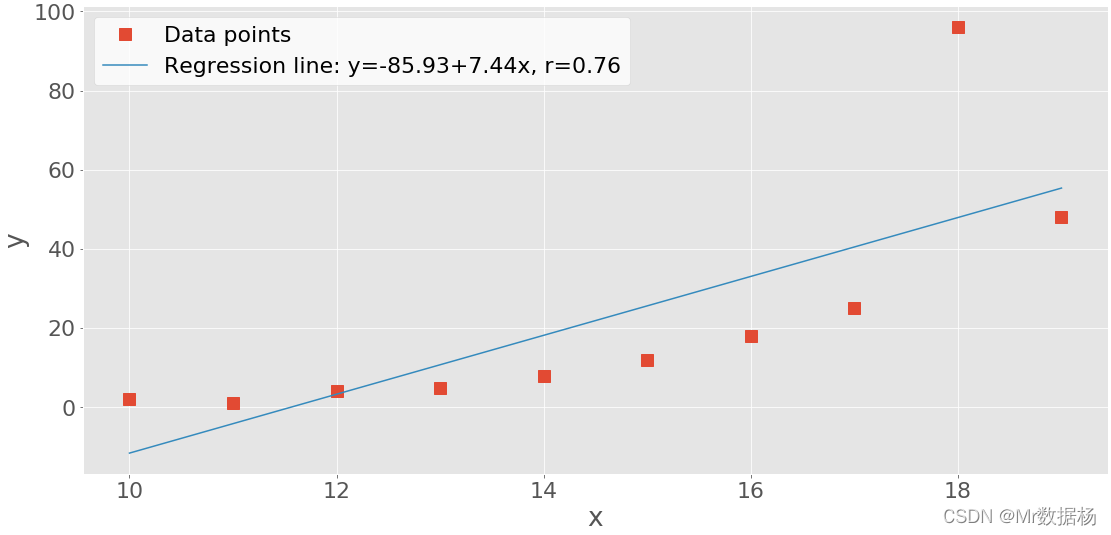
带有回归线的 XY 图
使用 linregress() 获得回归线的斜率和截距,以及相关系数。
slope, intercept, r, p, stderr = scipy.stats.linregress(x, y)
构建线性回归公式。
line = f' y={

      intercept:.2f}+{

      slope:.2f}x, r={

      r:.2f}'
line
'y=-85.93+7.44x, r=0.76'
.plot() 绘图。
fig, ax = plt.subplots()
ax.plot(x, y, linewidth=0, marker='s', label='Data points')
ax.plot(x, intercept + slope * x, label=line)
ax.set_xlabel('x')
ax.set_ylabel('y')
ax.legend(facecolor='white')
plt.show()
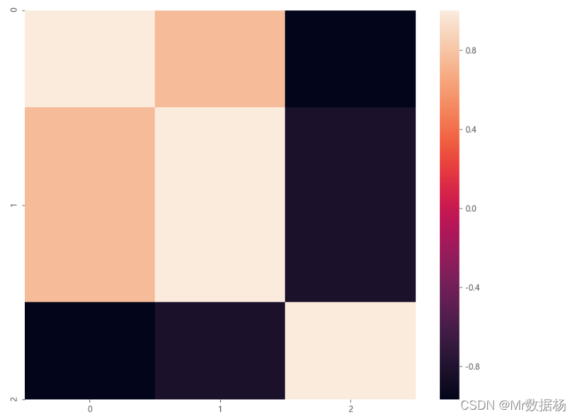
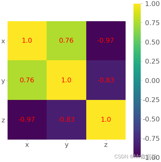
相关矩阵的热图 matplotlib
处理特征较多的相关矩阵用热图方式比较理想。
corr_matrix = np.corrcoef(xyz).round(decimals=2)
corr_matrix
array([[ 1.  ,  0.76, -0.97],
       [ 0.76,  1.  , -0.83],
       [-0.97, -0.83,  1.  ]])
其中为了表示方便将相关的数据四舍五入后用 .imshow() 绘制。
fig, ax = plt.subplots()
im = ax.imshow(corr_matrix)
im.set_clim(-1, 1)
ax.grid(False)
ax.xaxis.set(ticks=(0, 1, 2), ticklabels=('x', 'y', 'z'))
ax.yaxis.set(ticks=(0, 1, 2), ticklabels=('x', 'y', 'z'))
ax.set_ylim(2.5, -0.5)
for i in range(3):
    for j in range(3):
        ax.text(j, i, corr_matrix[i, j], ha='center', va='center',
                color='r')
cbar = ax.figure.colorbar(im, ax=ax, format='% .2f')
plt.show()
相关矩阵的热图 seaborn
import seaborn as sns

plt.figure(figsize=(11, 9),dpi=100)
sns.heatmap(data=corr_matrix,
            annot_kws={

    'size':8,'weight':'normal', 'color':'#253D24'},#数字属性设置,例如字号、磅值、颜色
           )