近来实验室的师姐要发论文,由于论文交稿时间临近,有一些杂活儿需要处理,作为实验室资历最浅的一批,我这个实习生也就责无旁贷地帮忙当个下手。今天师姐派了一个小活,具体要求是:
给一些训练模型的迭代次数,训练精度的数据,让我做成图表形式展示出来,一方面帮助检查模型训练时的不足,另一方面来看样本数目和预测精度之间的联系,数据具体格式如下:
Iteration 1500
label train test right acc
12 143 24 24 1.0
160 92 16 15 0.9375
100 12 2 0 0.0
142 0 0 0 0.0
152 0 0 0 0.0
110 10 2 0 0.0
170 12 2 2 1.0
42 421 70 63 0.9
31 43 8 5 0.625
22 132 22 18 0.818181818182
60 51 9 8 0.888888888889
51 916 153 143 0.934640522876
131 82 14 11 0.785714285714
53 84 14 10 0.714285714286
70 9 2 2 1.0
21 531 89 89 1.0
120 1 1 1 1.0
11 454 76 71 0.934210526316
90 1 1 1 1.0
32 39 7 6 0.857142857143
41 151 25 14 0.56
132 0 0 0 0.0
151 43 7 6 0.857142857143
43 8 2 1 0.5
80 7 2 1 0.5
141 96 16 16 1.0
44 67 12 2 0.166666666667
right: 509 accuracy:0.883680555556
我的任务就是以label为自变量,绘制出它和train及acc之间的关系。
接到这个任务后,最直观的感受就是常规的洗数据,于是我先把这些数据放在txt文件中存储下来,由于每个数据之间的间隔大于一个空格,我想当然地写个正则匹配脚本将数据间的大空格转换为一个逗号(转换为逗号的目的是这样可以直接转换为CSV表格文件,然而在本次任务中貌似意义不大….)
#**********************Python 3.6.1***************************#
#*            将txt文本数据中的过长的空格更为一个逗号           *#
#*****************   Author LQ  ******************************#
#********************** 2018/4/4  ****************************#

#!/usr/bin/python
# -*- coding: utf-8 -*-
import re
import os #os模块与文本操作直接相关的模块
#*********下面三句代码作用不详,就是为了防止出现编码问题*********
import importlib
import sys
importlib.reload(sys)
#****************************************************
PATTERN = '\s+'#匹配出文本中的长空格
class Cleaner:
    #初始化
    def __init__(self):
        os.chdir('D:\\Learning\\Machine_Learning\\实习\\师姐论文实验') #改变工作目录到txt文件对应的目录
        self.content = open("acc-onlyRealImage-Iter2500.txt")

    def grab_content(self):
        line=self.content.readline()
        pre=re.compile(PATTERN)
        while line:
            line_1=pre.sub(',',line) #将文本的长空格转换为逗号后,利于转成CSV格式,然后label按照升序排列
            self.Write_content(line_1)
            line = self.content.readline()

    def Write_content(self,line_1):
        path='acc-onlyRealImage-Iter2500-after.txt'
        f=open(path,'a')
        f.write('\n'+line_1)

    def run(self):
        self.grab_content()


if __name__ == '__main__':
    cleaner = Cleaner()
    cleaner.run()
数据清洗完成后,自然就是绘图了,逛了一些博客后,着手写个脚本,第一版是绘制出label和train及acc的双Y轴折线图,脚本较为简单,就是调用别人造的轮子,直接附上代码:
#**********************Python 3.6.1***************************#
#*                      绘制出双Y轴折线图                      *#
#*****************   Author LQ  ******************************#
#********************** 2018/4/4  ****************************#

#!/usr/bin/python
# -*- coding: utf-8 -*-
import re
import os #os模块与文本操作直接相关的模块
import matplotlib.pyplot as plt
import numpy as np
#*********下面三句代码作用不详,就是为了防止出现编码问题*********
import importlib
import sys
importlib.reload(sys)
#****************************************************
font2 = {'family' : 'Times New Roman',
         'weight' : 'normal',
         'size'   : 18,
        }

class Drawing:
    #初始化
    def __init__(self):
        os.chdir('D:\\Learning\\Machine_Learning\\实习\\师姐论文实验') #改变工作目录到指定文件目录
        self.content = open("acc-onlyRealImage-Iter2200-after.txt")
        self.content1 = open("acc-onlyRealImage-Iter2500-after.txt")

    def grab_content(self):
        lines=self.content.readlines()
        lines_1=self.content1.readlines()
        x_1 = [line.strip().split(',')[0] for line in lines ]#字段以逗号分隔,这里取得是第4列
        y_train_1=[line.strip().split(',')[1] for line in lines ]
        y_train_2=[line.strip().split(',')[1] for line in lines_1 ]
        y_acc_1=[line.strip().split(',')[4] for line in lines ]
        y_acc_2=[line.strip().split(',')[4] for line in lines_1 ]
        x = list(range(len(x_1)))
        y_acc=[]
        y_acc1=[]
        y_train=[]
        y_train1=[]
        for i in range(len(y_acc_1)):
            y_acc.append(float(y_acc_1[i]))
            y_acc1.append(float(y_acc_2[i]))
            y_train.append(int(y_train_1[i]))
            y_train1.append(int(y_train_2[i]))

        #plt.xticks(x, x_1,rotation=0)
        fig,left_axis=plt.subplots()

        p1, =left_axis.plot(x, y_train,'ro-')
        right_axis = left_axis.twinx()
        p2, =right_axis.plot(x, y_acc,'bo-')
        plt.xticks(x, x_1,rotation=0) #设置x轴的显示形式

        #设置左坐标轴以及右坐标轴的范围、精度
        left_axis.set_ylim(0,1201)
        left_axis.set_yticks(np.arange(0,1201,200))
        right_axis.set_ylim(0,1.01)
        right_axis.set_yticks(np.arange(0,1.01,0.20))

        #设置坐标及标题的大小、颜色
        left_axis.set_title('RealAndSimulation-Iter6600',font2)
        left_axis.set_xlabel('Labels',font2)
        left_axis.set_ylabel('Number of training sets',font2,color='r')
        left_axis.tick_params(axis='y', colors='r')
        right_axis.set_ylabel('Accuracy',font2,color='b')
        right_axis.tick_params(axis='y', colors='b')
        plt.show()

    def run(self):
        self.grab_content()

if __name__ == '__main__':
    Drawing = Drawing()
    Drawing.run()
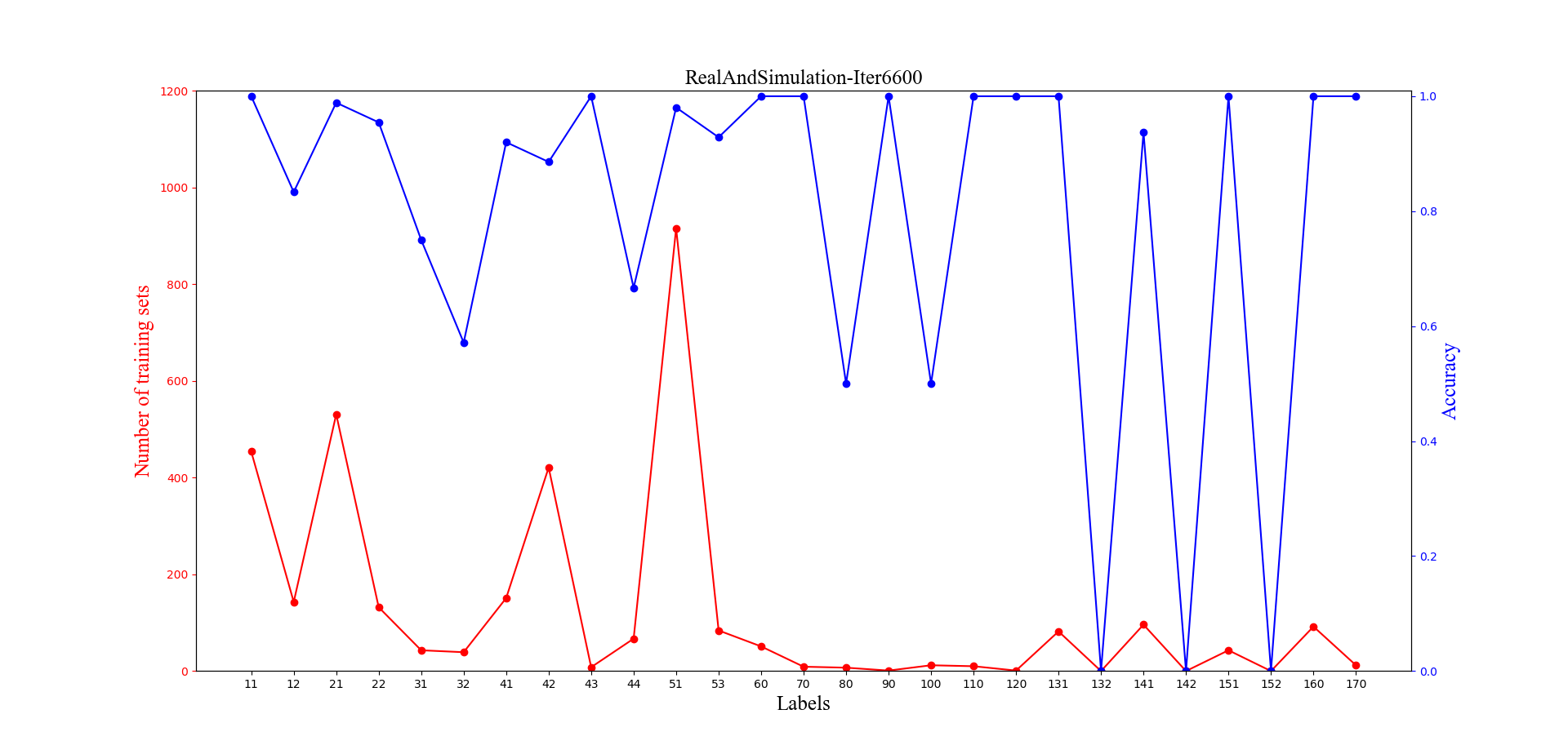
绘制出的图形如上所示,其实看起来也还不错,不过师姐表示有点乱,建议做个柱形的看看,于是继续撸代码:
#**********************Python 3.6.1***************************#
#*                     绘制单Y轴双变量柱状图                   *#
#*****************   Author LQ  ******************************#
#********************** 2018/4/4  ****************************#

#!/usr/bin/python
# -*- coding: utf-8 -*-
import re
import os #os模块与文本操作直接相关的模块
import matplotlib.pyplot as plt
import numpy as np
#*********下面三句代码作用不详,就是为了防止出现编码问题*********
import importlib
import sys
importlib.reload(sys)
#****************************************************
font2 = {'family' : 'Times New Roman',   #设置字体
         'weight' : 'normal',
         'size'   : 18,
        }

class Drawing:
    #初始化
    def __init__(self):
        os.chdir('D:\\Learning\\Machine_Learning\\实习\\师姐论文实验') #改变工作目录到指定文件的目录
        self.content = open("acc-onlyRealImage-Iter2200-after.txt")
        self.content1 = open("acc-onlyRealImage-Iter2500-after.txt")

    def autolabel(self,rects,y): #在柱状图上面添加 数值
        i=0
        for rect in rects:
            #读出列表存储的value值
            value=y[i]
            x_1 = rect.get_x() + rect.get_width()/2
            y_1 = rect.get_height()
            #x_1,y_1对应柱形的横、纵坐标
            i+=1
            plt.text(x_1, y_1, value, ha='center', va='bottom',fontdict={'size': 8}) #在fontdict中设置字体大小
            rect.set_edgecolor('white')

    def Pictures(self):
        lines=self.content.readlines()
        lines_1=self.content1.readlines()
        x_1 = [line.strip().split(',')[0] for line in lines ]#字段以逗号分隔,这里取得是第1列
        y_train_1=[line.strip().split(',')[1] for line in lines ]
        y_train_2=[line.strip().split(',')[1] for line in lines_1 ]
        y_acc_1=[line.strip().split(',')[4] for line in lines ]
        y_acc_2=[line.strip().split(',')[4] for line in lines_1 ]
        x = list(range(len(x_1)))
        y_acc=[]
        y_acc1=[]
        y_train=[]
        y_train1=[]
        for i in range(len(y_acc_1)):
            y_acc.append(float(y_acc_1[i]))
            y_acc1.append(float(y_acc_2[i]))
            y_train.append(int(y_train_1[i]))
            y_train1.append(int(y_train_2[i]))
        plt.xticks(x, x_1,rotation=0) #设置X轴坐标值为label值

        for i in range(len(x)): #调整柱状图的横坐标,使得打印出来的图形看起来更加舒服
            x[i] = x[i] -0.2
        a=plt.bar(x, y_train,width=0.4,label='iter2200',fc = 'b')
        #a=plt.bar(x, y_acc,width=0.4,label='iter2200',fc = 'b')
        for i in range(len(x)):
            x[i] = x[i] + 0.4
        b=plt.bar(x, y_train1, width=0.4, label='iter2500',fc = 'r')
        #b=plt.bar(x, y_acc1, width=0.4, label='iter2500',fc = 'r')
        plt.xlabel('Labels',font2)
        #设置Y轴值的范围
        plt.ylim((0, 1000))
        #设置Y轴的刻度值
        plt.yticks(np.arange(0,1001, 200))
        #plt.ylim((0, 1.1))
        #plt.yticks(np.arange(0,1.1, 0.2))
        #plt.ylabel('Accuracy',font2)
        plt.ylabel('Number of training sets',font2) #字体的格式在font2中有设置
        self.autolabel(a,y_train_1) #为柱形图打上数值标签
        self.autolabel(b,y_train_2)
        #self.autolabel(a,y_acc_1)
        #self.autolabel(b,y_acc_2)
        #plt.title("RealAndSimulation",font2)
        plt.title("OnlyRealImage",font2)
        plt.legend()
        plt.show()

    def run(self):
        self.Pictures()

if __name__ == '__main__':
    Draw = Drawing()
    Draw.run()
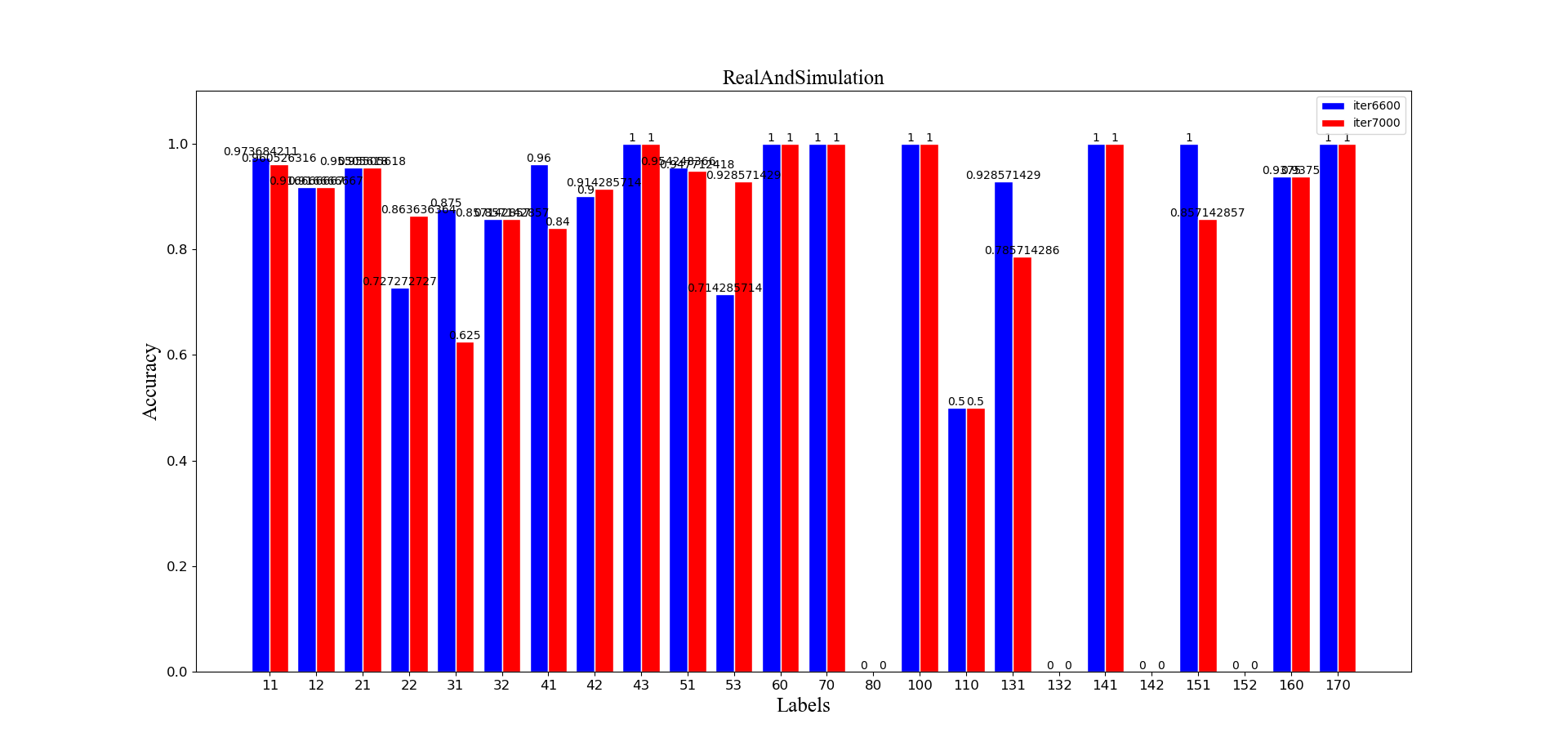
呈现的效果如下,此处因为对于双柱形图通常采用同一Y轴坐标系,所以此处选择的是比对不同迭代次数:
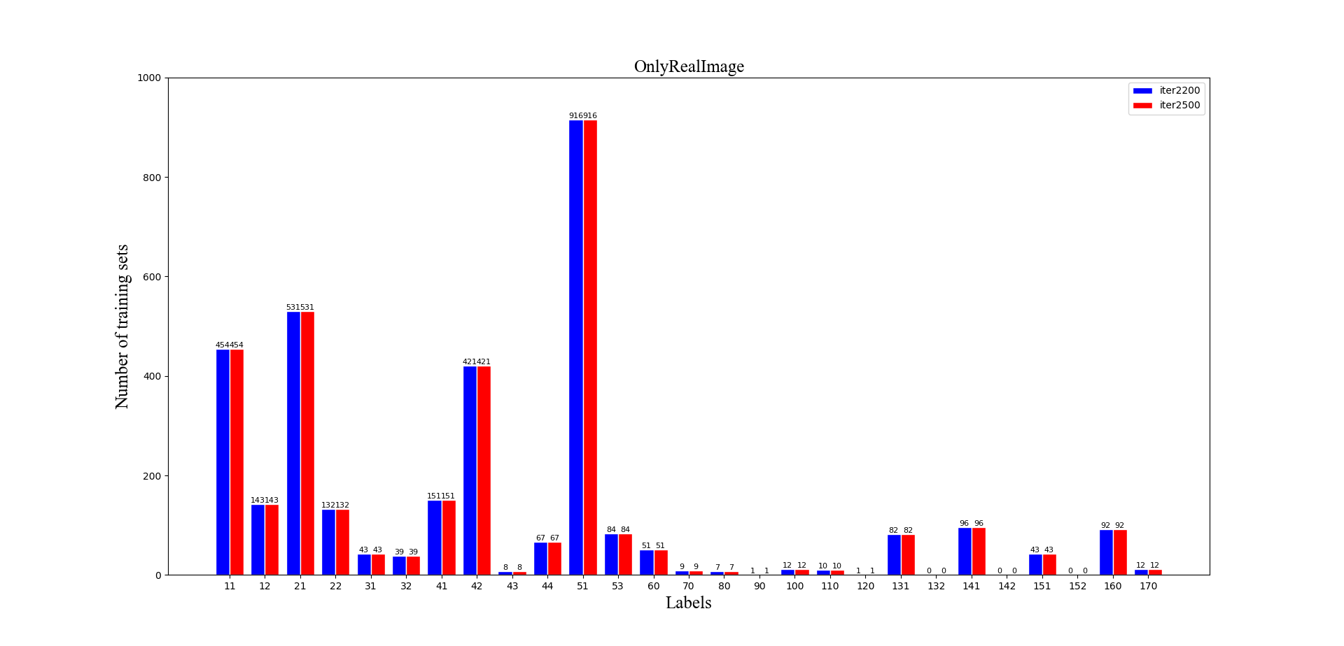
此处为了方便实验结果的观测,在每个柱形上面均打印出了对应的数值,至此,这部分的任务ending,难度不是很大,不过需要自己耐心编写脚本,调试出好的结果~