一、盒子边框
1、盒子圆角:border-radius:像素或者百分比
2、盒子阴影:box-shadow
属性:X 轴偏移量 , Y 轴便宜量 颜色的虚幻程度 阴影的颜色 阴影的位置 (阴影默认在外部 inset是设置在内部)
(偏移量可以使负值,左负右正,上负下正)
#a1{
            width: 100px;
            height: 100px;
            border: 1px solid #0000FF;
            background-image: url(QQ图片20180506095022.png);
            background-repeat: no-repeat;
            background-position: 20px 20px ;
            border-radius: 50%;}
二、背景
1、引入:background-image:url()
2、尺寸:size:100% 100%
3、平铺:repeat:no-repeat
4、位置:origin:content-box border-box padding-box position:top right left bottom(距左多少,距上多少7)
扫描二维码关注公众号,回复:
117032 查看本文章

三、字体
1、字体的阴影:text-shadow:x轴 y轴 阴影的模糊程度 阴影颜色
2、字体溢出显示 over-flow:hidden white-space:nowap;
3、英文字体的换行
①,word-break:break-all 例如div宽200px,
它的内容就会到200px自动换行,
如果该行末端有个英文单词很长(congratulation等),
它会把单词截断,变成该行末端为conra(congratulation的前端部分),
下一行为tulation(conguatulation)的后端部分了。
②、word-wrap:break-word 例子与上面一样,
但区别就是它会把congratulation整个单词看成一个整体,
如果该行末端宽度不够显示整个单词,
它会自动把整个单词放到下一行,
而不会把单词截断掉的。
它的内容就会到200px自动换行,
如果该行末端有个英文单词很长(congratulation等),
它会把单词截断,变成该行末端为conra(congratulation的前端部分),
下一行为tulation(conguatulation)的后端部分了。
②、word-wrap:break-word 例子与上面一样,
但区别就是它会把congratulation整个单词看成一个整体,
如果该行末端宽度不够显示整个单词,
它会自动把整个单词放到下一行,
而不会把单词截断掉的。
#a2{
            width: 200px;
            height: 50px;
            border: 1px solid chartreuse;
            word-break: break-word;

        }
四、透明度
1、opcity:0~1 越小越透明
2、background-color,rgba():
五、渐变色
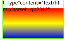
1、background-image:linear-gradient(指向方向,颜色1,颜色2,颜色3):
#a3{
            width: 200px;
            height: 100px;
            border: 1px solid #7FFF00;
            color: black;
            background-image: linear-gradient(to top,blue,yellow,red);

        }
六、图片
1、img:src
2、鼠标移上显示(注释)
3、图片的圆角:border-radius
4、图片的阴影:box-shadow
5、图片的滤镜:filter