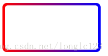
正常渐变色边框
<!DOCTYPE html>
<html lang="en">
<head>
<meta charset="UTF-8">
<title>Document</title>
</head>
<style>
.demo1 {
width: 200px;
height: 100px;
border: 10px solid;
border-image: -webkit-linear-gradient( red, blue) 30 30;
border-image: -moz-linear-gradient( red, blue) 30 30;
border-image: linear-gradient( red, blue) 30 30;
}
</style>
<body>
<div class="demo1"></div>
</body>
</html>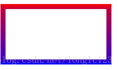
圆角渐变色边框 因为css3的 border-image 没法写圆角
<!DOCTYPE html>
<html lang="en">
<head>
<meta charset="UTF-8">
<title>Document</title>
</head>
<style>
.demo1 {
    width: 200px;
    height: 100px;
    /*border: 10px solid;*/
    /* border-image: -webkit-linear-gradient( red, blue) 30 30;
    border-image: -moz-linear-gradient( red, blue) 30 30;
    border-image: linear-gradient( red, blue) 30 30; */
    background: -webkit-linear-gradient(0deg, red, blue);
    /*background-image: -webkit-repeating-linear-gradient(left, #333 5%, #ccc 10%);*/
    /* background-image: -o-repeating-linear-gradient(left, #333 5%, #ccc 10%);
    background-image: repeating-linear-gradient(to right, #333 5%, #ccc 10%); */
    border-radius: 10px;
    border: 1px solid #fff;
}
.demo2 {
    width: 190px;
    height: 90px;
    background-color: #fff;
    border-radius: 6px;
    margin: 0 auto;
    margin-top: 5px;
}
</style>
<body>
<div class="demo1">
    <div class="demo2"></div>
</div>
</body>
</html>