背景样式
| 属性 | 说明 | 示例 |
|---|---|---|
| background | 在一个声明中设置所有背景属性(背景尺寸除外) | background: tomato url(图片地址) 32px 7px no-repeat; |
| background-color | 设置背景颜色 | background-color: tomato; |
| background-image | 设置背景图像 | background-image: url(“微微一笑很倾城.jpg”) ; |
| background-repeat | 设置背景重复方式 | background-repeat: no-repeat; |
| background-position | 设置背景定位 | background-position: 32px 7px; |
| background-size | 设置背景尺寸 | background-size: contain; |
语法顺序 :
{ background: background-color background-image background-position background-repeat; } // 属性合写
             (背景颜色)       (背景图片)       (背景定位)          (背景重复方式)
CSS Code :
{ background: tomato url("微微一笑很倾城.jpg") 32px 7px no-repeat; }
背景颜色
| 特殊值 | 说明 |
|---|---|
| transparent | 透明 |
{ background-color: tomato ; } // 颜色名写法
{ background-color: #EEFF66; } // HEX值(十六进制)写法
※ 当六位颜色值相邻数字两两相同时,可两两缩写为一位。如"#EEFF66"可合写为"#EF6"
{ background-color: rgb(32,32,32); } // RGB写法
{ background-color: rgb(32%,32%,32%); } // RGB百分比写法
{ background-color: rgb(32,32,32,0.5); } // RGBA写法
{ background-color: transparent; } // 透明
background-color属性的默认值为transparent。
背景颜色值的表示方法跟文本颜色值的表示方法一样。
背景图像
※使用背景图像的元素必须有宽度和高度,否则背景图像无法显示。
※背景图像在元素中的显示是按照自身的宽度、高度来平铺的,跟外面包裹的元素的宽度、高度无关。
CSS Code :
{ background-image: url("微微一笑很倾城.jpg"); }
图片路径通常使用相对路径。
background-image还有一个特殊值,即none,表示不显示背景图像。在实际开发中,这个值很少用。
| 值 | 说明 |
|---|---|
| repeat | 沿水平和垂直两个方向平铺 |
| no-repeat | 不平铺,即背景图像只显示一次 |
| repeat-x | 只沿水平方向平铺 |
| repeat-y | 只沿垂直方向平铺 |
HTML Code :
<!doctype html>
<html>
<head>
	<meta charset="utf-8">
	<title>背景图像重复方式</title>
	<style type="text/css">
		div{
			border: medium solid black;
			width: 400px;
			height: 400px;
			display: inline-block;
			background: url("微微一笑很倾城.jpg");
			background-size: 250px;
		}
		.first{
			background-repeat: no-repeat; //不平铺,即背景图像只显示一次
		}
		.second{
			background-repeat: repeat; //沿水平和垂直两个方向平铺
		}
		.third{
			background-repeat: repeat-x; //只沿水平方向平铺
		}
		.fourth{
			background-repeat: repeat-y; //只沿垂直方向平铺
		}
	</style>
</head>

<body>
	<div class="first"></div>
	<div class="second"></div>
	<br />
	<div class="third"></div>
	<div class="fourth"></div>
</body>
</html>
Result :
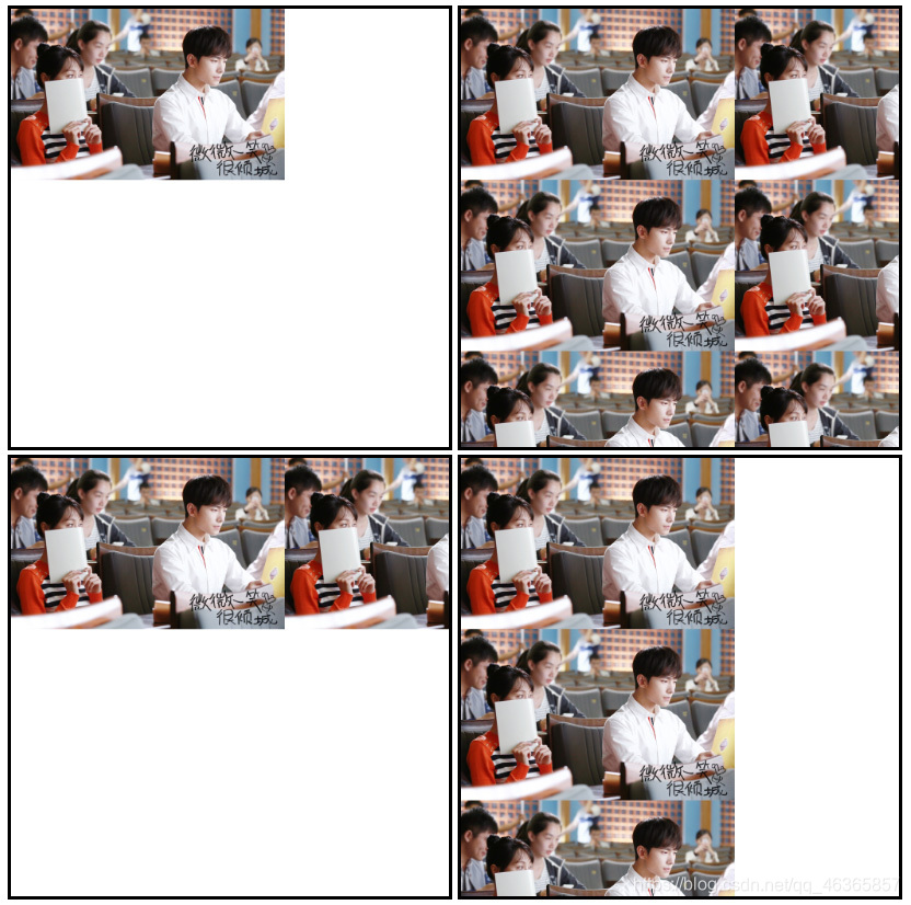
在实际开发中,repeat通常用于小图片平铺整个页面的背景或平铺页面中某一块内容的背景;no-repeat通常用于小图标的显示或只需要显示一次的背景图像;repeat-x通常用于导航背景、标题背景;repeat-y在页面制作中并不常用。
| 值 | 说明 | 示例 |
|---|---|---|
| Xpx Ypx | 使用像素值表示 X值表示水平位置 Y值表示垂直位置 |
0px 0px(默认值,表示左上角出现背景图像,无偏移) 30px 40px(正向偏移,图像向下和向右移动) -50px -60px(反向偏移,图像向上和向左移动) |
| X% Y% | 使用百分比表示背景的位置 | 30% 50%(水平方向移动30%,垂直方向居中) |
| x、y方向关键词 | 使用关键词表示背景的位置 水平方向的关键词有:left、center、right 垂直方向的关键词有:top、center、bottom |
使用水平和垂直方向的关键词进行自由组合 如果省略,则默认值为center right top(右上角出现) left bottom(左下角出现) top(上方水平居中位置出现) |
HTML Code :
<!doctype html>
<html>
<head>
<meta charset="utf-8">
<title>背景图像定位</title>
<style type="text/css">
div{
border: medium solid black;
width: 400px;
height: 400px;
display: inline-block;
background: url("微微一笑很倾城.jpg");
background-size: 250px;
background-repeat: no-repeat;
}
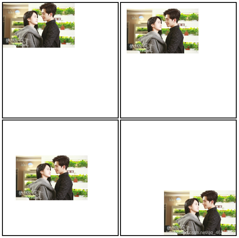
.first{
//未设置background-position属性 //默认值,表示左上角出现背景图像,无偏移
}
.second{
background-position: 20px 20px; //向右和向下移动20px
}
.third{
background-position: 30% 50%; //水平方向移动30%,垂直方向居中
}
.fourth{
background-position: right bottom; //右下角出现
}
</style>
</head>
<body>
<div class="first"></div>
<div class="second"></div>
<br />
<div class="third"></div>
<div class="fourth"></div>
</body>
</html>
Result :
| 值 | 说明 |
|---|---|
| Xpx Ypx | 像素,当只设置一个值时,将其作为图片宽度值来等比缩放 |
| X% Y% | 百分比,相对于元素宽度计算 如div宽度和高度是200px,当background-size取值为50% 80%时, div中背景图像的尺寸变为宽度100px(200px×50%),高度160px(200px×80%)。 |
| auto | 默认值,背景图片保持原样 |
| cover | 覆盖,即将背景图片等比缩放以填满整个容器 |
| contain | 容纳,即将背景图片等比缩放至某一边紧贴容器边缘为止 |
HTML Code :
<!doctype html>
<html>
<head>
	<meta charset="utf-8">
	<title>背景尺寸</title>
	<style type="text/css">
		div{
			border: medium solid black;
			width: 400px;
			height: 400px;
			display: inline-block;
			background: url("微微一笑很倾城.jpg");
			background-repeat: no-repeat;
		}
		.first{
			background-size: 350px;
		}
		.second{
			background-size: auto;
		}
		.third{
			background-size: 50% 80%;
		}
		.fourth{
			background-size: cover;
			background-position: center;
		}
		.fifth{
			background-size: contain;
		}
	</style>
</head>

<body>
	<div class="first"></div>
	<div class="second"></div>
	<div class="third"></div>
	<br />
	<div class="fourth"></div>
	<div class="fifth"></div>
</body>
</html>
Result :
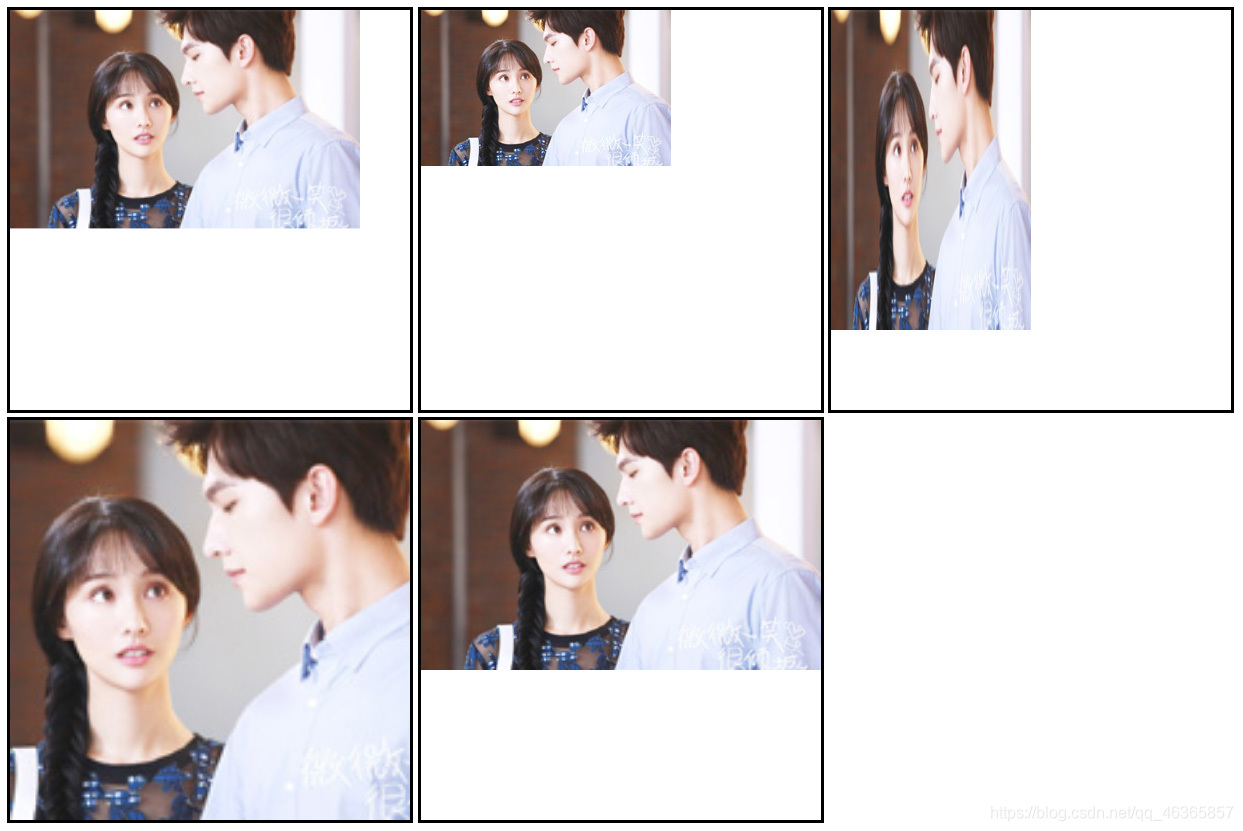
※只有当background-size:值为auto时;背景图像才不会失真,其它值都有可能使背景图像失真。
※background-size: cover配合background-position: center常用来制作全屏背景效果。缺点是需要一张足够大的背景图像,否则在较大分辨率的浏览器下显示时会导致图像失真。
我寻见一片海 碧蓝且耀着光
大片船只航行其上 都向着远方
Shared by Foriver_江河
