文本样式
| 属性 | 说明 | 示例 |
|---|---|---|
| color | 设置文本颜色 | color:#00C; |
| text-align | 设置文本水平对齐方式 | text-align: right; |
| vertical-align | 设置文本垂直对齐方式 | vertical-align: middle; |
| text-indent | 设置文本首行缩进 | text-indent: 32px; |
| line-height | 设置文本行高 | line-height: 32px; |
| text-decoration | 设置文本装饰 | text-decoration: underline |
| text-shadow | 设置文本阴影 | text-shadow: tomato 32px -32px 7px; |
文本颜色
CSS Code :
{ color: tomato ; } // 颜色名写法
{ color: #EEFF66; } // HEX值(十六进制)写法
※ 当六位颜色值相邻数字两两相同时,可两两缩写为一位。如"#EEFF66"可合写为"#EF6"
{ color: rgb(32,32,32); } // RGB写法
{ color: rgb(32%,32%,32%); } // RGB百分比写法
{ color: rgb(32,32,32,0.5); } // RGBA写法
※以上R、G、B三个参数,正整数的取值范围为0 ~ 255,百分比的取值为0% ~100%,超出范围值将截取最近的取值极限。
※在CSS3中,RGBA在RGB的基础上增加了Alpha透明度的参数,透明通道取值为0 ~ 1。0表示完全透明,1表示完全不透明。
水平对齐方式
| 值 | 说明 |
|---|---|
| left | 把文本排列到左边 |
| right | 把文本排列到右边 |
| center | 把文本排列到中间 |
| justify | 把文本两端对齐 |
CSS Code :
{ text-align: center; }
text-align属性的默认值为left。
垂直对齐方式
※vertical-align只能用来指定行内元素(inline)或表格单元格元素(table-cell)的垂直对齐方式,而对于像<p>、<div>等这样的块级元素是不起作用的。
因此,它经常用来设置文本与图片的对齐方式。
HTML Code:
<!doctype html>
<html>
<head>
<meta charset="utf-8">
<title>设置文本与图片的对齐方式</title>
<style type="text/css">
body img:nth-of-type(1){ vertical-align: top; } //顶对齐
body img:nth-of-type(2){ vertical-align: middle; } //垂直居中对齐
body img:nth-of-type(3){ vertical-align: bottom; } //底对齐
</style>
</head>
<body>
<img src="微微一笑很倾城.jpg" width="300" /> 微微一笑很倾城
<br />
<img src="微微一笑很倾城.jpg" width="300" /> 微微一笑很倾城
<br />
<img src="微微一笑很倾城.jpg" width="300" /> 微微一笑很倾城
</body>
</html>
Result:
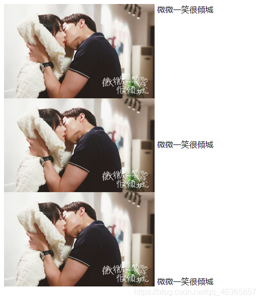
有关vertical-align属性的详细介绍请跳转至#
首行缩进
| 值 | 说明 |
|---|---|
| em | 倍数(相对长度单位,相对于当前对象内文本的字体尺寸) |
| px | 像素 |
CSS Code :
{ text-indent: 2em; }
{ text-indent: 32px; }
※按照中文排版的习惯,通常要求段首缩进两个字符。因此,在设置段落缩进时,使用em单位最为合适,通常设置为2em。
行高
| 值 | 说明 |
|---|---|
| em | 倍数(相对长度单位,相对于当前对象内文本的字体尺寸) |
| px | 像素 |
CSS Code :
{ line-height: 2em; }
{ line-height: 32px; }
文本装饰
| 值 | 说明 |
|---|---|
| none | 标准文本 |
| overline | 设置文本的上划线 |
| underline | 设置文本的下划线 |
| line-through | 设置文本的删除线 |
HTML Code :
<!doctype html>
<html>
<head>
	<meta charset="utf-8">
	<title>文本装饰</title>
	<style type="text/css">
		body span:nth-of-type(1){ text-decoration: none; } //标准文本
		body span:nth-of-type(2){ text-decoration: overline; } //上划线
		body span:nth-of-type(3){ text-decoration: underline; } // 下划线
		body span:nth-of-type(3){ text-decoration: line-through; } //删除线
	</style>
</head>

<body>
	<span>微微一笑很倾城</span>
	<br /><br />
	<span>微微一笑很倾城</span>
	<br /><br />
	<span>微微一笑很倾城</span>
	<br /><br />
	<span>微微一笑很倾城</span>
</body>
</html>
Result:
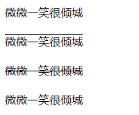
text-decoration属性的默认值为none。
文本阴影
语法顺序 :
{ text-shadow: color x-offset y-offset blur-radius; }
                    (x轴位移)(y轴位移)(阴影模糊半径)
CSS Code :
{ text-shadow: tomato 32px -32px 7px; }
| 说明 | |
|---|---|
| x-offset | x轴位移,指定阴影水平位移量,取值为正值或负值 如果为正值:阴影在对象的右边;如果为负值:阴影在对象的左边 |
| y-offset | y轴位移,指定阴影垂直位移量,取值为正值或负值 如果为正值:阴影在对象的底部;如果为负值:阴影在对象的顶部 |
| blur-radius | 阴影模糊半径,代表阴影向外模糊的范围,取值只能为正值。 如果为0,表示不具有模糊效果 |
我寻见一片海 碧蓝且耀着光
大片船只航行其上 都向着远方
Shared by Foriver_江河
