见代码:
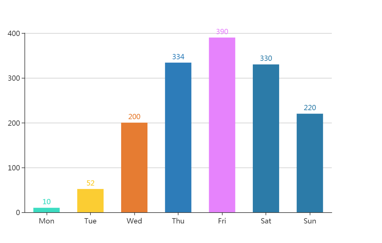
<!DOCTYPE html>
<html lang="en">
<head>
    <meta charset="UTF-8">
    <title>Document</title>
</head>
<body>
  <!-- 为ECharts准备一个具备大小(宽高)的Dom -->
    <div id="main" style="width: 600px;height:400px;"></div>
    <script src="https://cdn.bootcss.com/echarts/4.0.2/echarts.js"></script>
    <script>
    var myChart = echarts.init(document.getElementById('main'));
    myChart.title = '坐标轴刻度与标签对齐';
    option = {
        color: ['#3398DB'],
        tooltip : {
            trigger: 'axis',
            axisPointer : {            // 坐标轴指示器,坐标轴触发有效
                type : 'shadow'        // 默认为直线,可选为:'line' | 'shadow'
            }
        },
        grid: {
            left: '3%',
            right: '4%',
            bottom: '3%',
            containLabel: true
        },
        xAxis : [
            {
                type : 'category',
                data : ['Mon', 'Tue', 'Wed', 'Thu', 'Fri', 'Sat', 'Sun'],
                axisTick: {
                    alignWithLabel: true
                }
            }
        ],
        yAxis : [
            {
                type : 'value'
            }
        ],
        series : [
            {
                name:'直接访问',
                type:'bar',
                barWidth: '60%',
                data:[10, 52, 200, 334, 390, 330, 220],
                itemStyle: {
                    normal: {
                        color: function(params) {
                      var colorList = ['#2eddc1','#FCCE10','#E87C25','#277bbb','#E87fff','#277aaa'];
                            //若返回的list长度不足,不足部分自动显示为最后一个颜色
                        return colorList[params.dataIndex]
                      },
                        label: {
                            show: true,
                            position: 'top'
                        }
                    }
                }
            }
        ]
    };
    myChart.setOption(option)
    </script>
</body>
</html>
效果如下: