1 CSS3 transition 过渡
- transition-duration 过渡持续时间
- transition-property 想要执行过渡的样式
- 默认all
- 只支持数值类型的值,而且,必须是同一个样式,从一个数值,过渡到另一个样式
- transition-delay 过渡延迟时间
- transition-timing-function 过渡执行动画
- linear 整个过程保持匀速
- ease 慢速开始,然后加速,在慢下来,结束时特别慢(默认值)
- ease-in 慢快
- ease-out 快慢
- ease-in-out 与ease类似,中间较快,两端很慢但不同速
- cubic-bezier 三次方贝塞尔曲线cubic-bezier(x1,y1,x2,y2)
三次方贝塞尔曲线数值网址
复合写法
1. transition: property  duration  timing-function  delay;
2. transition: property  duration  timing-function , property  duration  timing-function;
2 CSS3 transform 变换
特性
- 不脱离文档流
- 不改变文档大小
- 具有四种变换类别,并且允许多值书写
- 多值的时候,从后到前执行动画
样式:
- translate(x,y) 位移
- translateX()、translateY()、translateZ()
- 如果只有一个值的情况下,设置的是x
- x、y同时移动
- 百分比数值,基于自己本身计算
- rotate(180deg)旋转
- scaleX()、scaleY()、scaleZ()
- 单位:倍数
- 如果只有一个值的情况下,同时设置x和y
- x和y同时缩放
- skew(x,y)斜切
- skew()、skewY()
- 单位(deg)
- 如果只有一个值的情况下,设置的是x
- transform-origin 变化原点
- 关键词left、right、top、bottom
- 数值(px)
- 默认 center center
transform 3D
- transform-style:preserve-3d 建立3D空间
设置子级是否处于3D。告诉浏览器,接下来的元素以及它的子元素要展示一个3D空间。 - perspective 景深
- perspective-origin 景深基点
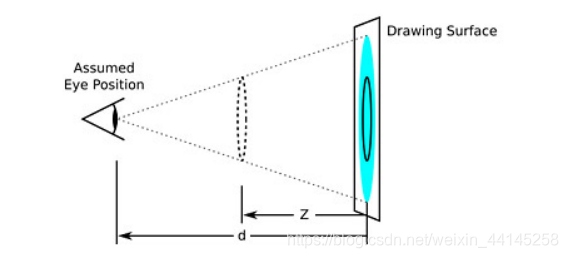
- perspective: 1000px,(视距)
元素定义 perspective 属性时,其子元素会获得透视效果,而不是元素本身
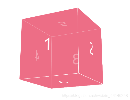
例,正方体
<!DOCTYPE html>
<html lang="en">
<head>
    <meta charset="UTF-8">
    <title>Title</title>
    <style>
        html,body{
            height: 100%;
        }
        body{
            perspective: 1000px;
        }
        .main{
            width: 200px;
            height: 200px;
            /*background: #000;*/
            position: absolute;
            top: 0;
            left: 0;
            right: 0;
            bottom: 0;
            margin: auto;
            transition: 10s;
            transform-style: preserve-3d;
        }
        .main:hover{
            transform: rotateX(290deg) rotateY(-490deg);
        }
        .box{
            position: absolute;
            top: 0;
            left: 0;
            width: 198px;
            height: 198px;
            background: rgba(231,62,95,0.5);
            border: 1px solid #fff;
            font: 50px/198px '';
            text-align: center;
            color: #fff;
        }
        .box:nth-child(1){
            transform: translateZ(100px);
        }
        .box:nth-child(2){
            transform:rotateY(90deg) translateZ(100px);
        }
        .box:nth-child(3){
            transform:rotateY(180deg) translateZ(100px);
        }
        .box:nth-child(4){
            transform:rotateY(270deg) translateZ(100px);
        }
        .box:nth-child(5){
            transform:rotateX(90deg) translateZ(100px);
        }
        .box:nth-child(6){
            transform:rotateX(-90deg) translateZ(100px);
        }
    </style>
</head>
<body>

<div class="main">
    <div class="box">1</div>
    <div class="box">2</div>
    <div class="box">3</div>
    <div class="box">4</div>
    <div class="box">5</div>
    <div class="box">6</div>
</div>

</body>
</html>
3 CSS3 animation 动画
3.1 animation-name 绑定到选择器的 keyframe 名称
3.2 keyframes 规定动画
@keyframes  name {
	selector {
		//css样式;
	}
}
- name 必须,定义动画名称
- selector 必须,动画时长百分比
- 0-100%
- from(与 0% 相同) to(与 100% 相同)
3.3 animation-duration 完成动画所花费的时间,以秒或毫秒计
3.4 animation-timing-function 规定动画的速度曲线
- linear 动画从头到尾的速度是相同的。
- ease 默认。动画以低速开始,然后加快,在结束前变慢。
- ease-in 动画以低速开始。
- ease-out 动画以低速结束。
- ease-in-out 动画以低速开始和结束。
- cubic-bezier(n,n,n,n) 在 cubic-bezier 函数中自己的值。可能的值是从 0 到 1 的数值。
3.5 animation-delay 动画开始之前的延迟时间,默0
3.6 animation-iteration-count 动画播放的次数
- n 定义动画播放次数的数值
- infinite 规定动画应该无限次播放
3.7 animation-direction 轮流反向播放动画
alternate 动画应该轮流反向播放
3.8 animation-play-state 动画运行或暂停
paused 暂停
running 播放(默认)
3.9 animation-fill-mode 规定对象动画时间之外的状态
- Forwards 动画运动完成之后,停留在最后一帧的状态
- backwards 动画播放之前,动画延时的这段时间里直接使用关键帧里面的第一帧样式 (0%时的样式)
