1.效果如下:
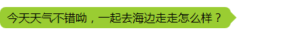
思路:一个没有宽高的div,如果边框为20px且颜色不同,那么可以看到出现的图形是一个四色的三角形组成的正方形。
代码:
.chat-msg {
position: relative;
height: 30px;
background-color: yellowgreen;
line-height: 30px;
padding: 0 10px;
border-radius: 8px;
display: inline-block; //行内块元素,宽度自适应
}
.arrow-right {
position: absolute;
top: 5px;
right: -18px;
width: 0;
height: 0;
border: 10px solid;
border-color: transparent;
border-left-color: yellowgreen !important;
display: inline-block;
}
<div class="chat-msg">
<span>今天天气不错呦,一起去海边走走怎么样?</span>
<div class="arrow-right"></div>
</div>
2.效果如下:
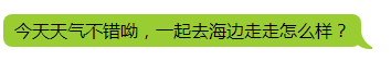
思路:如果两个正方形大小相同,且左下都有圆角,但是z-index不同,那么他们水平相交时,聪明的你有没有发现什么有意思的地方呢?!

代码:
.chat-msg {
position: relative;
height: 30px;
line-height: 30px;
padding: 0 10px;
border-radius: 8px;
display: inline-block;
background-color: yellowgreen;
}
.chat-msg:before {
content: "";
position: absolute;
bottom: -2px;
right: -10px;
width: 0px;
height: 20px;
z-index: -1;
border-right: 20px solid yellowgreen;
border-bottom-left-radius: 18px;
}
.chat-msg:after {
content: "";
position: absolute;
bottom: -2px;
right: -20px;
width: 0px;
height: 20px;
z-index: 1;
border-right: 20px solid white;
border-bottom-left-radius: 18px;
}
<span class="chat-msg">今天天气不错呦,一起去海边走走怎么样?</span>