版权声明:商业转载需要经过本人同意,敬上! https://blog.csdn.net/weixin_41835977/article/details/88936940
animation属性:
- animation-name :需要绑定的keyframe名称
- animation-duration:动画持续时间
- animation-timing-function:动画的运动曲线,linear,ease,ease-in,ease-out,ease-in-out,cubic-bezier(),steps()
- animation-delay:动画开始之前的延时
- animation-iteration-count:重复次数
- animation-direction:是否轮流反向播放动画,值normal,默认正常播放;alternate轮流反向播放
- animation-fill-mode:控制元素在动画执行前与动画完成后样式。none:使用得动画不会对动画等待和动画完成的元素样式产生改变;forwards:动画结束后,元素的样式将设置为动画的最后一帧的样式;backwards:在动画等待的那段时间内,元素的样式将设置为动画第一帧的样式;both:在动画等待和动画结束状态,元素将分别应用动画第一帧和最后一帧的样式著作权归作者所有。
皮球掉地反弹
主要利用贝塞尔曲线和ease控制动画效果。贝塞尔曲线控制速度曲线,ease使得每个阶段有缓动效果。
@keyframes bounce {
        60%,80%,to{
            transform: translateY(400px);
            animation-timing-function: ease;
        }
        70%{
            transform:translateY(300px);
        }
        90%{
            transform:translateY(360px);
        }
    }
    .ball{
        width:50px;
        height:50px;
        border-radius:50%;
        margin: auto;
        background: rgba(0,100,100,0.5);
        animation: bounce 2s cubic-bezier(.58,.13,.94,.64) forwards;
    }
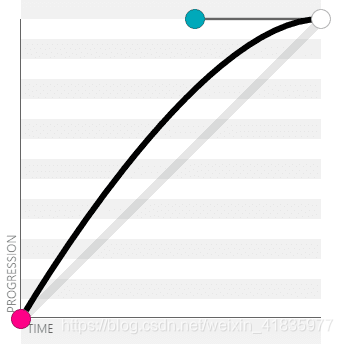
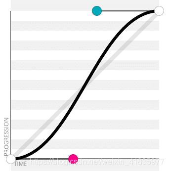
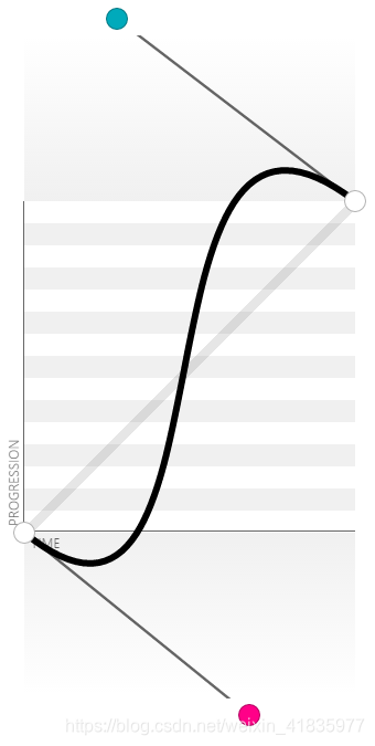
贝塞尔曲线
cubic-bezier 又称三次贝塞尔,主要是为animation生成速度曲线的函数,规定
cubie-bezier(,,,)。
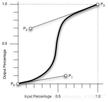
四个值的取值范围:
- P0:默认值 (0, 0)
- P1:动态取值 (x1, y1)
- P2:动态取值 (x2, y2)
- P3:默认值 (1, 1)
x轴取值范围0-1,超过将失效。
以一条直线放在范围只有 1 的坐标轴中,并从中间拿出两个点来拉扯(X 轴的取值区间是 [0, 1],Y 轴任意),最后形成的曲线就是动画的速度曲线。
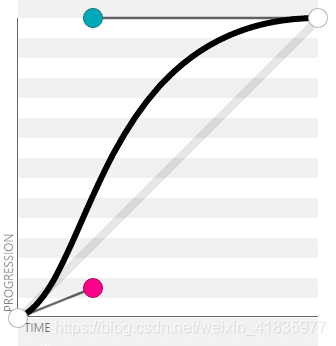
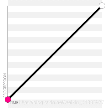
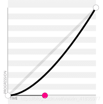
常见的贝塞尔曲线取值:
- ease:cubic-bezier(.25, .1, .25, 1)
- liner:cubic-bezier(0, 0, 1, 1) / cubic-bezier(1, 1, 0, 0)
- ease-in:cubic-bezier(.42, 0, 1, 1),开头慢,结尾加速
- ease-out:cubic-bezier(0, 0, .58, 1),开头快,结尾减速
- ease-in-out:cubic-bezier(.42, 0, .58, 1),开头慢,中间慢,结尾慢
- In Out . Back(来回的缓冲效果):cubic-bezier(0.68, -0.55, 0.27, 1.55)
纯CSS实现GIF效果
steps(10)使得动画效果分十步来完成,num*每小张图片效果 == 图片总长度,才能实现gifx效果。重复次数infinite,利用background-position对图片显示位置进行定位。
.gif {
        width: 50px;
        height: 72px;
        border: 1px solid transparent;
        background: url("https://s.cdpn.io/79/sprite-steps.png") no-repeat left top;
        animation: frames-animation 1s steps(10) infinite;
    }
    @keyframes frames-animation {
        0%{background-position:0 0; }
        100%{background-position: -500px 0}
    }
图片移动
animation-paly-state:pause,暂停动画;alternate:反向轮流播放动画;
  .pic{
            width: 150px;
            height: 150px;
            background: url('http://c3.staticflickr.com/3/2671/3904743709_74bc76d5ac_b.jpg');
            background-size: auto 100%;
            animation: panoramic 10s linear infinite alternate;
            animation-play-state: paused;
        }
        @keyframes panoramic{
            to{background-position: 100% 0;}
        }
        .pic:hover,.pic:focus{
            animation-play-state: running;
        }
实现打字输入效果
利用typing控制初始状态;border-right用于控制竖线动画;steps控制每次显示一个字符。
@keyframes typing {
        from{width: 0;}
    }
    @keyframes caret {
        50%{border-right-color: transparent;}
    }
    .write{
        font: bold 200% Consolas,Monaco,monospace;
        width:15ch;
        white-space: nowrap;
        overflow: hidden;
        border-right: .05em solid;
        animation: typing 8s steps(14),
                    caret 1s infinite;
    }