目录
1.标准盒子居中
不需要设置display,只能实现水平居中
扫描二维码关注公众号,回复:
14727433 查看本文章

效果:
效果图源码:
<!DOCTYPE html>
<html lang="en">
<head>
<meta charset="UTF-8">
<title>标准盒子</title>
<link rel="stylesheet" href="../css/reset.css">
<style>
.box {
width: 400px;
height: 400px;
background-color: #eee8d5;
}
.box2 {
width: 150px;
height: 150px;
background-color: #e0c46c;
/*水平居中*/
margin: 0 auto;
}
</style>
</head>
<body>
<div class="box">
<div class="box2">
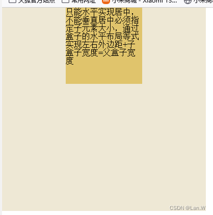
只能水平实现居中,不能垂直居中
必须指定子元素大小,通过盒子的水平布局等式实现
左右外边距+子盒子宽度=父盒子宽度
</div>
</div>
</body>
</html>
2.定位-绝对定位实现居中
不需要设置display, 需要设置position, 口诀是:子绝父相
-原理:
左右偏移量+可见框宽度+左右外边距=包含块宽度
上下偏移量+可见框高度+上下外边距=包含块高度
缺点:
配置项比较多,也是要指定盒子大小
效果图:
效果图源码:(常用于弹出层,需要设置弹出层的宽高)
<!DOCTYPE html>
<html lang="en">
<head>
<meta charset="UTF-8">
<title>标准盒子</title>
<link rel="stylesheet" href="../css/reset.css">
<style>
.box {
width: 400px;
height: 400px;
background-color: #eee8d5;
position: relative;
}
.box2 {
width: 150px;
height: 150px;
background-color: #e0c46c;
/*通过定位:position实现垂直居中:
子绝对定位父相对定位同时开启*/
position: absolute;
top: 0;
bottom: 0;
left: 0;
right: 0;
margin: auto;
text-overflow: ellipsis;
/*white-space: nowrap;*/
overflow: hidden;
}
.box2:hover {
text-overflow: inherit;
overflow: visible;
outline: red dashed;
}
</style>
</head>
<body>
<div class="box">
<div class="box2">
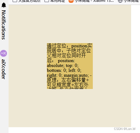
通过定位:position实现居中:
子绝对定位父相对定位同时开启:
position: absolute;
top、bottom、left、right: 0;
margin:auto;
-原理:
左右偏移量+可见框宽度+左右外边距=包含块宽度
上下偏移量+可见框高度+上下外边距=包含块高度
缺点:
配置项比较多,也是要指定盒子大小
</div>
</div>
</body>
</html>
3.表格方式实现垂直居中
display: table-cell;
效果图:
效果图源码:
<!DOCTYPE html>
<html lang="en">
<head>
<meta charset="UTF-8">
<title>表格一个</title>
<style>
.box1 {
width: 200px;
height: 200px;
background-color: yellow;
/*父元素:实现垂直居中*/
display: table-cell;
vertical-align: middle;
}
.box2 {
width: 100px;
height: 100px;
background-color: bisque;
margin: 0 auto;
text-overflow: ellipsis;
overflow: hidden;
}
</style>
</head>
<body>
<div class="box1">
<div class="box2">
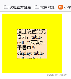
通过设置父元素为:table-cell:
/*实现水平居中*/
display: table-cell;
vertical-align: middle;
//子元素加上下面margin实现垂直水平居中
margin: 0 auto;
</div>
</div>
</body>
</html>
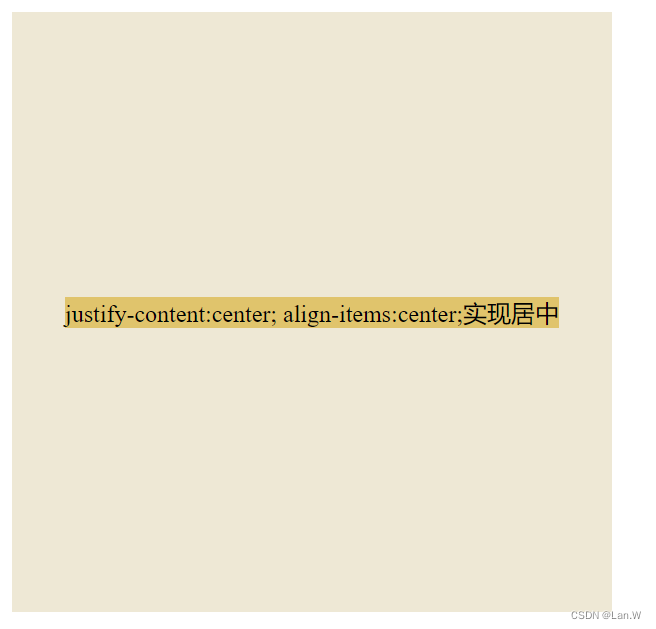
4.弹性盒子:实现垂直居中
display: flex
效果图:
效果图源码:
<!DOCTYPE html>
<html lang="en">
<head>
<meta charset="UTF-8">
<title>弹性盒子</title>
<link rel="stylesheet" href="../css/reset.css">
<!--
弹性盒子居中:
/*弹性盒子:实现垂直居中*/
display: flex;
justify-content: center;
align-items: center;
无缺点,完美
-->
<style>
.box {
width: 400px;
height: 400px;
background-color: #eee8d5;
/*弹性盒子:实现垂直居中*/
display: flex;
justify-content: center;
align-items: center;
}
.box2 {
width: 150px;
height: 150px;
background-color: #e0c46c;
}
</style>
</head>
<body>
<div class="box">
<div class="box2">
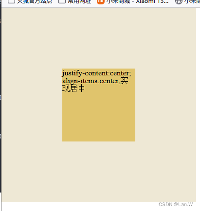
justify-content:center;
align-items:center;实现居中
</div>
</div>
</body>
</html>
方式2:
弹性盒子另一种垂直居中,通过内部子元素margin:auto自动撑开边距,让元素居中。代码如下:
子元素宽高不定,也可以实现垂直居中。
<style>
    .box {
        width: 400px;
        height: 400px;
        background-color: #eee8d5;
        /*弹性盒子*/
        display: flex;
    }

    .box2 {
        margin: auto; 、*元素外边距自动撑开*/
        background-color: #e0c46c;
    }
</style>
效果:
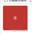
5.通过行高line-height实现垂直居中
行高与盒子高度一样,加:
text-align: center;
让内部的文字在中间显示。
效果图:
效果图源码:
<!DOCTYPE html>
<html lang="en">
<head>
    <meta charset="UTF-8">
    <title>Title</title>
    <style>

        .rest {
            width: 100px;
            height: 100px;
            /*通过行高: 实现文字垂直居中*/
            line-height: 100px;
            display: table-cell;
            text-align: center;
            background-color: #bd362f;
            color: white;
            border-radius: 5px;
                 }

    </style>
</head>
<body>
<div class="day2">
    <div class="rest">休</div>
</div>
</body>
</html>
6.变形+定位实现居中
/*绝对定位与变形结合实现:垂直水平居中*/
position: absolute;
left: 50%;
top: 50%;
transform: translateX(-50%) translateY(-50%);
效果图:
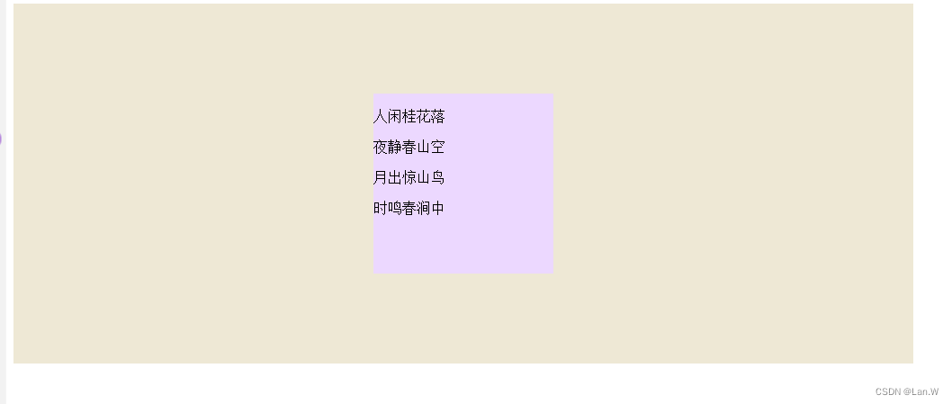
效果图源码:(常用于图片的居中显示)
<!DOCTYPE html>
<html lang="en">
<head>
    <meta charset="UTF-8">
    <title>6-变形-实现垂直水平居中.html</title>

    <style>
        .box2 {
            position: relative;
            background-color: #eee8d5;
            width: 1000px;
            height: 400px;
            /*    y轴方向移动*/
            /*transform: translateY(-50px);*/
        }

        .box {
            background-color: #ecd8ff;
            width: 200px;
            height: 200px;
            /*  transform:  x轴方向移动,
            变形不影响盒子,也不会改变文档流。只是改变盒子位置
            */
            /*绝对定位与变形结合实现:垂直水平居中*/
            position: absolute;
            left: 50%;
            top: 50%;
            transform: translateX(-50%) translateY(-50%);

        }

    </style>
</head>
<body>


<div class="box2">
    <div class="box">
        <p>人闲桂花落</p>
        <p>夜静春山空</p>
        <p>月出惊山鸟</p>
        <p>时鸣春涧中</p>
    </div>
</div>

</body>
</html>
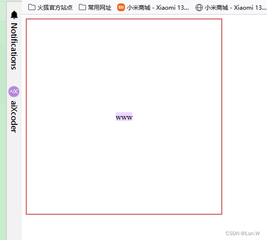
7.网格实现垂直居中
display: grid;
效果图:
效果图源码:
<!DOCTYPE html>
<html lang="en">
<head>
    <meta charset="UTF-8">
    <title>网格内容居中控制.html</title>
    <style>
        .box {
            width: 400px;
            height: 400px;
            border: 2px solid indianred;
            display: grid;
            /*实现水平居中,*/
            justify-items: center;
            /*    垂直居中控制*/
            align-items: center;
            /*    上面二个同时center,实现垂直水平居中*/

        }

        .box1 {
            background-color: #ecd8ff;
        }
    </style>
</head>
<body>
<div class="box">
    <div class="box1">
        www
    </div>
</div>
</body>
</html>
8.其他居中效果实现案例
8.1. icon小图标垂直居中
fontAwsome 图标在自身i标签或者em标签内垂直居中
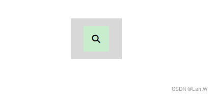
效果:搜索小图标在自身i标签居中

实现html源码
<!DOCTYPE html>
<html lang="en">
<head>
    <meta charset="UTF-8">
    <title>iconfont居中显示.html</title>
    <link rel="stylesheet" href="../布局作品/小米首页/css/all.css">
    <style>
        .app {
            width: 100px;
            height: 80px;
            position: relative;
            background-color: #d8d8d8;
            margin: 50px auto;
            border: 1px solid #e0c46c;
        }
        .search {
            background-color: #ecd8ff;
        }
        .search2 i {
            width: 50px;
            height: 50px;
            display: inline-block;
            line-height: 50px;
            text-align: center;
            background-color: #c7edcc;
        }
    </style>
</head>
<body>
    <div class="app">
        <div class="search2">
            <i class="fa-solid fa-search"></i>
        </div>
    </div>
</div>
</body>
</html>
扩展:同时需要整个i外面的search2对应的div在父容器:app,内部垂直居中
效果如下 :
实现源码:app设置大小,i父容器div没有设置大小与app一样,2个div大小都一样。
所以还是在i里设置其在父容器search对应的定位,就能实现整个i在app居中
<!DOCTYPE html>
<html lang="en">
<head>
    <meta charset="UTF-8">
    <title>iconfont居中显示.html</title>
    <link rel="stylesheet" href="../布局作品/小米首页/css/all.css">
    <style>
        .app {
            width: 100px;
            height: 80px;
            position: relative;
            background-color: #d8d8d8;
            margin: 50px auto;
            border: 1px solid #e0c46c;
        }
        .search {
            background-color: #ecd8ff;
        }
        .search2 i {
            width: 50px;
            height: 50px;
/*内部图标垂直居中*/
            display: inline-block;
            line-height: 50px;
            text-align: center;
            background-color: #c7edcc;

   /*    整个i 父容器search居中*/
            position: absolute;
            right: 0;
 /*    一般搜索按钮放在整体右边,把left:0注释掉就可以实现靠右*/
            left: 0;
            top: 0;
            bottom: 0;
            margin: auto;

        }
    </style>
</head>
<body>
    <div class="app">
        <div class="search2">
            <i class="fa-solid fa-search"></i>
        </div>
    </div>
</div>
</body>
</html>