效果属性
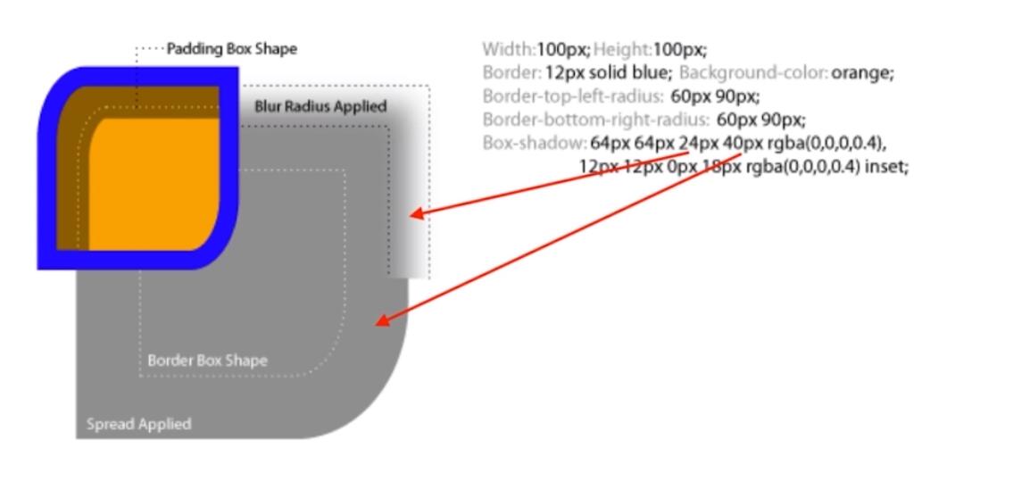
- box-shadow
- text-shadow
- border-radius
- background
- clip-path
box-shadow
- 营造立体感
- 充当没有宽度的边框(也可以用outline)
- 特殊效果(画图)
text-shadow
- 立体感
- 描边
*{
	text-shadow:1px 1px 0 white;
	/*偏移量 模糊 颜色*/
}
border-radius
- 圆角矩形
- 圆形
- 半圆/扇形/椭圆
tips:边框在圆角的计算范围之内
*{
	border-radius:1px 1px 1px 1px/1px 1px 1px 1px;
	/*比较少见的用法,前边是水平偏移量,后边是垂直偏移量*/
}
clip-path
- 对容器进行裁剪
- 常见几何图形
- 自定义路径
- 类似与遮罩不改变元素定位
	*{
		    clip-path: inset(100px 50px); /*缩减宽高*/
		    clip-path: ellipse(130px 140px at 10% 20%)/*椭圆*/
            clip-path: circle(50px at 100px 100px);/*圆形*/
            clip-path: polygon(50% 0%, 100% 50%, 50% 100%, 0% 50%, 10% 10%, 40px 10px);/*指定点*/
            clip-path: url(#clipPath);/*指定矢量SVG*/
	}
background
- 纹理、图案
- 渐变
- 雪碧图动画(切换开关之类)
        .i{
            width: 20px;
            height: 20px;
            background: url() no-repeat;
            background-size: 20px 40px;
            transition: background-position .4s;
        }
        .i:hover{
            background-position: 0 -20px;
        }
- 背景图尺寸适应
*{
	background-size:contain
	background-size:cover
}
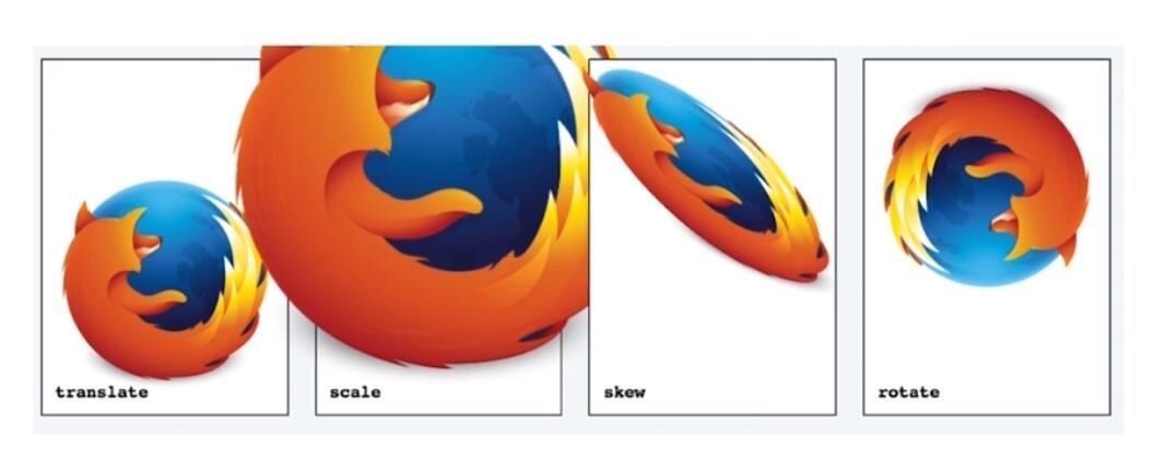
3D transform
- translate
- scale
- skew
- rotate
<!DOCTYPE html>
<html lang="en">
<head>
    <meta charset="UTF-8">
    <meta name="viewport" content="width=device-width, initial-scale=1.0">
    <meta http-equiv="X-UA-Compatible" content="ie=edge">
    <title>Document</title>
    <style>
        .container{
            margin:50px;
            padding: 10px;
            border: 1px solid red;
            width: 200px;
            height: 200px;
            position: relative;
            perspective: 500px;
            /* transform-style: preserve-3d; */
            /* transform: translateZ(-100px); */
            /* transition:transform .4s; */
        }
        .container{
            /* transform: translateZ(-100px) rotateX(90deg) rotateY(90deg); */
        }
        #cube{
            /* width:200px; */
            /* height:200px; */
        }
        #cube div{
            width: 200px;
            height:200px;
            position: absolute;
            line-height: 200px;
            font-size:50px;
            text-align: center;
        }
        #cube:hover{
            /* transform: translateZ(-100px) rotateX(270deg); */
            /* transform: translateZ(-100px) rotateX(90deg) rotateY(90deg); */
        }
        .front{
            transform: translateZ(100px);
            /* transform: translateX(100px); */
            /* transform: translateX(100px) translateY(10px) rotate(25deg); */
            /* transform: rotate(25deg) translateX(100px) translateY(10px); */
            background:rgba(255,0,0,.3);
        }
        .back{
            /* transform: translateZ(-100px); */
            transform: translateZ(-100px) rotateY(180deg);
            background:rgba(0,255,0,.3);
        }
        .left{
            transform: translateX(-100px) rotateY(-90deg);
            background:rgba(0,0,255,.3);
        }
        .right{
            transform: translateX(100px) rotateY(90deg);
            background:rgba(255,255,0,.3);
        }
        .top{
            transform: translateY(-100px) rotateX(-90deg);
            background:rgba(255,0,255,.3);
        }
        .bottom{
            transform: translateY(100px) rotateX(90deg);
            background:rgba(0,255,255,.3);
        }


    </style>
</head>
<body>
    <div class="container">
        <div id="cube">
            <div class="front">1</div>
            <div class="back">2</div>
            <div class="right">3</div>
            <div class="left">4</div>
            <div class="top">5</div>
            <div class="bottom">6</div>
        </div>
    </div>
</body>
</html>
性能需求比较高
复杂场景容易出现bug