3D呈现transform-styletransform-style☆☆☆☆☆
- 控制子元素是否开启三维立体环境
transform-style: flat代表子元素不开启3D立体空间,默认的transform-style: preserve-3d子元素开启立体空间代码写给父级,但是影响的是子盒子
代码演示
<!DOCTYPE html>
<html lang="en">

<head>
    <meta charset="UTF-8">
    <meta name="viewport" content="width=device-width, initial-scale=1.0">
    <meta http-equiv="X-UA-Compatible" content="ie=edge">
    <title>Document</title>
    <style>
        body {
            perspective: 500px;
        }

        .box {
            position: relative;
            width: 200px;
            height: 200px;
            margin: 100px auto;
            transition: all 2s;
            /* 让子元素保持3d立体空间环境 */
            transform-style: preserve-3d;
        }

        .box:hover {
            transform: rotateY(60deg);
        }

        .box div {
            position: absolute;
            top: 0;
            left: 0;
            width: 100%;
            height: 100%;
            background-color: pink;
        }

        .box div:last-child {
            background-color: purple;
            transform: rotateX(60deg);
        }
    </style>
</head>

<body>
    <div class="box">
        <div></div>
        <div></div>
    </div>
</body>

</html>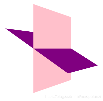
<!DOCTYPE html>
<html lang="en">
<head>
<meta charset="UTF-8">
<meta name="viewport" content="width=device-width, initial-scale=1.0">
<meta http-equiv="X-UA-Compatible" content="ie=edge">
<title>Document</title>
<style>
body {
perspective: 400px;
}
.box {
position: relative;
width: 300px;
height: 300px;
margin: 100px auto;
transition: all .4s;
/* 让背面的紫色盒子保留立体空间 给父级添加的 */
transform-style: preserve-3d;
}
.box:hover {
transform: rotateY(180deg);
}
.front,
.back {
position: absolute;
top: 0;
left: 0;
width: 100%;
height: 100%;
border-radius: 50%;
font-size: 30px;
color: #fff;
text-align: center;
line-height: 300px;
}
.front {
background-color: pink;
z-index: 1;
}
.back {
background-color: purple;
/* 像手机一样 背靠背 旋转 */
transform: rotateY(180deg);
}
</style>
</head>
<body>
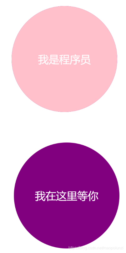
<div class="box">
<div class="front">我是程序员</div>
<div class="back">我在这里等你</div>
</div>
</body>
</html>