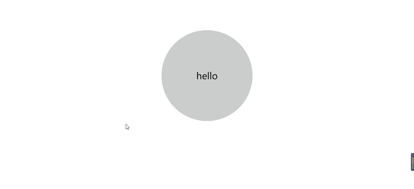
两面翻转的盒子
<!DOCTYPE html>
<html lang="en">

<head>
    <meta charset="UTF-8">
    <meta name="viewport" content="width=device-width, initial-scale=1.0">
    <title>两面翻转的盒子</title>
    <style>
        body {
            perspective: 400px;
        }

        .box {
            position: relative;
            width: 300px;
            height: 300px;
            margin: 100px auto;
            transition: all 1s;
            /* perspective: 100px; */
            /* 让背面的盒子保留3d效果 */
            transform-style: preserve-3d;
        }

        .box:hover {
            transform: rotateY(180deg);
        }

        .front,
        .back {
            position: absolute;
            top: 0;
            left: 0;
            width: 100%;
            height: 100%;
            border-radius: 50%;
            font-size: 30px;
            text-align: center;
            line-height: 300px;
        }

        .front {
            background-color: #ccc;

        }

        .back {
            background-color: skyblue;
            /* 背靠背旋转 */
            transform: rotateY(180deg);
        }
    </style>

</head>

<body>
    <div class="box">
        <div class="front">
            hello
        </div>
        <div class="back">
            world
        </div>
    </div>
</body>

</html>
效果:
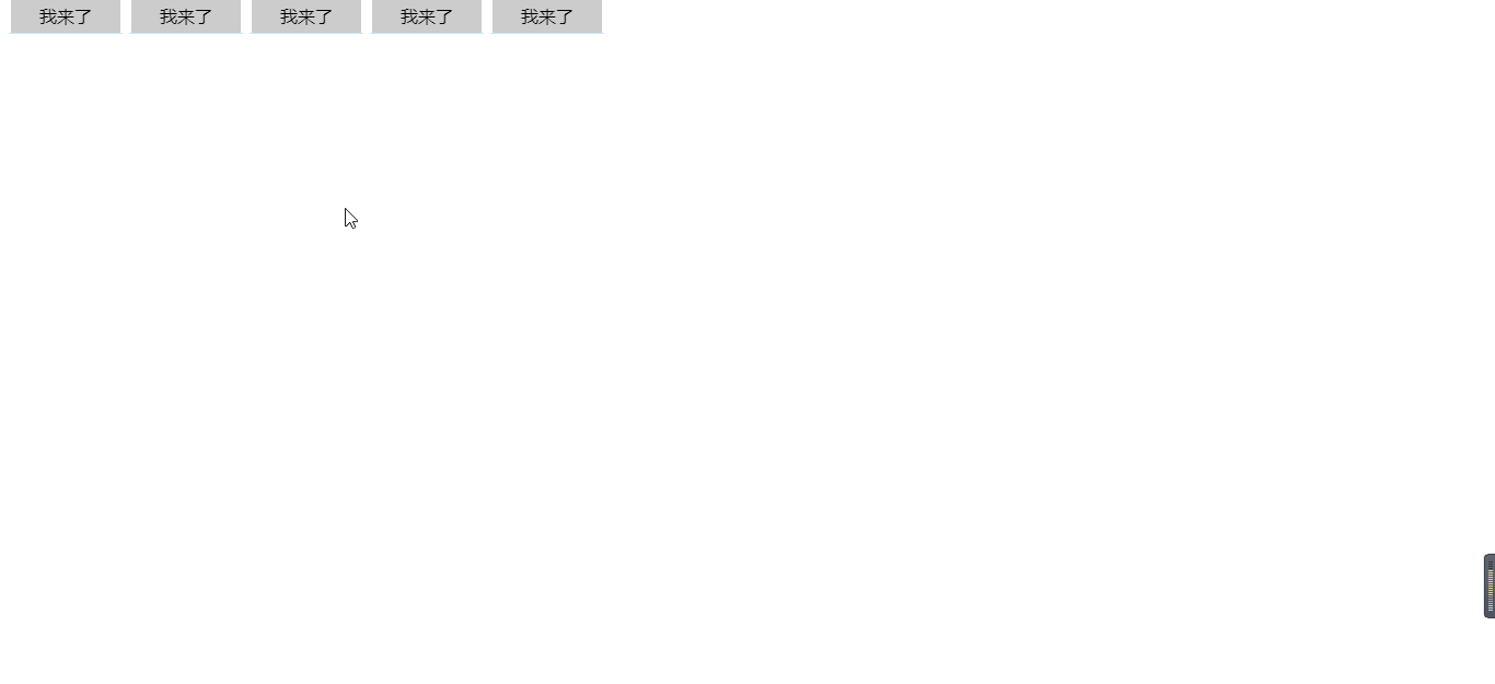
3D导航栏
<!DOCTYPE html>
<html lang="en">

<head>
    <meta charset="UTF-8">
    <meta name="viewport" content="width=device-width, initial-scale=1.0">
    <title>3D导航栏</title>
    <style>
        * {
            margin: 0;
            padding: 0;
        }

        ul li {

            float: left;
            width: 100px;
            height: 30px;
            line-height: 30px;
            list-style: none;
            margin-left: 10px;
            perspective: 500px;
            text-align: center;

        }

        .box {
            position: relative;
            width: 100%;
            height: 100%;
            transform-style: preserve-3d;
            transition: all .5s;


        }

        ul li:hover .box {
            transform: rotateX(90deg);


        }

        .box .front,
        .bottom {
            position: absolute;
            top: 0;
            left: 0;
            width: 100%;
            height: 100%;
        }

        .front {
            background-color: #ccc;
            transform: translateZ(50%);
        }

        .bottom {
            /* 如果我们有移动和其他样式 我们必须先移动 */
            transform: translateY(50%) rotateX(-90deg);
            background-color: skyblue;

        }
    </style>
</head>

<body>
    <ul>
        <li>
            <div class="box">
                <div class="front">我来了</div>
                <div class="bottom">换我上了</div>
            </div>
        </li>
        <li>
            <div class="box">
                <div class="front">我来了</div>
                <div class="bottom">换我上了</div>
            </div>
        </li>
        <li>
            <div class="box">
                <div class="front">我来了</div>
                <div class="bottom">换我上了</div>
            </div>
        </li>
        <li>
            <div class="box">
                <div class="front">我来了</div>
                <div class="bottom">换我上了</div>
            </div>
        </li>
        <li>
            <div class="box">
                <div class="front">我来了</div>
                <div class="bottom">换我上了</div>
            </div>
        </li>
    </ul>
</body>

</html>
效果:
旋转木马
<!DOCTYPE html>
<html lang="en">

<head>
    <meta charset="UTF-8">
    <meta name="viewport" content="width=device-width, initial-scale=1.0">
    <title>旋转木马</title>
    <style>
        body {
            perspective: 1000px;
        }

        section {
            position: relative;
            width: 300px;
            height: 200px;
            margin: 200px auto;
            /* 保留子元素的3D效果 */
            transform-style: preserve-3d;
            animation: rotate 6s linear infinite;
            background: url("./images/1.gif");
        }

        @keyframes rotate {
            0% {
                transform: rotateY(0);
            }

            100% {
                transform: rotateY(360deg);
            }
        }

        section:hover {
            animation-play-state: paused;
        }

        section div {
            position: absolute;
            top: 0;
            left: 0;
            width: 100%;
            height: 100%;
            background: url("./images/12.jpg")no-repeat;
        }

        section div:nth-child(1) {
            transform: rotateY(0) translateZ(300px);
        }

        section div:nth-child(2) {
            transform: rotateY(60deg) translateZ(300px);
        }

        section div:nth-child(3) {
            transform: rotateY(120deg) translateZ(300px);
        }

        section div:nth-child(4) {
            transform: rotateY(180deg) translateZ(300px);
        }

        section div:nth-child(5) {
            transform: rotateY(240deg) translateZ(300px);
        }

        section div:nth-child(6) {
            transform: rotateY(300deg) translateZ(300px);
        }
    </style>
</head>

<body>
    <section>
        <div></div>
        <div></div>
        <div></div>
        <div></div>
        <div></div>
        <div></div>
    </section>
</body>

</html>
