```css
<!DOCTYPE html>
<html lang="en">
<head>
<meta charset="UTF-8">
<meta name="viewport" content="width=device-width, initial-scale=1.0">
<title>Document</title>
<style>
* {
margin: 0px;
padding: 0px;
}
ul {
margin: 100px;
}
ul li {
width: 120px;
height: 35px;
list-style: none;
perspective: 500px;
}
.box {
position: relative;
width: 100%;
height: 100%;
/* 呈现出3D鲜效果 */
transform-style: preserve-3d;
transition: all .4s;
}
.box:hover {
transform: rotateX(90deg);
}
.front,
.bottom {
position: absolute;
left: 0;
top: 0;
width: 100%;
height: 100%;
text-align: center;
line-height: 35px;
}
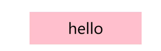
.front {
background-color: pink;
/* 先移动再旋转 */
transform: translateY(17.5px) rotateX(-90deg);
}
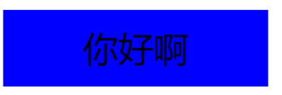
.bottom {
background-color: blue;
transform: translateZ(17.5px);
}
</style>
</head>
<body>
<ul>
<li>
<div class="box">
<div class="front">hello</div>
<div class="bottom">你好啊</div>
</div>
</li>
</ul>
</body>
</html>