<!DOCTYPE html>
<html lang="en">
<head>
<meta charset="UTF-8">
<meta name="viewport" content="width=device-width, initial-scale=1.0">
<title>Document</title>
<style>
body {
/* 3D视觉的透视*/
perspective: 400px;
}
.box {
position: relative;
width: 300px;
height: 300px;
margin: 100px auto;
/* 动画效果和时间 */
transition: all .5s;
/* 让背面的蓝色盒子保留立体空间,给父级添加 */
transform-style: preserve-3d;
}
.box:hover {
transform: rotateY(180deg);
}
.fornt,
.back {
position: absolute;
top: 0;
left: 0;
width: 100%;
height: 100%;
font-size: 30px;
color: #ffffff;
border-radius: 50%;
text-align: center;
line-height: 300px;
}
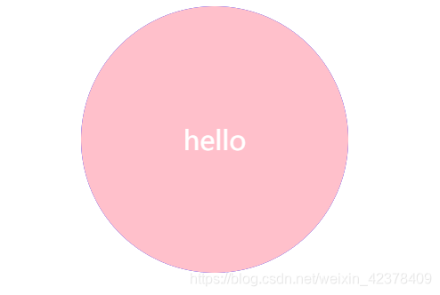
.fornt {
background-color: pink;
transform: rotateY(180deg);
}
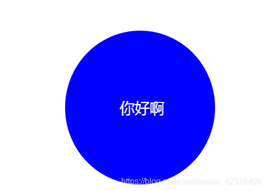
.back {
background-color: blue;
}
</style>
</head>
<body>
<div class="box">
<div class="fornt">hello</div>
<div class="back">你好啊</div>
</div>
</body>
</html>