主成分分析和因子分析
#包载入
library(corrplot)
library(psych)
library(GPArotation)
library(nFactors)
library(gplots)
library(RColorBrewer)
- 1
- 2
- 3
- 4
- 5
- 6
- 7
主成分分析
主成分分析(PCA)是对针对大量相关变量提取获得很少的一组不相关的变量,这些无关变量也成为主成分变量。
数据探索
#本部分引入消费者品牌感知的问卷数据集作为数据

pca <- read.csv("http://r-marketing.r-forge.r-project.org/data/rintro-chapter8.csv")

summary(pca)
#可以看到,该数据除了一个字符变量外,其他都是1~10的数字变量
head(pca)
- 1
- 2
- 3
- 4
- 5
- 6
- 7
- 8
library(corrplot)
#检查两两变量之间的相关关系
corrplot(cor(pca[,1:9]), order = "FPC")
#"FPC" for the first principal component order.
- 1
- 2
- 3
- 4
- 5
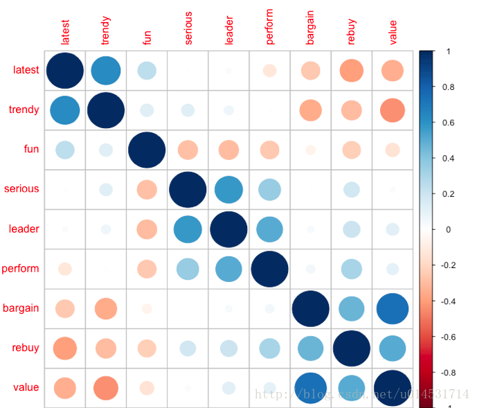
可以大致发现聚成了三个类别,分别是latest/trendy/fun,serious/leader/perform,bargain/rebuy/value三类,而这也是接下来的分析所要验证的。
提取主成分
#数据表度化
pca.sc <- pca
pca.sc[,1:9] <- scale(pca.sc[,1:9])
#提取主成分
pca.pc <- prcomp(pca.sc[,1:9])
summary(pca.pc)
#判断成分数量
plot(pca.pc, type = "l")
- 1
- 2
- 3
- 4
- 5
- 6
- 7
- 8
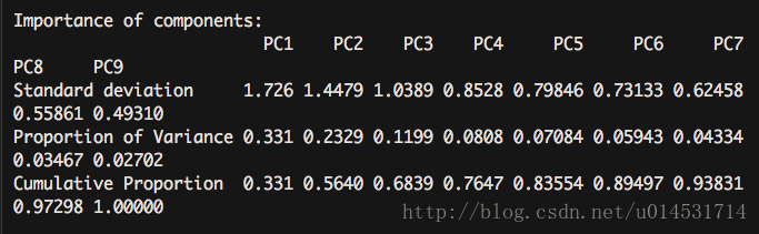
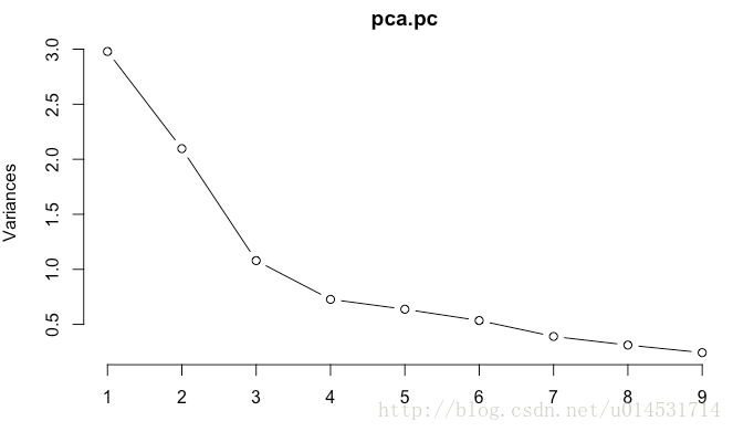
对于主成分数量,scree图可看到在3类之后,每个主成分解释的方差增值减少。
主成分得分获取
#psych包也有不错的PCA分析输出
library(psych)
fa.parallel(pca.sc[,1:9],fa = "pc") #principal()需要事先知道大致多少成分,该包的碎石图输出
pca.psy <- principal(pca.sc[,1:9], nfactors = 3,rotate = "none")
round(unclass(pca.psy$weights),2) #获取主成分得分
- 1
- 2
- 3
- 4
- 5
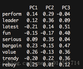
此处的获得的各个主成分的构成系数,可以导出:PC1 = 0.14*perform + 0.12 leader + latest(-0.21)….
品牌感知图
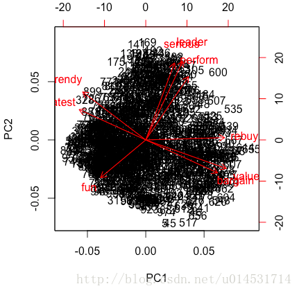
与此同时,主成分分析运用的另一个重要方面是,通过双标图(biplot)考察不同类别(品牌)之间的关系可视化
#对主成分中的前两个成分映射到二维,但因为直接投射数据主体会面临散点太多,可视度差的问题
biplot(pca.pc)
#所以,可对其类别(品牌)进行映射
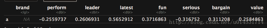
pca.mean <- aggregate(.~ brand, pca.sc, mean)
rownames(pca.mean) <- pca.mean[,1]
pca.mean.pc <- prcomp(pca.mean[,-1], scale = T)
summary(pca.mean.pc)
biplot(pca.mean.pc) #品牌感知图
- 1
- 2
- 3
- 4
- 5
- 6
- 7
- 8
- 9
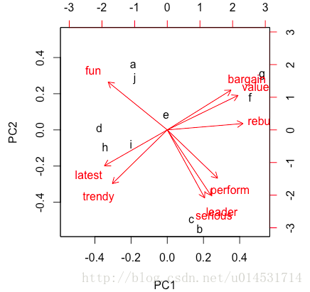
从这张图上就可以考到各个分类(品牌)的调性和位置。
可进一步考察不同品牌间的差异:
pca.mean["a",] - pca.mean["j",]
- 1
- 2
解释性因子分析
因子分析(EFA)是用来发现一组变量潜在结构的方法,主要针对无法观测的因子变量,提取获得可观测的显变量。
EFA因子数量确定
# 碎石图和特征值确定因子数目
library(nFactors)
# 多种碎石图方案
nScree(pca.sc[,1:9])

#  noc naf nparallel nkaiser
#  1   3   2         3       3

# >1 的特征值数量
eigen(cor(pca.sc[,1:9]))

#$values
#[1] 2.9792956 2.0965517 1.0792549 0.7272110 0.6375459 0.5348432 0.3901044
#[8] 0.3120464 0.2431469
- 1
- 2
- 3
- 4
- 5
- 6
- 7
- 8
- 9
- 10
- 11
- 12
- 13
- 14
- 15
从以上结果可知,因子数在2和3之间选择。
#使用psych包提取公因子
#公因子数量为2的方案
fa(pca.sc[,1:9], nfactors = 2, rotate = "none",fm = "ml") #因子化方法选择最大似然法ml
- 1
- 2
- 3
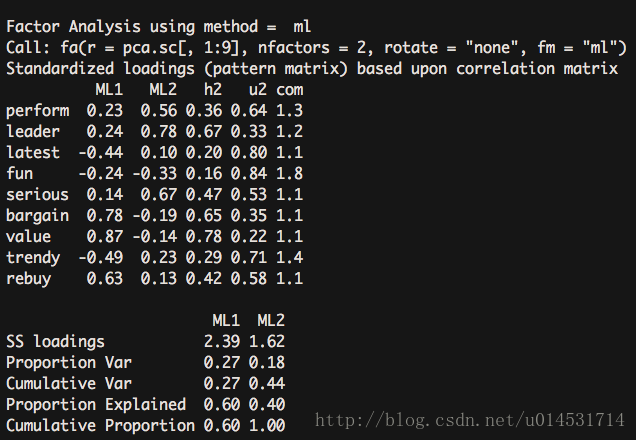
2因子方案的只解释了44%的方差。
#公因子数量为3的方案
fa(pca.sc[,1:9], nfactors = 3, rotate = "none",fm = "ml")
- 1
- 2
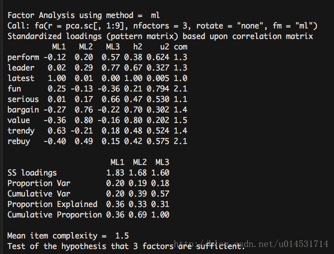
上升到了57%的方差解释度。由此可认为3因子方案更胜一筹。
EFA旋转
两种方法进行旋转
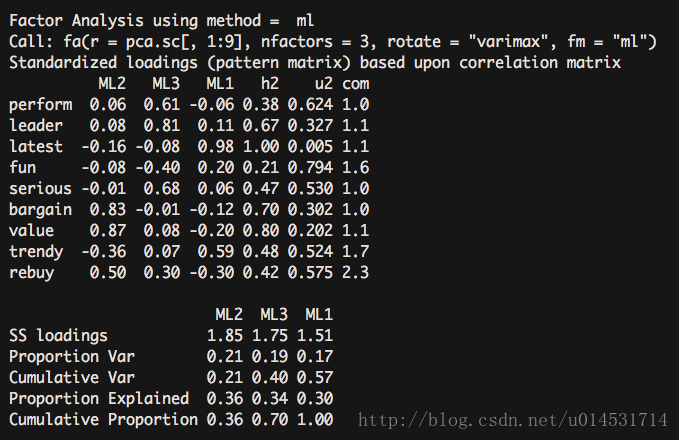
#使用psych的fa来进行正交旋转
#正交旋转
fa.vaf <- fa(pca.sc[,1:9], nfactors = 3, rotate = "varimax",fm = "ml")
fa.vaf
#斜交旋转
#使用GPArotation的oblimin斜交旋转,factanal的结果相对简练。
library(GPArotation)
fa.ob <- factanal(pca.sc[,1:9], factors = 3, rotation = "oblimin")
fa.ob
#获得未列出的因子结构矩阵,通过因子模型矩阵*因子关联矩阵获得
fsm <- function(oblique) {
if (class(oblique)[2]=="fa" & is.null(oblique$rotmat)) {
    warning("Object doesn't look like oblique EFA")
} else {
    P <- unclass(oblique$loading)
    F <- P %*% oblique$rotmat
    return(F)
} }
fsm(fa.ob)
- 1
- 2
- 3
- 4
- 5
- 6
- 7
- 8
- 9
- 10
- 11
- 12
- 13
- 14
- 15
- 16
- 17
- 18
- 19
- 20
正交旋转
斜交旋转
正交旋转将人为的强制因子间不相关,并且关注的结果集中在因子结构矩阵(correlations of the variables with the factors)。斜交旋转则关注三个矩阵:
* 因子模式矩阵(pattern matrix),结果中的(loading)列出了各个变量和因子变量的标准化回归系数。
* 因子关联矩阵(Factor Correlations matrix),因子间的关联性考察。
* 因子结构矩阵(structure matrix),即因子载荷矩阵,衡量变量与因子间的相关系数。
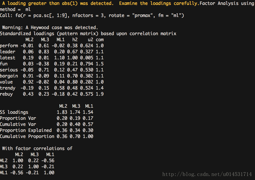
#相应的替代方案
#正交旋转
fa.va <- factanal(pca.sc[,1:9], factors = 3, rotation = "varimax")
#斜交旋转
fa.promax <- fa(pca.sc[,1:9], nfactors = 3, rotate = "promax",fm = "ml")

fsmfa <- function(oblique) {
if (class(oblique)[2]=="fa" & is.null(oblique$Phi)) {
    warning("Object doesn't look like oblique EFA")
} else {
    P <- unclass(oblique$loading)
    F <- P %*% oblique$Phi
    return(F)
} }

fsmfa(fa.promax)
- 1
- 2
- 3
- 4
- 5
- 6
- 7
- 8
- 9
- 10
- 11
- 12
- 13
- 14
- 15
- 16
EFA旋转结果的可视化
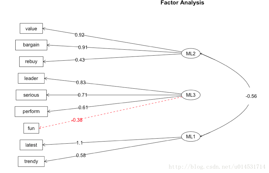
使用路线图展示潜因子和单独因子之间的关系。
fa.diagram(fa.promax,simple = T,digits = 2)
- 1
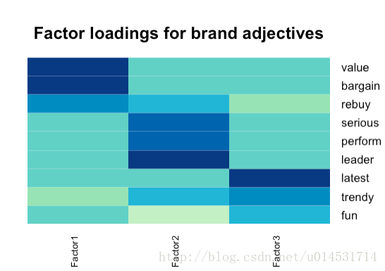
使用热图更直观的展示潜因子和变量之间的关系。
library(gplots)
library(RColorBrewer)
heatmap.2(fa.ob$loadings,
          col=brewer.pal(9, "GnBu"), trace="none", key=FALSE, dend="none",
           Colv=FALSE, cexCol = 1.5,
           main="\n\n\nFactor loadings for brand adjectives")
- 1
- 2
- 3
- 4
- 5
- 6
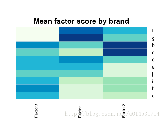
不同品牌因子得分
#获得各个品牌的三个因子均值
fa.ob <- factanal(pca.sc[,1:9], factors = 3, rotation = "oblimin",scores = "Bartlett")
fa.score <- data.frame(fa.ob$scores)
fa.score$brand <- pca.sc$brand
fa.score.mean <- aggregate(.~ brand, fa.score, mean)
fa.score.mean
#根据因子均值做热图
rownames(fa.score.mean) <- fa.score.mean[, 1]           # brand names
fa.score.mean <- fa.score.mean[, -1]

heatmap.2(as.matrix(fa.score.mean),
           col=brewer.pal(9, "GnBu"), trace="none", key=FALSE, dend="none",
           cexCol=1.2, main="\n\n\n\nMean factor score by brand")
- 1
- 2
- 3
- 4
- 5
- 6
- 7
- 8
- 9
- 10
- 11
- 12
- 13
- 14