https://www.bilibili.com/video/av29438238/?p=4
plt.plot()
plt.xtrick(rotation=45)
plt.xlabel()/plt.ylabel()
fig=plt.figure(figsize=(3,3))
fig.add_subplot(4,1,(1/2/3/4))
label
plt.legend(loc='best')
条形图:两个参数,一个是高度,一个是横轴距离原点的距离
bar/barh

扫描二维码关注公众号,回复:
3736891 查看本文章

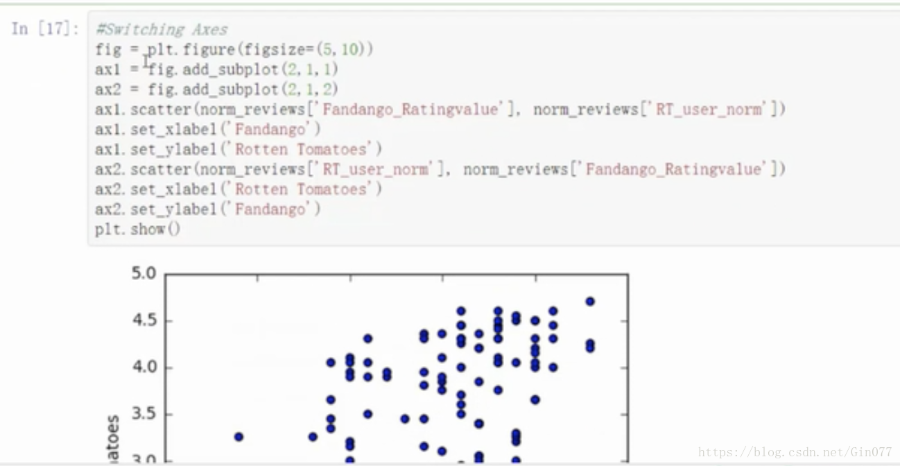
散点图
scatter
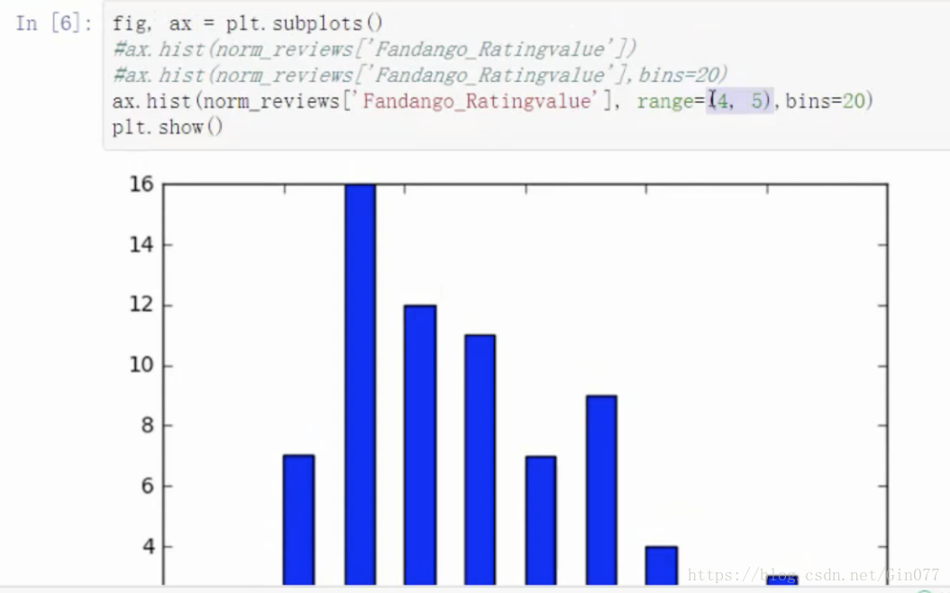
柱形图
hist

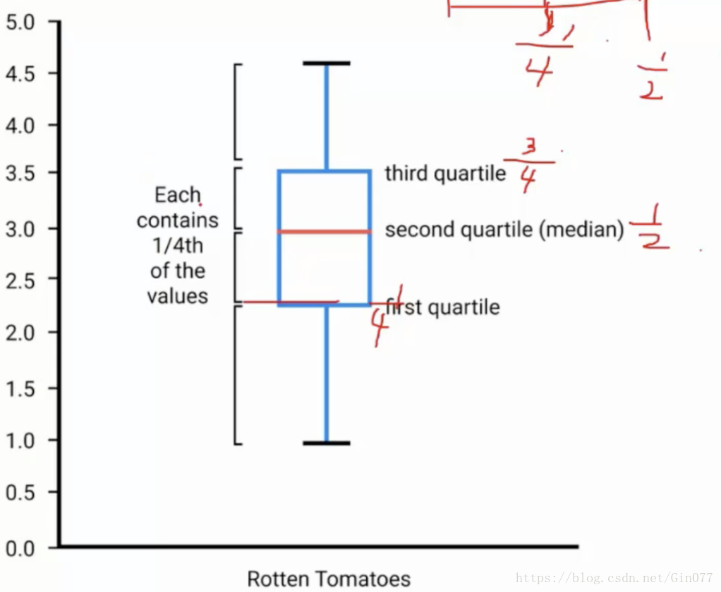
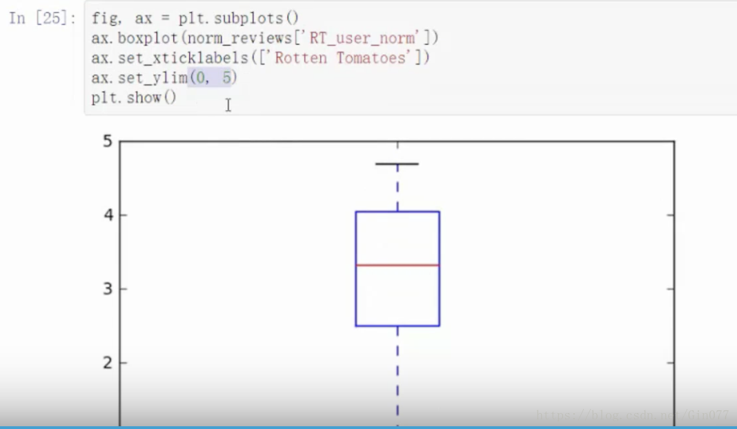
盒图
boxplot